1.0.3 • Published 5 years ago
react-toggle-dark-mode-uid v1.0.3
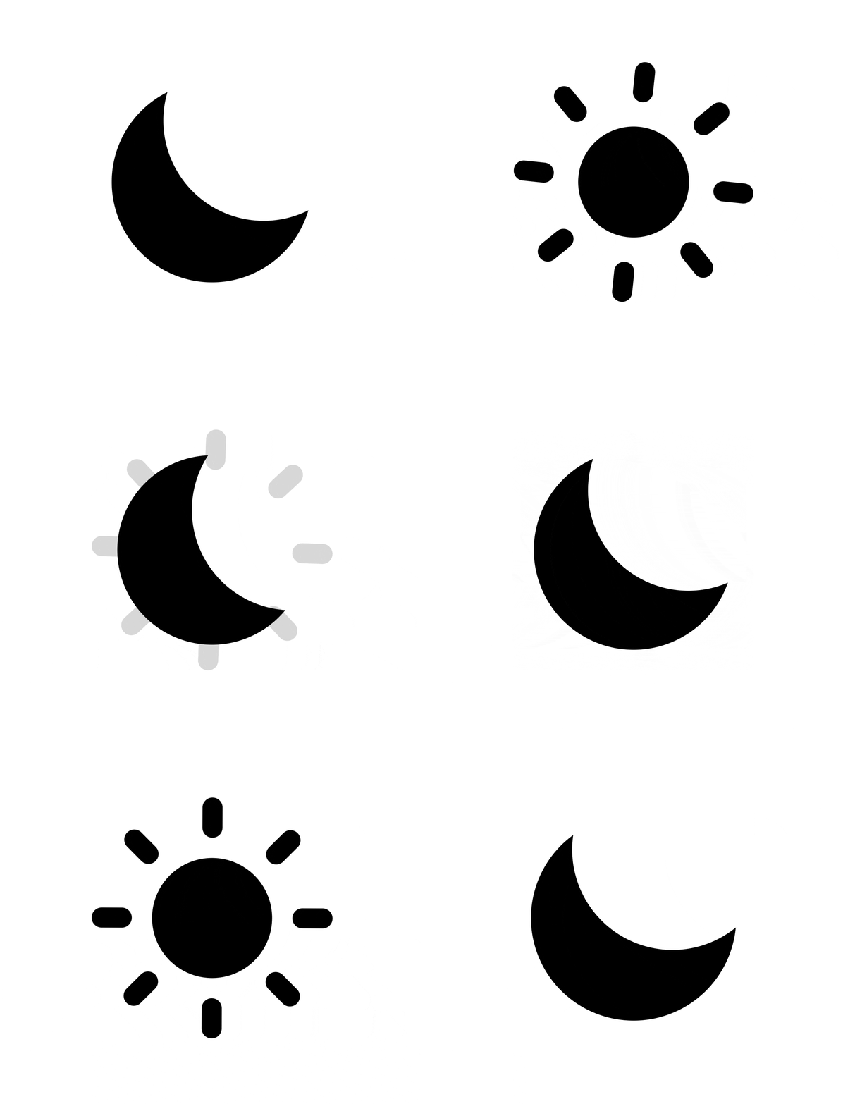
🌃 Animated dark mode toggle as seen in blogs!

Prerequisites
- node >=10
Installation
npm i react-toggle-dark-modeor with Yarn:
yarn add react-toggle-dark-modeUsage
import * as React from 'react';
import * as ReactDOM from 'react-dom';
import { DarkModeSwitch } from 'react-toggle-dark-mode';

const App = () => {
  const [isDarkMode, setDarkMode] = React.useState(false);

  const toggleDarkMode = (checked: boolean) => {
    setDarkMode(checked);
  };

  return (
    <DarkModeSwitch
      style={{ marginBottom: '2rem' }}
      checked={isDarkMode}
      onChange={toggleDarkMode}
      size={120}
    />
  );
};
API
DarkModeSwitch
Props
| Name | Type | Default Value | Description |
|---|---|---|---|
| onChange | (checked: boolean) => void | Event that triggers when icon is clicked. | |
| checked | boolean | false | Current icon state. |
| style | Object | CSS properties object. | |
| size | number | 24 | SVG size. |
| animationProperties | Object | defaultProperties (see below) | Override default animation properties. |
| moonColor | string | white | Color of the moon. |
| sunColor | string | black | Color of the sun. |
Default Animation Properties
const defaultProperties = {
  dark: {
    circle: {
      r: 9,
    },
    mask: {
      cx: '50%',
      cy: '23%',
    },
    svg: {
      transform: 'rotate(40deg)',
    },
    lines: {
      opacity: 0,
    },
  },
  light: {
    circle: {
      r: 5,
    },
    mask: {
      cx: '100%',
      cy: 0,
    },
    svg: {
      transform: 'rotate(90deg)',
    },
    lines: {
      opacity: 1,
    },
  },
  springConfig: { mass: 4, tension: 250, friction: 35 },
};
Contributors
Thanks goes to these wonderful people (emoji key):
This project follows the all-contributors specification. Contributions of any kind are welcome!
Show your support
Give a ⭐️ if this project helped you!
1.0.3
5 years ago