2.0.3 • Published 2 years ago
react-touch-swiper v2.0.3
react-touch-swiper
Touch and drag slider component for React

- Touch friendly on mobile
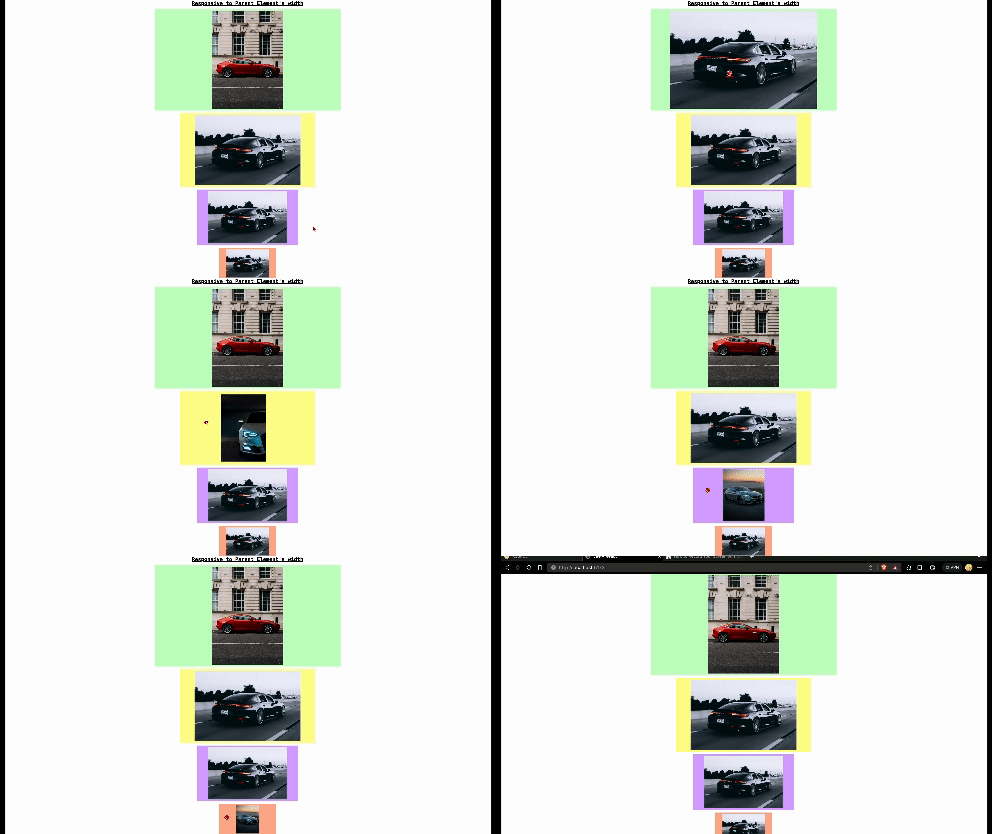
- Responsive to viewport resizing
- Supports mouse drag by default
- Simple API
- Sizes to any size parent container
- small bundle size with zero dependencies
Install
npm i react-touch-swiperUsage
import React from 'react'
import { Slider } from 'react-touch-swiper'

// here we are importing some images
// but the Slider children should be an array of node like img
// or your own components

import images from './images'

function App() {
  return (
    <Slider
      onSlideComplete={(event,slideIndex) => {
        console.log('sliding completed', slideIndex)
      }}
      onSlide={(event,slideIndex) => {
        console.log("sliding", slideIndex)
      }}
      onSlideStart={(event,slideIndex) => {
        console.log('sliding started', slideIndex)
      }}
      keyEvent={false}
      controllButton={false}
      activeIndex={0}
      threshHold={100}
      transition={0.3}
      scaleEffect={true}
    >
      {images.map(({ url, title }, index) => (
        <img src={url} key={index} alt={title} />
      ))}
    </Slider>
  )
}

export default App
Available Props
| Prop | Type | Default | Description |
|---|---|---|---|
| onSlideComplete | (event: eventObject, completedIndex: number) => void | A function that gets called when sliding completed | |
| onSlideStart | (event: eventObject, startedIndex: number) => void | A function that gets called when sliding started | |
| onSliding | (event: eventObject, currentIndex: number) => void | A function that gets called when sliding | |
| activeIndex | number | 0 | Set to start on this index or use state to update the current index |
| threshHold | number | 100 | A pixel value that must be dragged before slide snaps to its position customise with your value according to size of the window |
| transition | number | 0.3 | The transition delay in seconds |
| scaleEffect | boolean | false | scale effect for individual slides while dragging |
| keyEvent | boolean | false | Enable arrow key navigation |
| controllButton | boolean | false | Show control buttons |
| autoSliding | boolean | false | enable auto sliding based on time interval |
| autoSlideTimeInterval | number | 3000 | specific auto sliding time interval in ms |
| disableDefaultPadding | boolean | false | remove default padding of slide element (0.3rem) |
| style | object | {} | specific custom style to slider parent component (width, height, etc ..) |
License
MIT © 2023 Hamdan-KT