react-use-page-content-navigation v1.0.0
react-use-page-content-navigation
This package is React hook that enables content navigation based on scroll state.

This example is run in a layout containing a fixed header of height 92px and a margin before content of 48px (contentTopOffset: 140).
Table of Contents
Installation
NPM
npm -i react-use-page-content-navigationYarn
yarn add react-use-page-content-navigationUsage
const {...returned} = usePageContentNavigation(props.children, {...options})A Brief Explanation
The hook is given an array of React children referred to as the 'content'.
Each section is expected to contain the given sectionTitleProp unless the nestedSectionProp flag is set in wich case the hook will dive one level to retrieve the value.
The hook will automatically assign each section a DOM ID based on the section title unless an ID is already provided.
A collection of links so-to-speak is returned which contains the necessary data (DOM ID, label) associated with each section.
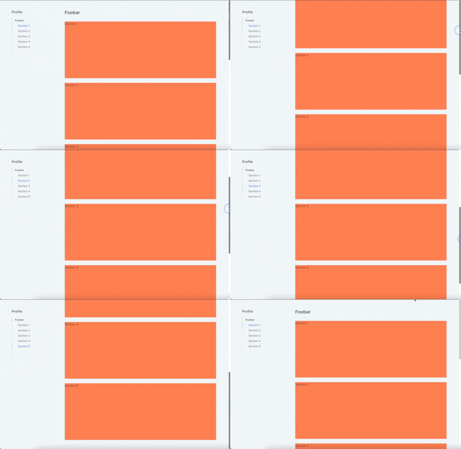
When the user scrolls, the currentIndex is updated to reflect the section most relevant to boundary within the viewport (see demo gif).
It should be mentioned that one is expected to manage the currentIndex if the user clicks on a mapped link. This is by design as it allows for flexible behaviour such as a scroll-to call as well as state restoration through URL hash.
Caveat
This hook was designed to make use of the default overflow behaviour as it attaches a scroll listener to the window itself and not any element in particular. This is by design as React's event handlers must be given as props which, in my case, wasn't suitable.
Returned
| Name | Description |
|---|---|
contentLinks | An array of links to the content |
mutatedChildren | The given children as clones with DOM IDs if not provided initially |
currentIndex | The current content section index |
setCurrentIndex | A setter for currentIndex |
Options
| Name | Description |
|---|---|
enabled? | Whether to enable the component. This finds usefulness in controlling which page is elligible for the behaviour. |
sectionTitleProp | The property name of the section title (e.g. <Card title="Hey" /> = Hey) |
nestedSectionProp? | The property acting as parent for the actual sectionTitleProp. This finds usefulness with modular components which may take another as part of their layout (e.g. <Card header={<Header title='Hey' />} />. |
viewportBoundary? | The viewport breakoff boundary as a float up (default: 0.3, I wouldn't recommend going below that threshold) |
contentTopOffset? | The offset prior to the content itself. This finds usefulness in layout where you may have a fixed header or another such components which may result in a skewed boundary box. |
TypeScript Support
You will find a collection of typings bundled with the package.
License
MIT License (c) 2022 Maximilien Zaleski