react-weekly-scheduler v0.0.1
react-weekly-schedule


Installation
npm i react-weekly-scheduleBasic Usage
import React, { useState } from 'react';
import 'resize-observer-polyfill/dist/ResizeObserver.global';
import { TimeGridScheduler, classes } from 'react-week-scheduler';
import 'react-week-scheduler/index.css';

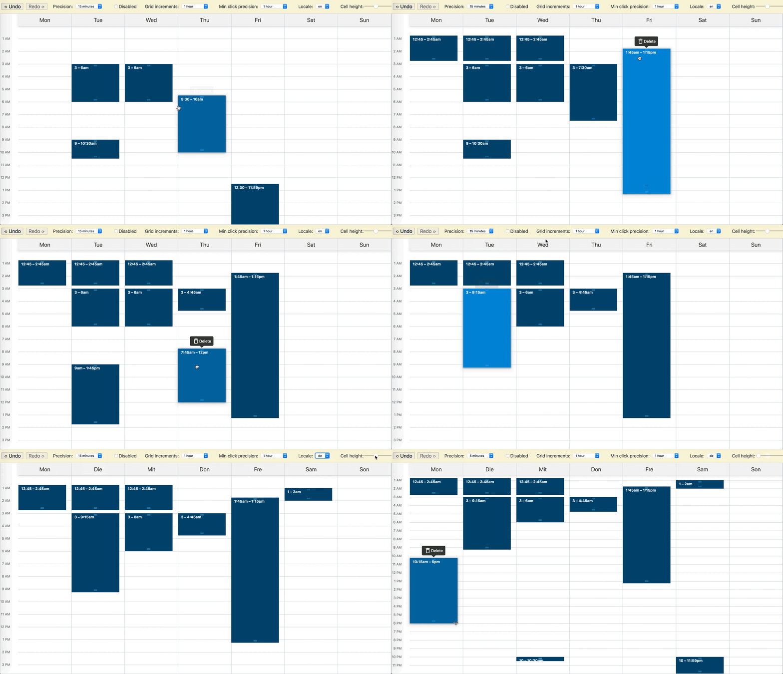
const rangeStrings = [
  ['2019-03-04 00:15', '2019-03-04 01:45'],
  ['2019-03-05 09:00', '2019-03-05 10:30'],
  ['2019-03-06 22:00', '2019-03-06 22:30'],
  ['2019-03-07 01:30', '2019-03-07 03:00'],
  ['2019-03-07 05:30', '2019-03-07 10:00'],
  ['2019-03-08 12:30', '2019-03-08 01:30'],
  ['2019-03-09 22:00', '2019-03-09 23:59'],
];

const defaultSchedule = rangeStrings.map(range =>
  range.map(dateString => new Date(dateString)),
);

function App() {
  const [schedule, setSchedule] = useState(defaultSchedule);

  return (
    <TimeGridScheduler
      classes={classes}
      originDate={new Date('2019-03-04')}
      schedule={schedule}
      onChange={setSchedule}
    />
  );
}
Customization
react-week-scheduler ships with a set of default styles for convenience. The styles are compiled as CSS Modules class names. The components exported from the package do not import the styles by default. Instead, they expect a classes prop to be passed.
The class names need to be available at runtime as a regular JS object.
Using the default styles
To use the default styles, import the default classes object as well as the styles file and pass it to the component:
import { TimeGridScheduler, classes } from 'react-week-scheduler';
import 'react-week-scheduler/index.css';

function App() {
  return <TimeGridScheduler classes={classes} {...otherProps} />;
}
The stylesheet react-week-scheduler/index.css has scoped class names precompiled, and the classes object has a mapping of class names to scoped class names. You do not need to have your bundle configured for CSS modules.
Browser Support
This library should work on any modern browser.
However, a global polyfill for ResizeObserver is required since ResizeObserver is currently only supported by Chrome 64+.
The following web platform features are used:
- Flexbox
touch-action: noneposition: sticky- Touch Events
- CSS containement (optional)
- Custom CSS Properties (optional)
Mobile Browser Support
Touch events are handled properly, with a 300ms delay on the initial touch start event to allow for scrolling.
The component should work fine on any modern mobile browser. However, due to lack of support for touch-action: none
on iOS Safari, dragging or resizing time blocks may not work very well.
6 years ago
6 years ago

