1.2.11 • Published 2 years ago
react-wheel-time-picker v1.2.11
React wheel time picker

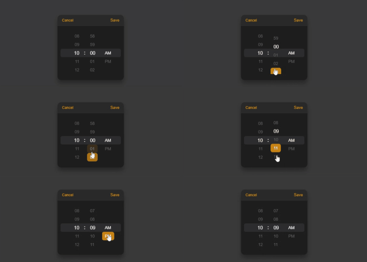
A modern wheel time picker for your React app.
- Full Typescript support
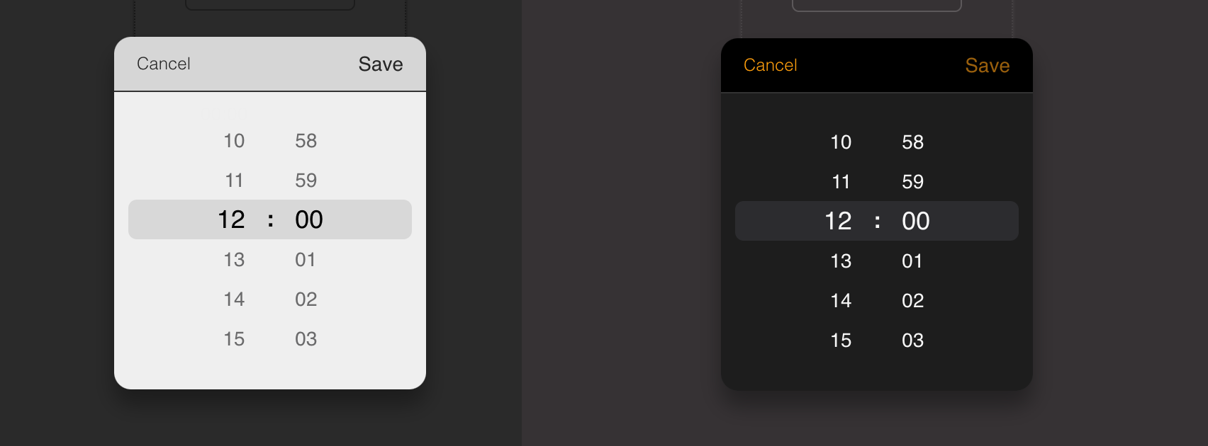
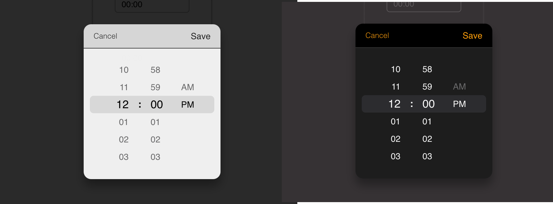
- Dark & Light mode support
- No moment.js needed
- Zero dependencies and lightweight
Live demo
To see the live demo: Click here
install
npm install react-wheel-time-pickeror
yarn add react-wheel-time-pickerd.ts declaration
If you have a vite-env.d.ts or other d.ts file in your src folder you can put this
declare module 'react-wheel-time-picker'
It's for finding corresponding type of 'react-wheel-time-picker'.
Usage
24 hours format (light & dark)

import React, { useState } from 'react';
import { TimePicker } from 'react-wheel-time-picker';

export default const  App = () => {
    const [value, setValue] = useState('12:00');
    const [isDarkMode, setIsDarkMode] = useState(false);

    const onChange = (timeValue: string) => {
    setValue(timeValue);
    };

   return (
      <div>
        <TimePicker
            label="Start time"
            isDarkMode={isDarkMode}
            onChange={onChange}
            value={value}
        />
      </div>
   );
}
12 hours format (light & dark)

import React, { useState } from 'react';
import { TimePicker } from 'react-wheel-time-picker';

export default const  MyApp = () => {
    const [value, setValue] = useState('10:00 AM');
    const [isDarkMode, setIsDarkMode] = useState(false);

    const onChange = (timeValue) => {
        setValue(timeValue);
    }

   return (
      <div>
        <TimePicker
            use12Hours
            label="Start time"
            isDarkMode={isDarkMode}
            onChange={onChange}
            value={value}
        />
      </div>
   );
}
API
| Name | Type | Default | Description |
|---|---|---|---|
| label | String (optional) | n/a | Name of the input. |
| isDarkMode | Boolean (optional) | n/a | for dark mode support. |
| value | String | n/a | Current value. |
| cellHeight | Number (optional) | 28 | The height of the cell number. |
| placeHolder | String (optional) | "Selet_time" | Time input's placeholder. |
| pickerDefaultValue | String (optional) | "00:00" | The initial value that the picker begin with in the first time. |
| disabled | Boolean (optional) | false | Whether picker is disabled. |
| isOpen | Boolean (optional) | false | Whether the time picker should be opened. |
| required | Boolean (optional) | false | Whether time input should be required. |
| cancelButtonText | String (optional) | "Cancel" | Cancel button text content |
| saveButtonText | String (optional) | "Save" | Save button text content |
| controllers | Boolean (optional) | true | Whether the buttons should be displayed |
| seperator | Boolean (optional) | true | whether show the colon seperator |
| id | String (optional) | n/a | Input time picker id |
| name | String (optional) | n/a | Input time picker name |
| use12Hours | Boolean (optional) | false | 12 hours display mode |
| inputClassName | String (optional) | n/a | Input time picker className |
| popupClassName | String (optional) | n/a | time picker popup className |
| onChange | (value) => alert ('New time is: ', value) | n/a | Called when select a different value |
| onSave | (value) => alert ('Time saved is: ', value) (optional) | n/a | When the user clicks on save button |
| onClose | () => alert('Clock closed') (optional) | n/a | When the user clicks on cancel button |
| onAmPmChange | (value) => alert('Am/Pm changed : value') (optional) | n/a | called when select an am/pm value |
| onOpen | () => alert('time picker opened') (optional) | n/a | called when time picker is opened |
Contributions Welcome!
git clone https://github.com/rodolphe37/react-wheel-time-pickerLicense
The ISC License.
1.2.11
2 years ago
1.2.9
2 years ago
1.2.8
2 years ago
1.2.7
2 years ago
1.2.5
2 years ago
1.2.4
2 years ago
1.2.3
2 years ago
1.2.2
2 years ago
1.2.1
2 years ago
1.2.0
2 years ago
1.1.3
2 years ago
1.1.2
2 years ago
1.1.1
2 years ago
1.1.0
2 years ago
1.0.9
2 years ago
1.0.8
2 years ago
1.0.7
2 years ago
1.0.6
2 years ago
1.0.5
2 years ago
1.0.4
2 years ago
1.0.2
2 years ago
1.0.1
2 years ago

