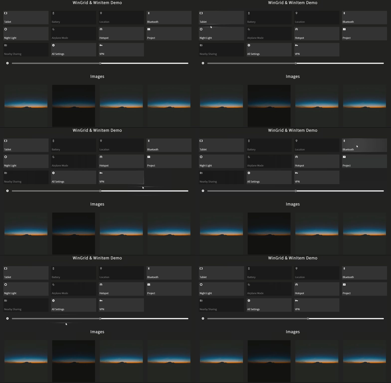
react-win-grid v1.0.2
react-win-grid
A lightweight and customisable Windows 10 Grid Component for ReactJS to give a native windows look to your web apps.

Table of contents
Changelog
- @1.0.* - First stable version
Installation
npm install react-win-gridGetting Started
import { WinGrid, WinItem } from 'react-win-grid';OR
const { WinGrid, WinItem } = require('react-win-grid');WinItem
This is a button component. Use this for individual clickable/hoverable items in your layout.
This can be used inside of WinGrid or as a standalone component.
Below is a list of props (optional) you can pass to the component.
| props | description | type | acceptable values |
|---|---|---|---|
| backgroundColors | Colors that will be applied as gradient on background on mouse hover | Array of strings | All color values supported by CSS |
| borderColors | Colors that will applied as gradient on borders on mouse hover | Array of strings | All color values supported by CSS |
| borderWidth | Border thickness in pixels | Number | Any positive number |
| className | HTML class attribute equivalent | String | - |
| contentIsImage | This prop is recommended when the child is any image element. | Boolean | true \| false |
| disabled | Disable the WinItem | Boolean | true \| false |
| eventHandlers | Event Handlers for the component | Object | key should be valid React event names and value will be the event handler function |
| onlyBackground | Don't apply hover effect on borders | Boolean | true \| false |
| onlyBorders | Don't apply hover effect on background | Boolean | true \| false |
| style | CSS styles for the component | Object | Valid css properties (camelCased) |
⚠ Note: Adding the
contentIsImageprop toWinItemwill not allow events to pass down to its children elements as this adds a layer on top of the image for hover effect to be visible. However, you can still set event handlers on the component itself by adding theeventHandlersprop. You can instead put image and non image in seperateWinItems
//The button will not receive click event
<WinItem contentIsImage>
	<img
		src='https://picsum.photos/1920/1080/'
		alt='imagesc'
		style={{ maxWidth: `100%` }}
	/>
	<button onClick={() => console.log('click')}> I am unclickable</button>
</WinItem>
WinGrid
This is a CSS grid component with the Windows10 grid hover effect.
Use this layout to arrange and all the items inside this component should be either WinItem or HTML elements.
If you want to pass your react component to this, wrap it inside WinItem.
All the props mentioned below are optional
| props | description | type | acceptable values |
|---|---|---|---|
| borderColors | Colors that will applied as gradient on borders on mouse hover | Array of strings | All color values supported by CSS |
| borderWidth | Border thickness in pixels | Number | Any positive number |
| className | HTML class attribute equivalent | String | - |
| directions | directions parameter specified in cursor-nearby-elements package | Number | Positive integers |
| eventHandlers | Event Handlers for the component | Object | key should be valid React event names and value will be the event handler function |
| highlightRadius | This value is like factor which multiplies with the original spotlight radius aka offset resulting in smaller or bigger radius | Object | Valid css properties (camelCased) |
| offsetPoints | offsetPoints parameter specified in cursor-nearby-elements package | Array of floats | Positive float values (Refer the package for default value) |
| shouldSkipAngle | shouldSkipAngle parameter specified in cursor-nearby-elements package | Number | Positive integers |
| style | CSS styles for the component | Object | Valid css properties (camelCased) |
💡 Tip: Use the
offsetPointsanddirectionsprops to fine tune the performance of theWinGridbased on your layout


