react-work-flow v1.1.1
中文文档
English document
Install
Please install the 1.0.5 version at that time.
npm i react-work-flow@1.0.5About the react-work-flow
First of all, thank MrBlenny very much because this React plugin is based on his Github repository react-flow-chart .
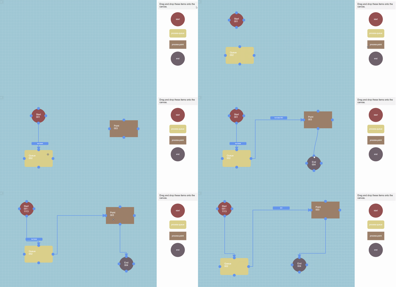
Before introducing this plugin, let's first take a look at what this plugin can do with the following GIF image:
If the GIF image can't be loaded, you can click Here to view.

Shown above, The React plugin is designed to help users quickly build a workflow GUI.
The main basic functions of the plugin are as follows:
- Drag and drop the add node and add the node name and description information.
- Drag and drop to add a connection to connect two nodes.And optionally add a line of description label.
- Double-click the node to modify the name and description of the node.
- Double-click the line to modify the label of the line.
- Click the node or connection, and press the Back key to delete the node or connection
Advanced features of the plug-in include:
- Custom style, developers can customize the modification of node, wire style
- More advanced features are in development
The plugin is very flexible, and many of its functions can be controlled on their own, as we'll see in a moment.
Use of the Plugin
1. Build the most basic page
After the plugin is successfully installed, we first set up the basic page. The code example is as follows:
import * as React from 'react'
import { FlowChartWithState, Content, Page, Sidebar, SidebarItem } from 'react-work-flow'

// Initializes an empty panel
const chartSimple = {
    offset: {
        x: 0,
        y: 0
    },
    nodes: {
    },
    links: {
    },
    selected: {},
    hovered: {}
}

const DragAndDropSidebar = () => {
    return (
        <Page>
            <Content>
                <FlowChartWithState initialValue={chartSimple} />
            </Content>
            <Sidebar>
                <div style={{ margin: "10px", padding: "10px", background: "rgba(0,0,0,0.05)" }}>
                    Drag and drop these items onto the canvas.
                </div>
                <SidebarItem type="start" />
                <SidebarItem type="process-queue" />
                <SidebarItem type="process-point" />
                <SidebarItem type="end" />
            </Sidebar>
        </Page>
    )
}

export default DragAndDropSidebar;
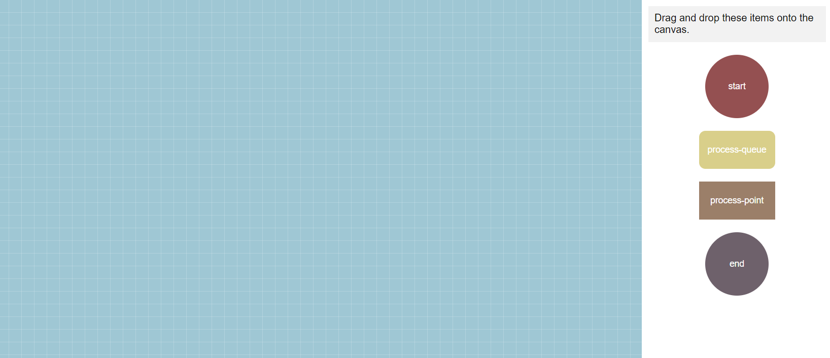
After the page is built, put the page into our own project. When we open the page, we can see a blank work-flow GUI:

2. Get the JSON Data of work-flow
When we successfully create a work-flow, we definitely want to save its relevant data to the database, so that we can use this data to re-render the work-flow later.
This is a JSON format of the data, the sample code to get the data is as follows:
// Other code can refer to the above example

const DragAndDropSidebar = () => {
    let workFlowValue = {}

    let getWorkFlowChartValue = (newWorkFlowValue) => {
        workFlowValue = newWorkFlowValue
        console.log("work-flow 的JSON数据: ", workFlowValue)
    }

    return (
        <Page>
            <Content>
                <FlowChartWithState
                    initialValue={chartSimple}
                    getWorkFlowChartValue={getWorkFlowChartValue} />
            </Content>
        </Page>
    )
}
3. Custom rules of adding links that do not allow adding links in some cases
In some cases, we need to control the permission of the user to add a link. Under inappropriate circumstances, the user is not allowed to add a link. For example, the user is not allowed to connect to the same node with a link.
// Other code can refer to the above example

function validateLink({ linkId, fromNodeId, fromPortId, toNodeId, toPortId, chart }) {
    if (fromNodeId === toNodeId) {
        return false
    }

    return true;
}


const DragAndDropSidebar = () => (
  <Page>
    <Content>
      <FlowChartWithState
        initialValue={chartSimple}
        config={{ validateLink: validateLink }}
      />
    </Content>
  </Page>
)
4. Whether users are allowed to edit work-flow
In some cases, we may have a need to allow users to view only work-flow, but not to edit work-flow.Then the following code can be used for control:
// Other code can refer to the above example

const DragAndDropSidebar = () => (
  <Page>
    <Content>
      <FlowChartWithState
        initialValue={chartSimple}
        config={{ readonly: true }}
      />
    </Content>
  </Page>
)
5.Whether allowed to add caption to the line
When adding a new link or double-clicking the link, the description cannot be added by default. If you want to enable this function, you can directly pass parameters to enable the function:
// Other code can refer to the above example

const DragAndDropSidebar = () => {
    return (
        <Page>
            <Content>
                <FlowChartWithState
                    initialValue={chartSimple}
                    isAllowAddLinkLabel={true} />
            </Content>
        </Page>
    )
}
6. Custom style, modify the node style
When you custom the style, I recommend using styled-components for quick custom style. First of all, execute the below code to install the plugin.
npm i styled-componentsThen refer to the following code to customize and modify the node style:
// Other code can refer to the above example

import styled from 'styled-components'

// Custom the style of start Node
const StartPoint = styled.div`
    position: absolute;
    width: 100px;
    height: 100px;
    padding: 0px;
    display: flex;
    justify-content: center;
    align-items: center;
    background: rgb(148, 80, 81);
    color: red;
    border-radius: 50%;
`

// Custom the style of proces-queue Node
const ProcessQueue = styled.div`
    width: 200px;
    height: 120px;
    position: absolute;
    padding: 30px;
    background: rgb(217, 207, 138);
    color: white;
    border-radius: 10px;
    & div {
    padding: 0px;
    margin: 0px;
}
`

// Custom the style of process-point Node
const ProcessPoint = styled.div`
    width: 200px;
    height: 120px;
    position: absolute;
    padding: 30px;
    background: rgb(155, 127, 105);
    color: white;
    & div {
    padding: 0px;
    margin: 0px;
}
`

// Custom the style of end Node
const EndPoint = styled.div`
    position: absolute;
    width: 100px;
    height: 100px;
    padding: 0px;
    display: flex;
    justify-content: center;
    align-items: center;
    background: rgb(110, 97, 107);
    color: white;
    border-radius: 50%;
`

const NodeCustom = React.forwardRef(({ node, children, ...otherProps }, ref) => {
    switch (node.type) {
        case "start":
            return (
                <StartPoint ref={ref} {...otherProps}>
                    {children}
                </StartPoint>
            )
        case "end":
            return (
                <EndPoint ref={ref} {...otherProps}>
                    {children}
                </EndPoint>
            )
        case "process-queue":
            return (
                <ProcessQueue ref={ref} {...otherProps}>
                    {children}
                </ProcessQueue>
            )
        case "process-point":
            return (
                <ProcessPoint ref={ref} {...otherProps}>
                    {children}
                </ProcessPoint>
            )
    }
    return (
        <StartPoint ref={ref} {...otherProps}>
            {children}
        </StartPoint>
    )
})

const chartSimple = {
    offset: {
        x: 0,
        y: 0
    },
    nodes: {
    },
    links: {
    },
    selected: {},
    hovered: {}
}

const DragAndDropSidebar = () => {
    return (
        <Page>
            <Content>
                <FlowChartWithState
                    initialValue={chartSimple}
                    Components={{
                        Node: NodeCustom
                    }} />
            </Content>
        </Page>
    )
}
Note: so far, there are only four types of nodes in this plugin:start、process-queue、process-point and end。
Adding other types of nodes is not currently supported, but it may be available in future releases.
7. Custom style, modify the style of node in the right sidebar
At this point, there are only four types of nodes in the plug-in, so we can only change the styles of these four types of nodes for the time being. Later versions will allow developers to customize their own nodes.
The way to modify the style is very simple. The reference code is as follows:
// Other code can refer to the above example


// Define the style, note that it is a variable of type string
const startItemStyle = `
  {
    width: 100px;
    height: 100px;
    border-radius: 50px;
    background: red;
    line-height: 100px;
    padding: 0;
    text-align: center;
  }
`

// Pass custom styles to child elements
const DragAndDropSidebar = () => (
  <Page>
    <Sidebar>
      <SidebarItem type="start" ports={startPoint} itemStyle={startItemStyle} />
    </Sidebar>
  </Page>
)
8. Custom style, modify the link style
The way to modify the line style is similar to the way to modify the node style. The reference code is as follows:
// Other code can refer to the above example

import styled from 'styled-components'
import { LinkDefault, generateLabelPosition  } from 'react-work-flow'

const Label = styled.div`
  position: absolute;
  width: 120px;
`
const LabelContent = styled.div`
  padding: 5px 10px;
  background: cornflowerblue;
  color: white;
  border-radius: 5px;
  display: flex;
  align-items: center;
  justify-content: center;
  font-size: 10px;
  cursor: pointer;
`
const LinkCustom = (props) => {
  const { startPos, endPos } = props
  const { centerX, centerY } = generateLabelPosition(startPos, endPos)
  return (
    <>
      <LinkDefault {...props} />
      <Label style={{ left: centerX, top: centerY }} >
         { props.link.properties && props.link.properties.label && (
           <LabelContent>{props.link.properties && props.link.properties.label}</LabelContent>
         )}
      </Label>
    </>
  )
}

const DragAndDropSidebar = () => {
  return (
    <Page>
      <Content>
        <FlowChartWithState
          initialValue={chartSimple}
          Components={{
            Link: LinkCustom
          }}
          />
      </Content>
    </Page>
  )
}
But be aware that when user add a new link or user double-click the link, if you allow him to add the label, When customize LinkCustom , be sure to add the double-click event onDoubleClick. The example code is as follows:
// Other code can refer to the above example

const LinkCustom = (props) => {
  const { startPos, endPos, link, onLabelDoubleClick } = props
  const { centerX, centerY } = generateLabelPosition(startPos, endPos)
  return (
    <>
      <LinkDefault {...props} />
      <Label
        style={{ left: centerX, top: centerY }}
        onDoubleClick={ () => { onLabelDoubleClick({linkId: link.id}) } } >
         { props.link.properties && props.link.properties.label && (
           <LabelContent>{props.link.properties && props.link.properties.label}</LabelContent>
         )}
      </Label>
    </>
  )
}
9. Custom style, modify the style of the ports on the node
The method to modify the endpoint style is similar to the method to modify the node style. The reference code is as follows:
// Other code can refer to the above example

import styled from 'styled-components'

const PortCustomOuter = styled.div`
  width: 20px;
  height: 20px;
  border-radius: 20px;
  background: cornflowerblue;
  cursor: pointer;
  display: flex;
  justify-content: center;
  align-items: center;

  &:hover {
    background: cornflowerblue;
  }
  & svg {
    width: 15px;
    height: 15px;
  }
`

const PortCustom = (props) => {
  return <PortCustomOuter />
}


const chartSimple = {
  offset: {
    x: 0,
    y: 0
  },
  nodes: {
  },
  links: {
  },
  selected: {},
  hovered: {}
}


const DragAndDropSidebar = () => {
  return (
    <Page>
      <Content>
        <FlowChartWithState
          initialValue={chartSimple}
          Components={{
            Port: PortCustom
          }}
          />
      </Content>
    </Page>
  )
}

export default DragAndDropSidebar;
10. Customize the endpoint on the node, modifying its number and position
By default, each node in the plugin has four ports, and they are in the top, right, bottom and left.
If this default configuration does not meet your requirements, you can modify the number and location of ports in the following ways.
// Other code can refer to the above example

const startPoint = {
  port1: {
    id: 'port1',
    type: 'left',
  },
  port2: {
    id: 'port2',
    type: 'right',
  },
  port3: {
    id: 'port3',
    type: 'top',
  },
  port4: {
    id: 'port4',
    type: 'bottom',
  },
  port5: {
    id: 'port5',
    type: 'left',
  },
  port6: {
    id: 'port6',
    type: 'right',
  },
  port7: {
    id: 'port7',
    type: 'top',
  },
  port8: {
    id: 'port8',
    type: 'bottom',
  }
};

const DragAndDropSidebar = () => (
  <Page>
    <Sidebar>
      <SidebarItem type="start" ports={startPoint} />
    </Sidebar>
  </Page>
)
Through the above code, we can set the number of ports of start type node to 8. It should be noted that each node can have up to eight endpoints.
If you need to set another number of endpoints, you can simply delete the attributes of the startPoint object in the above code.
The id in the attribute is the id of the endpoint, and the id of different endpoints is different.
The type in the attribute is the location of the endpoint, specifying which side of the node the endpoint is on. For example, bottom indicates that the endpoint is at the bottom of the node.
In the last
This is the function of the plug-in description, if the above function still can not meet your needs, you are very welcome to clone the code to modify.
If you have any Suggestions, questions or comments about this plugin, please let me know in time. Thank you very much.
Information about the author: