reactchart v1.1.0
Fund KIS' immutable React-based charts library
This is a work of Fund KIS to easily produce quality charts.
Those graphics are produce in the SVG format.
More exemples are available at the Fund KIS github page.
Dependencies
This library is based on React and Freezer.
Installation
Using npm and the npm registry,
npm install reactchartIf you wish to use directly the sources:
using git:
you'll need to clone the repo
git clone git@github.com:fundkis/reactchart.gitin some place node can reach (either locally in your
node_modules folder or in the NODE_PATH folder, if
set), then you'll need to delete the .git folder.
Using npm:
npm install git+ssh://git@github.com/fundkis/reactchart.git## Usage
Let's start with a minimal example:
let React = require('react');
let Chart = require('reactchart');

let props = {
	width: 600, // px
    height: 300, // px
    data: [{
    	series: [
        	{x: 0, y: 1},
        	{x: 1, y: 2},
        	{x: 2, y: 2},
        	{x: 3, y: 3},
        	{x: 4, y: 2.5},
        	{x: 5, y: 4},
        	{x: 6, y: 1}
    	]
    }],
    graphProps: [{color: 'blue'}]
};

class ShowChart extends React.Component {

	render(){
    	return <div>
        	<h1>My first graph!</h2>
            <Chart {...props}/>
        </div>;
    }
}
The above example produces this chart:
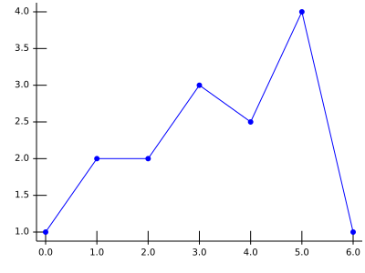
Then all the subtlety consists in knowing how to use the props.
Proprieties you should know about
The very least you need to do is to provide a width, a height, some data and graphProps. The data you wish to render are the series in the data part, while the way you wish to see them will be in the graphProps part.
The data
The data proprieties contains the numerical description of the graphic, basically what should be shown. It is an array as one graphic may contain several data.
data: [{
	series: [{x, y, value, label: {x, y}, tag, legend		}], // the data points
    type: 'Plain' or 'Bars' or ..., // type of graph
    stacked: undefined or x or y, // should the data be stacked along a direction
    ord: {
    	axis: 'left' or 'right', // which axis
        type: 'number' or 'date', // type of y data
    },
    abs: {
		axis: 'bottom' or 'top',
        type: 'number' or 'date'
	}
}, ...
]
Default settings and type of chart
The first piece of information to provide is the data points. The simplest
form is {x, y} with the values being either a number or a date. The label enables
to print labels instead of values at the axis' corresponding tick.
The library can handle numbers and dates as input values, a date should be explicitely declared in the corresponding proprieties (abs if abscissa or ord if ordinate).
Once you have some data, you get to choose which type of chart will give them the best justice! Here are the same data, rendered by the default settings, changing the type value. The stairs can be either left or right.
| type | Resulting chart | type | Resulting chart |
|---|---|---|---|
Bars | 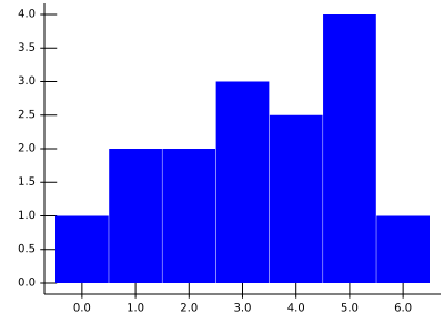 | yBars | 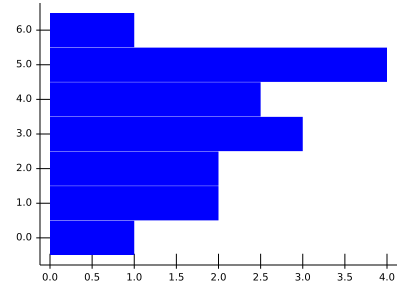 |
Stairs | 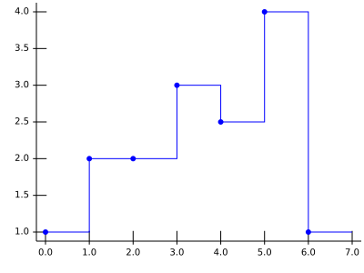 | Stairs | 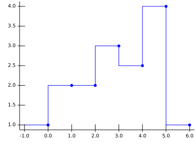 |
Pie | 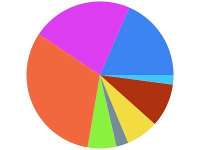 |
Stacking
It is possible to stack values. Each stacked-declared serie will be offsetted so as to "sit" on the stack. You probably want bar marks, and no line. The stacked parameter takes a string giving the direction of the stacking:
| Direction | Prop | Chart |
|---|---|---|
| x | stacked: 'x' | 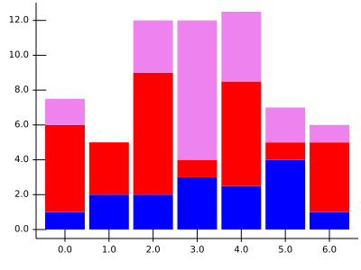 |
| y | stacked: 'y' | 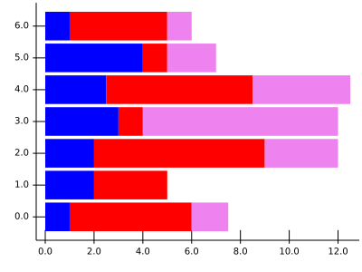 |
The axis
An axis can be a date or a number axis. As dates are not numbers, the library shows period instead of milestone, unless the period is very short.
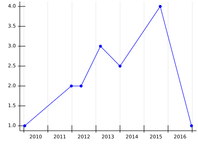
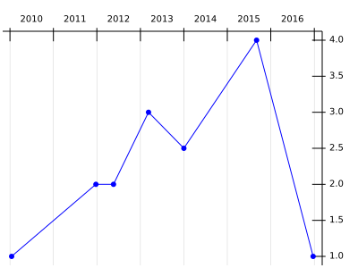
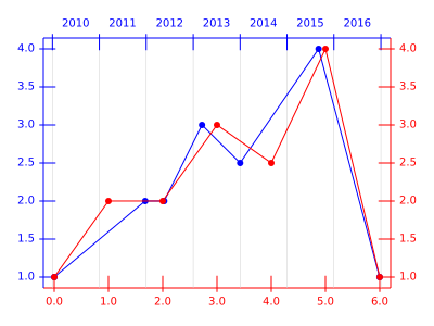
The axis against which the data should be plotted can be left or right, top of bottom, providing the correct axis definition.
The graphProps
This contains the description of how the data should be printed. When there are several values, the first value given is the default value.
Note that in most browsers, an undefined color is equivalent to black.
graphProps: [{
	color: 'black' or 'blue' or '#1F456C' or ..., // any color
	width: 1, // any number
	fill: 'none' or 'blue' or ..., // any color or 'none'
	shade: 1, // any number between 0 and 1
    dropLine: {x: false or true, y:false or true}, // draw?
	// mark props, explicit at this level
	// overwritten if present in markProps
	// exists for friendlyness of use
	mark: true or false, // print marks ?
	markColor: undefined, // any color
	markSize: 3, //
	markType: 'dot' or 'square', //
	onlyMarks: false, //
	// contains low-level description,
	// i.e. specific things like radius
	// for a dot, or anything.
	markProps: {},
	shader: undefined, // playing with colors
	tag: {
		show: false, // show the tag
		print: (t) => t + '', // if something special needs to be done
		fontSize: 10, // any number
		pin: true or false, // show the pin
    	pinColor: 'black',
		pinLength: 10, // 10 px as pin length by default
		pinAngle: 90, // direction fo pin
		pinHook: 3
	}
}, ...
]
The details of the marksProps are given at the marks section, the shader at the shading section.
Basic
The basic proprieties are the color (color), the width of the line (width), the opacity of the charts (shade) and wether or not the area under the curve should be colored (fill).
dropLine
The dropLine boolean is used to print the drop lines.
The marks controller at high level
A few mark controllers are available at this level of description. The most common ones:
- should the mark be printed? mark;
- the color of the marks: markColor;
- the type of mark: markType;
- the size of the marks: markSize.
The different types available are currently dot, square and bar. Note that the size has a different meaning for different marks. For more details, see the description of the marks.
shader
The shader enables fine color control of the marks, it has three calculations type, see the shading section for more details.
Tag the data
You can tag any data point you wish. Note that tagging is a complex issue, and it is not in the FundKIS TODO list to start research in this area. Thus labelling is kept at it's most basic form: you describe a tag (called pin) with its length, angle, and hook. The tag itself is given by a tag propriety in the data point.
The axis' description: axisProps
React Chart supports two possible axis for the abscissa and the ordinate: at the top of the bottom of the chart for the abscissa, left or right for the ordinate. Thus the following description:
{
	ticks: {
		major: {
        	color: 'black' or 'blue' or '#F13ED5" or...,
            show: true or false,
            labelColor: 'black' or 'blue' or '#F13ED5" or...
        },
        minor: {
        	color: 'black' or 'blue' or '#F13ED5" or...,
            show: true or false,
            labelColor: 'black' or 'blue' or '#F13ED5" or...
        },
	},
	grid: {
		major: {
        	color: 'lightgrey' or ...,
            show: false or true
        },
		minor: {
        	color: 'lightgrey' or ...,
            show: false or true
        },
	},
	show: true,
	// to force definition
	min: undefined,
	max: undefined,
	tickLabels: [], //{coord: where, label: ''}, coord in ds
	color:     'black',
	width:      1,
	label:      '',
	empty:      false
}
An axis is composed of the axis line, the ticks and the grid. The ticks and the grid can be major or minor. A tick is composed of a line and a label placed near it.
All of these different parts have a color and a show proprieties. The axis can be forced to a minimum (min) and a maximum (max) value.
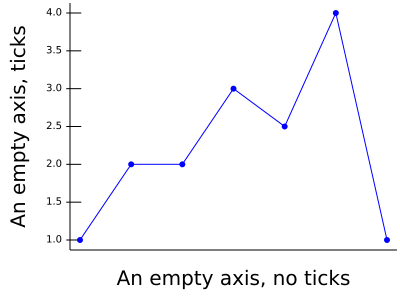
You can provide a label to your axis, and have only a line using the empy boolean.
The different graphics' type
As shown in the first section, you have:
- Plain
- Bars
- yBars
- Stairs
- Pie
Stairs can be either right or left using the propriety stairs in the graphProps propriety.
The different marks
As of now, React Chart supports dot, square, opendot and opensquare using the markType propriety. The markSize propriety refers to the radius of the dot and the width of the square.
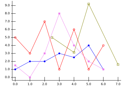
Playing with the colors
Marks color or opacity can be evaluated and computed for each point.