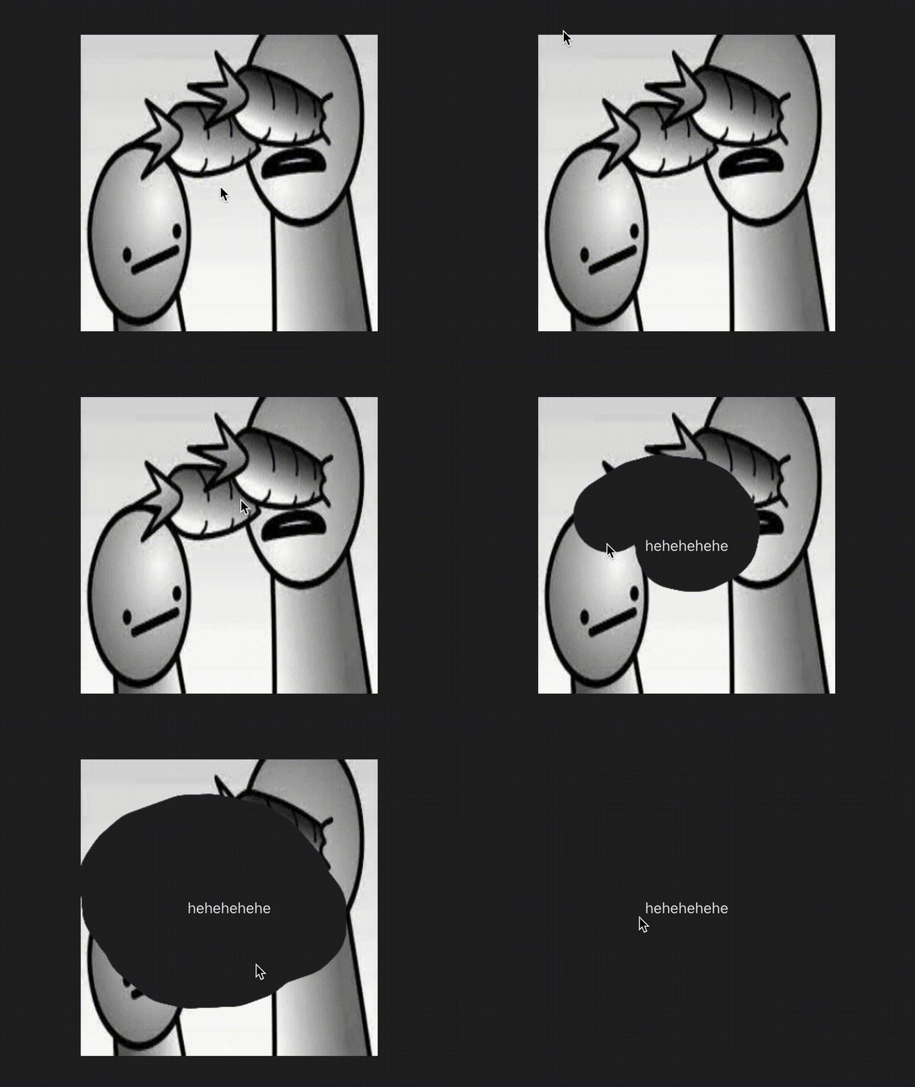
reactjs-scratchcard v1.0.6
reactjs-scratchcard
A simple scratchcard component for React under ~8kB
Original repo by Aleksik (not maintained)
https://github.com/aleksik/react-scratchcard
Converted this repo from class based components to function based components
https://github.com/dopey2/react-scratchcard-v2
Improvements over older versions
- Functional Components
- Fully Type Safe
- Added relative sizing (rem, em , vh, vw, etc) over static sizing (px)
- Custom Transition Props for animating completion
- More functions to be added soon
Demo

How to install
npm install --save reactjs-scratchcardor
yarn add reactjs-scratchcardUsage
import React, { useRef }  from 'react';
import ScratchCard from 'reactjs-scratchcard';

const App = () => {

    const handleComplete = () => {
    // do some stuff here
    }

  return (
    <div>
      <ScratchCard
        brushSize         = {40}
        fadeOutOnComplete = {true}
        finishPercent     = {60}
        height            = {"20rem"}
        image             = {src}
        transitionProps   = {{ timeout: 200 }}
        onComplete        = {handleComplete}
        width             = {"20rem"}
      >
        <span
          style={{
            width         : "100%",
            height        : "100%",
            textAlign     : "center",
            display       : "flex",
            alignItems    : "center",
            justifyContent: "center"
          }}>
          hehehehehe
        </span>
      </ScratchCard>
    </div>
  );
};
ScratchCardProps
export type ScratchCardProps = {
    width: CSSLengthUnit
    height: CSSLengthUnit
    image: string
    finishPercent?: number
    onComplete: () => void
    brushSize?: number
    fadeOutOnComplete: boolean
    children: React.ReactNode
    customBrush?: CustomBrush
    customCheckZone?: CustomCheckZone
    transitionProps?: TransitionProps
}
The ScratchCardProps type represents the props (properties) expected by a scratch card component. It has the following properties:
width: Specifies the width of the scratch card.height: Specifies the height of the scratch card.image: Specifies the image used as the background of the scratch card, provided as a string.finishPercent(optional): Specifies the percentage of the scratch card that needs to be completed for theonCompletecallback to be triggered. If not provided, the default value is70%.onComplete: Specifies the callback function to be called when the scratch card is completely scratched.brushSize(optional): Specifies the size of the brush used for scratching, represented as a number. If not provided, the default value is20.fadeOutOnComplete: Specifies whether the scratch card should fade out when it is completed, represented as a boolean value.- customBrush (optional): Specifies a custom brush to be used instead of the default brush. It is of type
CustomBrushand allows customizing the brush image, width, and height. - customCheckZone (optional): Specifies a custom check zone for determining the completion of the scratch card.
- transitionProps (optional): Specifies the transition properties for animating the completion of the scratchcard. It has a timeout of 1s by default
Types
CSSLengthUnit
export type CSSLengthUnit = Unit<RelativeLengthUnitSuffix>The CSSLengthUnit type represents a CSS relative length unit, like "rem" | "em" | "vw" | "vh" | "vmin" | "vmax"
CustomBrush
export type CustomBrush = {
    image: any
    width: CSSLengthUnit
    height: CSSLengthUnit
}
The CustomBrush type represents a custom brush used in a scratch card component. It has the following properties:
image: Specifies the brush image, which can be of any type.width: Defines the width of the brush using theCSSLengthUnittype.height: Defines the height of the brush using theCSSLengthUnittype.
CustomCheckZone
export type CustomCheckZone = {
    x: number
    y: number
    width: CSSLengthUnit
    height: CSSLengthUnit
}
The CustomCheckZone type represents a custom check zone in a scratch card component. It defines an area where the scratch card completion is checked. It has the following properties:
x: Specifies the x-coordinate of the check zone as a number.y: Specifies the y-coordinate of the check zone as a number.width: Defines the width of the check zone using theCSSLengthUnittype.height: Defines the height of the check zone using theCSSLengthUnittype.
TransitionProps
export type TransitionProps = {
    timeout: number
}
The TransitionProps type represents the properties used for defining transitions in components. It has the following property:
timeout: Specifies the duration of the transition in seconds.
Caveats
- Currently, there is an issue with the Scratchcard's sizing, as it cannot be adjusted to occupy the entire width and height of its wrapper component by using percentage units. For proper functionality, it is important to ensure that both the wrapper and Scratchcard component have identical height and width dimensions. I am actively working on resolving this matter and will implement the necessary changes promptly.
License
MIT © vimalkmr816