redux-breakpoint v3.0.6
redux-breakpoint
Make your component aware of breakpoint and device width just by connecting to store.
This is a lightweight library to help your redux based application to be more responsive.

Browser Support
This library is supported in all browsers where redux is supported. No extra dependencies are added.
Intro
redux-breakpoint library is useful for the following cases:
1) If you have to write different rendering logic in your components for different device-width or breakpoint, this library will be handy. (You need this library because JS and CSS media-query are not mutual).
2) If you are writing or using any component level responsive library to detect width-change or breakpoint-change, then you're against the core principle of Redux - Single source of truth . Device width-change / breakpoint-change is global for your application, So it must be in redux store.
3) This library uses breakpoint definition of bootstrap4. It doesn't mean that, store will get dispatched only for those breakpoint change. Store gets dispatched for every width change (Performance is taken care with debouncing). So you have full flexibility to have your own unlimited breakpoint definition by using the width from store.
Theoritically, Every pixel is a breakpoint.
Note: This library can be used in React, Angular2 or in any other application where redux is used.
Installation
npm install redux-breakpoint --save
How to use
redux-breakpoint has just two functions:- syncBreakpointWithStore and breakpointReducer.
import React from 'react'
import ReactDOM from 'react-dom'
import { createStore, combineReducers } from 'redux'
import { Provider } from 'react-redux'
import syncBreakpointWithStore, {breakpointReducer} from 'redux-breakpoint'

import reducers from '<file-path>/reducers'

// Add the breakpoint reducer to your store
const store = createStore(
  combineReducers({
    ...reducers,
    breakpoint: breakpointReducer
  })
)

// make your store sync with device width change.
syncBreakpointWithStore(store);

ReactDOM.render(
  <Provider store={store}>
    <App/>
  </Provider>,
  document.getElementById('root')
)
syncBreakPointWithStore(store,config)
This is similar to syncHistoryWithStore from react-redux-router. As soon as you created the store object, call syncBreakPointWithStore function by passing your store object as written in the above code.
The second parameter config is an optional parameter. Use it only if you want to change the default debounce settings. By default, dispatchHeight is False debounce is True and debounceTime is 100ms.
ex:
To enable height change dispatch:
 syncBreakPointWithStore(store, {
        dispatchHeight: true
     })
To change debounce time:
 syncBreakPointWithStore(store, {
        debounceTime: 200
     })
To disable debouncing: (Not recommended)
   syncBreakPointWithStore(store, {
          debounce: false
       })
breakpointReducer
This is similar to routerReducer from react-redux-router. Wherever you combine your other reducers, just add this along.
Example usage
We'll take one real use case. Let's say we want to use DateRangePicker component from airbnb's react-dates library. It has a property called orientation. And the value can be either "horizontal" or "vertical". To make this component responsive, I have to pass the property value as "vertical" For xs breakpoint (Mobile potrait), for other breakpoints I want to pass it as "horizontal". It's obvious that CSS media-query can't help in this case. redux-breakpoint is there to help us. Let's go..
import React from 'react'
import {connect} from 'react-redux';
import {DateRangePicker} from 'react-dates'  //Sample

class ExampleComponent extends React.Component{

   render(){
      let orientation = "horizontal";
      let {breakpoint} = this.props;
      if(breakpoint.isExtraSmall){
         orientation = "vertical";
      }

      return(

     <DateRangePicker orientation={orientation} />
     )
   }

}
mapStateToProps(state){
  return {
    breakpoint: state.breakpoint
  }
}
)
export default connect(mapStateToProps,null)(ExampleComponent);
If you want to have your own breakpoint, use breakpoint.width .
 if(breakpoint.width < 400){
         orientation = "vertical";
      }
That's all it takes. When your application grows, you might need more Components/Container to be aware of breakpoints. So it is better to keep the breakpoint/width data in store and the breakpoint calculation logic in reducer.
Available variables
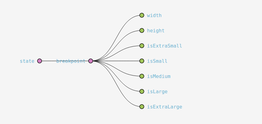
width, isExtraSmall, isSmall, isMedium, isLarge, isExtraLarge. (The breakpoint calculation is same as bootstrap's breakpoint.
Since, store is dispatched for every width change, you have the full flexiblity to have your own breakpoint logic based on the width.
"Why store is dispatched for every width change instead of only breakpoint change ?" - You may ask.
Answer - If we dispatch only for breakpoint change (Small to Medium), we're taking away the flexibility of having our own breakpoint. We consider that every pixel is a breakpoint. That's why we named our action type as 'BREAKPOINT_CHANGE' instead of 'SIZE_CHANGE'.
Features
It uses Debounce logic to avoid unwanted dispatches, in turn it'll avoid unwanted re-rendering.
This library is not only for breakpoint, it also can be used as window resize trigger by enabling dispatchHeight. If any of your components/container has to use resize listener for xxx reason, it's very easy to subscribe to store rather than adding 'resize' listener to window and writing debounce or throttle logic again.
Next steps
- Adding support for server side rendering.