regridder v0.8.2
regridder
Simple React js responsive grid layout system.
Contents
Overview
Regridder allows developers to easily (and simply) create flexible and responsive grid layouts within their React js applications. Regridder makes use of the excellent CSS Grid Layout feature, and uses the same syntaxes for prop values.
Regridder uses the incredible styled-components package to apply the styles required for the grid and grid items, including applying media queries for responsiveness. If you aren't using it yet, give it a look to see if it could help improve your styling experience.
Compatibility
All major browsers, except for Internet Explorer.
https://caniuse.com/#feat=css-grid
Installation
npm
npm i regridder
yarn
yarn add regridder
Install dependencies
Don't forget to install styled-components as well if you're not already using it. The installation of this package is separated so that we can reduce the size of regridder significantly if you happen to be using styled-components already.
npm
npm i styled-components
yarn
yarn add styled-components
Refer to the docs for your version of npm or yarn if you encounter issues installing this package.
API Reference
Be sure to check out the CSS Grid Layout Documentation for various prop syntaxes – in general, camelCased component props should map to a dash-cased css property within that documentation (though not all component props have a css property equivalent).
Grid props
Note that all Grid props are optional.
breakpoints
- Array of strings
- Defines responsive breakpoint width values
- E.g.
['500px', '700px'] - Default value:
['40em', '52em', '64em']
alignItems
- String
- Defines the vertical alignment of items in the grid
- E.g.
'end'
justifyItems
- String
- Defines the horizontal alignment of items in the grid
- E.g.
'center'
gridGap
- String
- Defines the amount of space between grid items (vertically and horizontally)
- E.g.
'1em'
numRows
- Integer
- Defines the number of rows the grid should have (rows are usually added automatically)
- E.g.
4
rowHeight
- String
- Defines the height of the rows
- E.g.
'2em'
fixedRows
- String
- Defines the number of rows, as well as their heights
- E.g.
'2em 1em'or'repeat(4, 1em)' - Note that you may prefer to use fractional heights, using the
frunit (instead ofemin the above examples)
numColumns
- Integer
- Defines the number of columns the grid should have
- E.g.
2
columnWidth
- String
- Defines the width of the columns
- E.g.
'2em'
fixedColumns
- String
- Defines the number of columns, as well as their widths
- E.g.
'2em 1em'or'repeat(4, 1em)' - Note that you may prefer to use fractional widths, using the
frunit (instead ofemin the above examples)
GridItem props
Note that all GridItem props are optional.
rowStart
- Integer
- Defines the row that the item should start at (inclusive)
- E.g.
2 - Note that row counting starts at
1
rowEnd
- Integer
- Defines the row that the item should end at (exclusive)
- E.g.
4
rowSpan
- Integer
- Defines how many rows the item should cover
- E.g.
2
columnStart
- Integer
- Defines the column that the item should start at (inclusive)
- E.g.
2 - Note that column counting starts at
1
columnEnd
- Integer
- Defines the column that the item should end at (exclusive)
- E.g.
4
columnSpan
- Integer
- Defines how many columns the item should cover
- E.g.
2
gridArea
- String
- Defines precisely where the item should be placed in the grid
- E.g.
'1 / 1 / 2 / 3'– this translates to:rowStart: 1,columnStart: 1,rowEnd: 2,columnEnd: 3
Responsiveness
For all Grid and GridItem props, you may provide a single value (as documented above), or an array of values – if you provide an array of values, each value will be used at appropriate responsive breakpoints. For example, if you provide [1, 2, 3] as the value for a prop, 1 will be used below the smallest breakpoint, 2 will be used from the next breakpoint and up, 3 will be used from the next breakpoint and up etc. Also note that if you provide a single value for a prop, that value will be used at all breakpoints.
Examples
Uniform Grid
If you're only interested in defining a simple, uniform layout and don't need to position and manipulate individual items within your grid, then you don't need to use the GridItem component at all, and can pass your own custom components as children to the Grid. For example:
Mobile View:

Desktop View:

import React from "react";
import { Grid } from "regridder";

// This is just to add a border for better visibility of grid items
const itemStyle = { border: "1px solid black" };

const MyUniformLayout = () => (
  <Grid
    numColumns={[2, 3]}
    rowHeight={["2em", "3em"]}
    gridGap="1em"
    style={{ textAlign: "center" }} // this is just for nicer viewing of text
  >
    <div style={itemStyle}>Item 1</div>
    <span style={itemStyle}>Item 2</span>
    <div style={itemStyle}>Item 3</div>
    <span style={itemStyle}>Item 4</span>
  </Grid>
);

export default MyUniformLayout;
Spanning Grid Items Across Rows And Columns
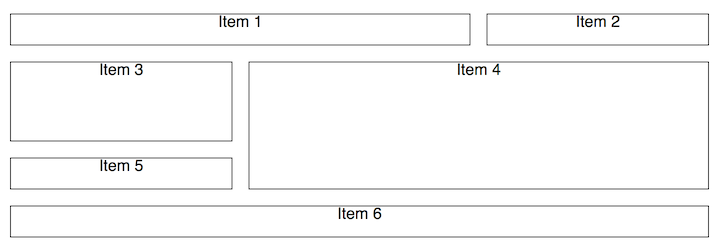
Here we define a grid with 3 columns and add 6 items to the grid, specifying how many rows and columns some of the items should span, while keeping defaults for others. Note that by default, a grid item will span one column and one row.

import React from "react";
import { Grid, GridItem as BaseGridItem } from "regridder";

// This is just to add a border for better visibility of grid items
const GridItem = props => (
  <BaseGridItem style={{ border: "1px solid black" }} {...props} />
);

const MySimpleLayout = () => (
  <Grid
    numColumns={3}
    rowHeight="2em"
    gridGap="1em"
    style={{ textAlign: "center" }} // this is just for nicer viewing of text
  >
    <GridItem columnSpan={2}>Item 1</GridItem>
    <GridItem>Item 2</GridItem>
    <GridItem rowSpan={2}>Item 3</GridItem>
    <GridItem rowSpan={3} columnSpan={2}>
      Item 4
    </GridItem>
    <GridItem>Item 5</GridItem>
    <GridItem columnSpan={3}>Item 6</GridItem>
  </Grid>
);

export default MySimpleLayout;
Responsive Grid
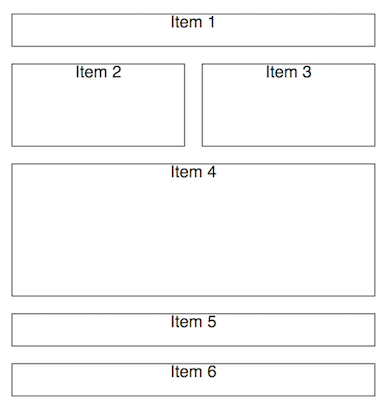
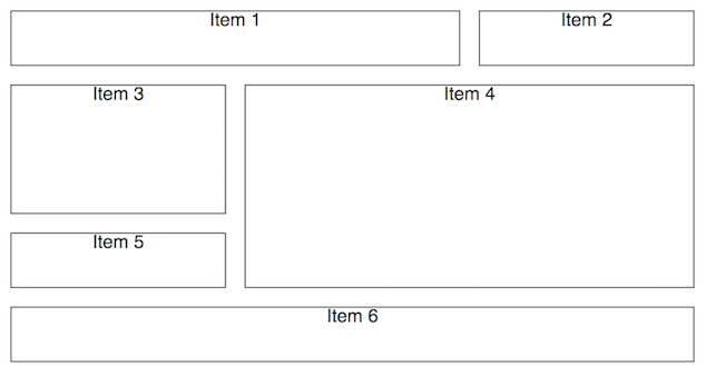
Creating a layout that is responsive to the screen width of a user's device can be achieved by simply providing arrays of values for relevant props in the Grid and/or GridItem components. In the following example, we specify that the number of columns, the row height and the width/height of various grid items should vary respective to the default breakpoints (['40em', '52em', '64em']). Note that you can also provide your own breakpoints to the Grid component, and you can use whichever unit of measurement you'd prefer.
Mobile View:

Desktop View:

import React from "react";
import { Grid, GridItem as BaseGridItem } from "regridder";

// This is just to add a border for better visibility of grid items
const GridItem = props => (
  <BaseGridItem style={{ border: "1px solid black" }} {...props} />
);

const MyResponsiveLayout = () => (
  <Grid
    numColumns={[2, 3]}
    rowHeight={["2em", "3em"]}
    gridGap="1em"
    style={{ textAlign: "center" }} // this is just for nicer viewing of text
  >
    <GridItem columnSpan={2}>Item 1</GridItem>
    <GridItem rowSpan={[2, 1]}>Item 2</GridItem>
    <GridItem rowSpan={2}>Item 3</GridItem>
    <GridItem rowSpan={3} columnSpan={2}>
      Item 4
    </GridItem>
    <GridItem columnSpan={[2, 1]}>Item 5</GridItem>
    <GridItem columnSpan={[2, 3]}>Item 6</GridItem>
  </Grid>
);

export default MyResponsiveLayout;7 years ago
7 years ago
8 years ago
8 years ago
8 years ago
8 years ago
8 years ago
8 years ago
8 years ago
8 years ago
8 years ago
8 years ago
8 years ago
8 years ago
8 years ago
8 years ago
8 years ago
8 years ago
8 years ago
8 years ago
8 years ago
8 years ago
8 years ago
8 years ago
8 years ago
8 years ago
8 years ago
8 years ago
8 years ago
8 years ago
8 years ago