remark-block-containers v1.1.0
English · 中文
This is a remark plugin for creating custom containers that allow the addition of titles, IDs, or style classes.
❓When to use?
If you want to add custom containers in Markdown, such as generating warning, details, danger, or tip boxes.
- Allows customization of tag types
- Allows adding IDs or style classes
- Allows customization of tag titles
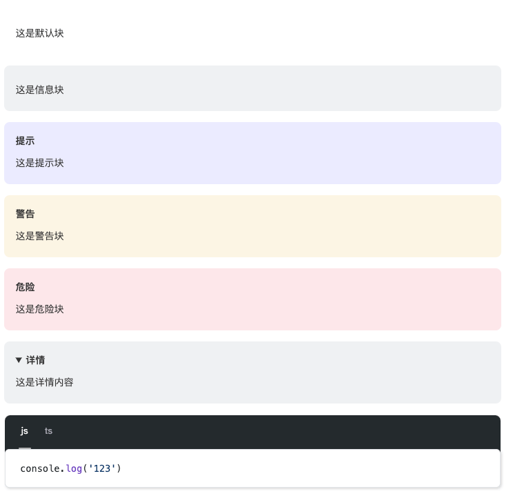
- Built-in shortcuts for info, tip, warning, danger, details, code-group, etc.
📦 Installation
This package only works with ESM. Node.js version 14.14+
npm install remark-block-containersor
yarn add remark-block-containersor
pnpm add remark-block-containers📄 Usage
::: [type][{id|class}] [title]
Suppose you have the following Markdown file, example.md, which contains a flexible container of type "tip".
Note: Each container must start and end with three colons, and there must be a blank line between two adjacent containers.
<!-- Must have a blank line -->
::: tip 提示
这是一条提示。
:::
<!-- Must have a blank line -->
And you have an example.js file that includes:
import { unified } from 'unified'
import { read } from 'to-vfile'
import remarkParse from 'remark-parse'
import remarkRehype from 'remark-rehype'
import rehypeStringify from 'rehype-stringify'
import rehypeFormat from 'rehype-format'
import remarkBlockContainers from 'remark-block-containers'

const file = await unified()
  .use(remarkParse)
  .use(remarkBlockContainers)
  .use(remarkRehype)
  .use(rehypeFormat)
  .use(rehypeStringify)
  .process(await read('example.md'))

console.log(String(file))
Running node example.js will produce the following output👇
<div class="block-default tip">
  <p class="block-title">提示</p>
  <p>这是一条提示。</p>
</div>
info、tip、warning、danger、details、code-groupare built-in shortcuts and are equivalent to::: p{.tip}。If you want to add a custom ID, use
::: p{#id}.Therefore, it is allowed to customize any container as long as the
typeis a valid tag type, such asdiv,main,span, etc.
Optional Styles
By default, all containers have no style, so you can set container styles yourself or use preset styles:
// 引入预设样式表
import 'remark-block-containers/css'
Code Group
When using code-group, simply referencing this plugin is not enough to implement the switching logic. It requires importing useCodeGroups.js at the appropriate location and executing the useCodeGroups method to listen for code group tab clicks and implement the switching logic.
import { useCodeGroups } from 'remark-block-containers/useCodeGroups'
useCodeGroups()
❗ Important Notes
Currently, there is an issue where a container with no content is mistakenly interpreted as a non-container, so it is best to avoid this practice.
:::
:::
⚙️ Options
All options are optional.
use(remarkBlockContainers, {
  containerClass: 'block-default', // Default container style class
  containerType: 'div', // Container tag type, only affects shortcuts.
  titleType: 'p', // Title tag type
  titleClass: 'block-title', // Default title style class
})
You can also use the default options directly
use(remarkBlockContainers)

