


remark-github-blockquote-alert


Remark plugin to add support for GitHub Alert
Alerts are a Markdown extension based on the blockquote syntax that you can use to emphasize critical information.
Installation
This package is ESM only: Node 12+ is needed to use it and it must be import instead of require.
npm install remark-github-blockquote-alertUsage
import { remarkAlert } from 'remark-github-blockquote-alert'

let markdown = `# Alert \n> [!NOTE] \n> test`;
const htmlStr = remark()
    .use(remarkParse)
    .use(remarkAlert)
    .use(remarkRehype)
    .use(rehypeStringify)
    .processSync(markdown).toString()
The output HTML will be:
<h1>Alert</h1>
<div class="markdown-alert markdown-alert-note" dir="auto">
<p class="markdown-alert-title" dir="auto"><svg class="octicon" viewBox="0 0 16 16" width="16" height="16" aria-hidden="true"><path d="M0 8a8 8 0 1 1 16 0A8 8 0 0 1 0 8Zm8-6.5a6.5 6.5 0 1 0 0 13 6.5 6.5 0 0 0 0-13ZM6.5 7.75A.75.75 0 0 1 7.25 7h1a.75.75 0 0 1 .75.75v2.75h.25a.75.75 0 0 1 0 1.5h-2a.75.75 0 0 1 0-1.5h.25v-2h-.25a.75.75 0 0 1-.75-.75ZM8 6a1 1 0 1 1 0-2 1 1 0 0 1 0 2Z"></path></svg>NOTE</p>
<p>Useful information that users should know, even when skimming content.</p>
</div>
Modify the title
Change the expression [!NOTE] to [!NOTE/笔记]
let markdown = `# Alert \n> [!NOTE/笔记] \n> test`;

const htmlStr = remark()
    .use(remarkParse)
    .use(remarkAlert, { legacyTitle: true })
    .use(remarkRehype)
    .use(rehypeStringify)
    .processSync(markdown).toString()
The output HTML will be:
<h1>笔记</h1>
<div class="markdown-alert markdown-alert-note" dir="auto">
<p class="markdown-alert-title" dir="auto"><svg class="octicon" viewBox="0 0 16 16" width="16" height="16" aria-hidden="true"><path d="M0 8a8 8 0 1 1 16 0A8 8 0 0 1 0 8Zm8-6.5a6.5 6.5 0 1 0 0 13 6.5 6.5 0 0 0 0-13ZM6.5 7.75A.75.75 0 0 1 7.25 7h1a.75.75 0 0 1 .75.75v2.75h.25a.75.75 0 0 1 0 1.5h-2a.75.75 0 0 1 0-1.5h.25v-2h-.25a.75.75 0 0 1-.75-.75ZM8 6a1 1 0 1 1 0-2 1 1 0 0 1 0 2Z"></path></svg>NOTE</p>
<p>Useful information that users should know, even when skimming content.</p>
</div>
Wrap tag name with container
let markdown = `> [!CAUTION] \n> Hello World`;
const htmlStr = remark()
  .use(remarkParse)
  .use(remarkAlert, { tagName: "blockquote" })
  .use(remarkRehype)
  .use(rehypeStringify)
  .processSync(markdown).toString()
The output HTML will be:
<blockquote class="markdown-alert markdown-alert-caution" dir="auto">
<p class="markdown-alert-title" dir="auto"><svg class="octicon" viewBox="0 0 16 16" width="16" height="16" aria-hidden="true"><path d="M4.47.22A.749.749 0 0 1 5 0h6c.199 0 .389.079.53.22l4.25 4.25c.141.14.22.331.22.53v6a.749.749 0 0 1-.22.53l-4.25 4.25A.749.749 0 0 1 11 16H5a.749.749 0 0 1-.53-.22L.22 11.53A.749.749 0 0 1 0 11V5c0-.199.079-.389.22-.53Zm.84 1.28L1.5 5.31v5.38l3.81 3.81h5.38l3.81-3.81V5.31L10.69 1.5ZM8 4a.75.75 0 0 1 .75.75v3.5a.75.75 0 0 1-1.5 0v-3.5A.75.75 0 0 1 8 4Zm0 8a1 1 0 1 1 0-2 1 1 0 0 1 0 2Z"></path></svg>CAUTION</p>
<p>Hello World</p>
</blockquote>
Styling
You can mimic GitHub's alert style by adding the styles provided in the npm package to your CSS.
import 'remark-github-blockquote-alert/alert.css'Or, add the following styles to your CSS to mimic GitHub's alert style:
@media (prefers-color-scheme: dark) {
.markdown-alert {
--color-border-default: #30363d;
--color-accent-fg: #58a6ff;
--color-accent-emphasis: #1f6feb;
--color-danger-fg: #f85149;
--color-danger-emphasis: #da3633;
--color-attention-fg: #d29922;
--color-attention-emphasis: #9e6a03;
--color-done-fg: #a371f7;
--color-done-emphasis: #8957e5;
--color-success-fg: #3fb950;
--color-success-emphasis: #238636;
}
}
@media (prefers-color-scheme: light) {
.markdown-alert {
--color-border-default: #d0d7de;
--color-accent-fg: #0969da;
--color-accent-emphasis: #0969da;
--color-danger-fg: #d1242f;
--color-danger-emphasis: #cf222e;
--color-attention-fg: #9a6700;
--color-attention-emphasis: #9a6700;
--color-done-fg: #8250df;
--color-done-emphasis: #8250df;
--color-success-fg: #1a7f37;
--color-success-emphasis: #1f883d;
}
}
.markdown-alert {
border-left: .25em solid var(--borderColor-default, var(--color-border-default));
color: inherit;
margin-bottom: 16px;
padding: .5rem 1em
}
.markdown-alert>:last-child {
margin-bottom: 0!important
}
.markdown-alert .markdown-alert-title {
align-items: center;
display: flex;
font-size: 14px;
font-weight: 500;
line-height: 1
}
.markdown-alert .markdown-alert-title svg.octicon {
margin-right: 8px!important;
margin-right: var(--base-size-8,8px) !important;
fill: currentColor;
}
.markdown-alert.markdown-alert-note {
border-left-color: var(--borderColor-accent-emphasis,var(--color-accent-emphasis))
}
.markdown-alert.markdown-alert-note .markdown-alert-title {
color: var(--color-accent-fg);
color: var(--fgColor-accent,var(--color-accent-fg))
}
.markdown-alert.markdown-alert-tip {
border-left-color: var(--borderColor-success-emphasis,var(--color-success-emphasis))
}
.markdown-alert.markdown-alert-tip .markdown-alert-title {
color: var(--color-success-fg);
color: var(--fgColor-success,var(--color-success-fg))
}
.markdown-alert.markdown-alert-important {
border-left-color: var(--borderColor-done-emphasis,var(--color-done-emphasis))
}
.markdown-alert.markdown-alert-important .markdown-alert-title {
color: var(--color-done-fg);
color: var(--fgColor-done,var(--color-done-fg))
}
.markdown-alert.markdown-alert-warning {
border-left-color: var(--borderColor-attention-emphasis,var(--color-attention-emphasis))
}
.markdown-alert.markdown-alert-warning .markdown-alert-title {
color: var(--color-attention-fg);
color: var(--fgColor-attention,var(--color-attention-fg))
}
.markdown-alert.markdown-alert-caution {
border-left-color: var(--borderColor-danger-emphasis,var(--color-danger-emphasis))
}
.markdown-alert.markdown-alert-caution .markdown-alert-title {
color: var(--color-danger-fg);
color: var(--fgColor-danger,var(--color-danger-fg))
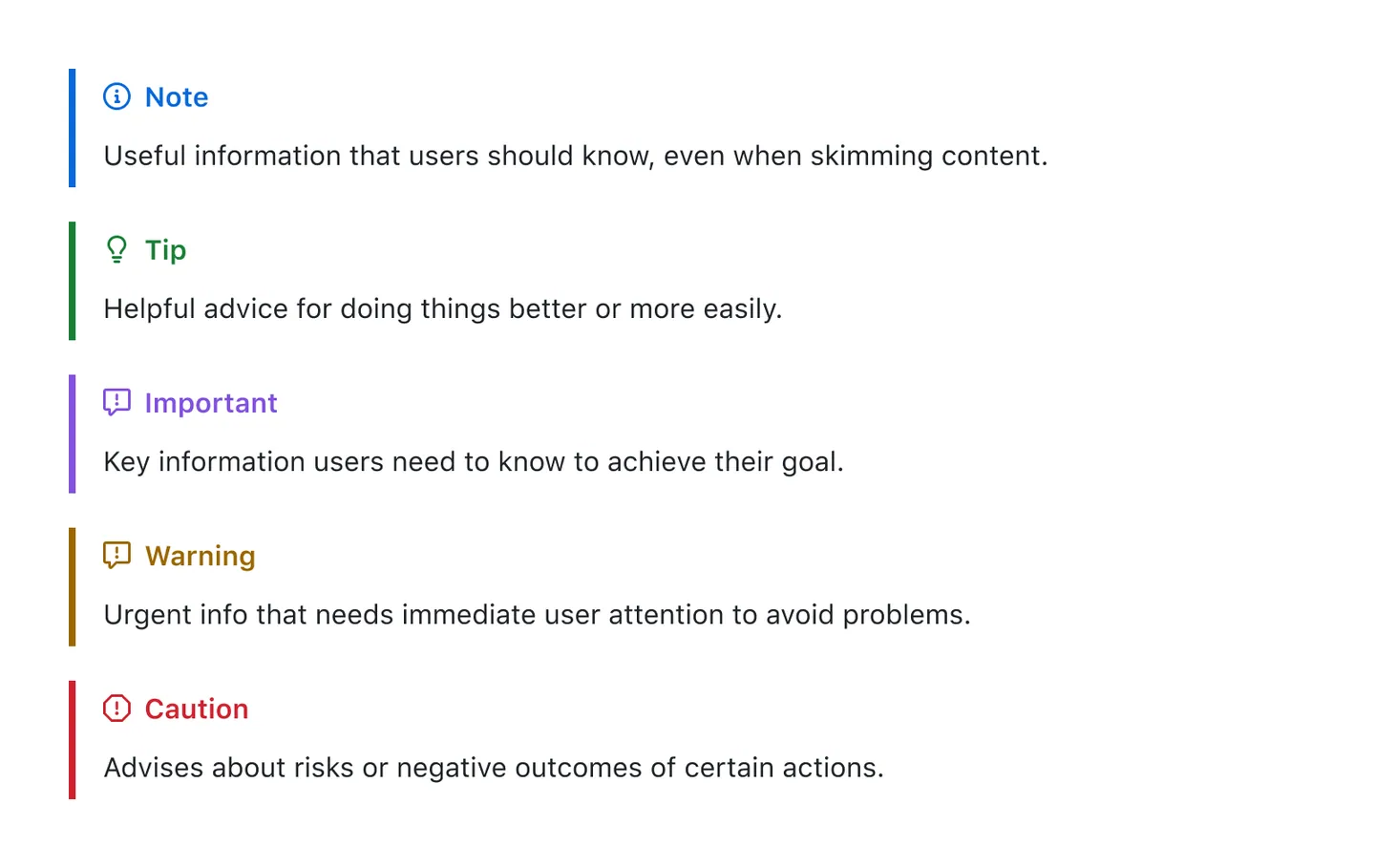
}Currently 5 types of alerts are supported:
To add an alert, use a special blockquote line specifying the alert type, followed by the alert information in a standard blockquote. Five types of alerts are available:
> [!NOTE]
> Useful information that users should know, even when skimming content.

> [!TIP]
> Helpful advice for doing things better or more easily.

> [!IMPORTANT]
> Key information users need to know to achieve their goal.

> [!WARNING]
> Urgent info that needs immediate user attention to avoid problems.

> [!CAUTION]
> Advises about risks or negative outcomes of certain actions.
Here are the rendered alerts:
Useful information that users should know, even when skimming content.
Helpful advice for doing things better or more easily.
Key information users need to know to achieve their goal.
Urgent info that needs immediate user attention to avoid problems.
Advises about risks or negative outcomes of certain actions.
Related
rehype-rewriteRewrite element with rehype.rehype-videoAdd improved video syntax: links to.mp4and.movturn into videos.rehype-attrNew syntax to add attributes to Markdown.rehype-ignoreIgnore content display via HTML comments, Shown in GitHub readme, excluded in HTML.
Contributors
As always, thanks to our amazing contributors!

Made with contributors.
License
MIT Kenny Wong