resizer-box v1.1.6
resizer-box

resizer-box is a web component that helps you resize any HTML element in any direction you want.
Tech Stack
This is a web component written in vanilla js without any external dependencies. Being a web component it is compatible with all the existing frameworks (React, Angular, Vue etc.) and with all browsers.
Demo
You can test it here: demo
Install
Import in Browser ( Recommend )
Use the script tag and the src from unpkg with the latest version. Being a web component, once you add the script it will be automatically created and you can start using it.
<script type="module" src="https://unpkg.com/resizer-box@latest/lib/resizer-box.min.js"></script>Usage
<resizer-box
    width="300px"
    height="200px"
    resize-right
>
    <div class="myBox" slot="content">
        <img src="./assets/demo-img.jpg" alt="demo-img" width="400" height="400">
        <h1>Test 123</h1>
        <p>Lorem Ipsum is simply dummy text of the printing and typesetting industry. </p>
    </div>
</resizer-box>
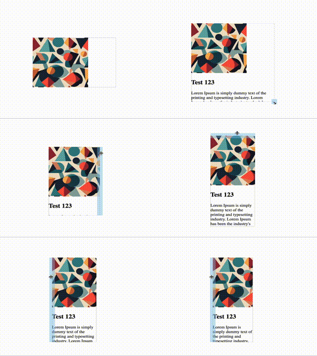
In the example above the resize-box component wraps the div#myBox so that we can resize the div#myBox. An important aspect is to add slot="content" attribute for the element that you want to resize.
Attributes
| Attribute | Mandatory | Description | Value |
|---|---|---|---|
| width | true | The initial width of the element | px - eg. 200px |
| height | true | The initial height of the element | px - eg. 200px |
| resize-right | false | The possibility to resize starting from the right | boolean - true/false |
| resize-left | false | The possibility to resize starting from the left | boolean - true/false |
| resize-bottom | false | The possibility to resize starting from the bottom | boolean - true/false |
| resize-top | false | The possibility to resize starting from the top | boolean - true/false |
| resize-bottom-right | false | The possibility to resize starting from the bottom right | boolean - true/false |
| resize-bottom-left | false | The possibility to resize starting from the bottom left | boolean - true/false |
| resize-top-left | false | The possibility to resize starting from the top left | boolean - true/false |
| resize-top-right | false | The possibility to resize starting from the top right | boolean - true/false |
| max-width | false | The max width to which an element can be resized | px - eg. 200px |
| min-width | false | The min width to which an element can be resized | px - eg. 200px |
| max-height | false | The max height to which an element can be resized | px - eg. 200px |
| min-height | false | The min height to which an element can be resized | px - eg. 200px |
Events
The component dispatches the resize event with the new width and height of the HTML element based on the user interaction.
const resizeBox = document.querySelector("resizer-box");

resizeBox.addEventListener("resize", (e) => {
  const { width, height } = e.detail;
  ...
});
Styling

By default all the handles come with a default width and color on hover.
You can style all the handles by using the CSS ::part pseudo-element.

resizer-box::part(handle):hover {
  background-color: blueviolet;
}

resizer-box::part(handle-bottom):hover {
  background-color: green;
}

resizer-box::part(handle-bottom-left):hover {
  background-color: red;
}
The parts that are exposed for styling are:
- handle (apply to all the handles)
- handle-right
- handle-left
- handle-top
- handle-bottom
- handle-bottom-right
- handle-bottom-left
- handle-top-left
- handle-top-right