rm-react-popover v0.2.3

Why this positioning library?
Many positioning libraries in an effort to be simple assume static positioning and have no sense of the container they get appended to (often the document's body).
I wanted to build a positioning component that could handle relative and absolute positioned containers, could scroll with its container, could be used as a general-purpose positioning mechanism, and was dead-simple to use.
If you like the way the library has been written, or find it useful in your own project don't forget to star it!
Installation
yarn
yarn add rm-react-popovernpm
npm install rm-react-popover --saveUsage
import React, { Component } from "react"
import Popover from "rm-react-popover"

//Then, inside of your components render method
class Example extends Component {
    render() {
        return (
                <Popover
                    //Some HTML element to place the markup in
                    parent={this.container}
                    //some HTML element to stick the menu to
                    element={this.element}
                     //Can be a string, or an array of string like ["left", "top"]. Possible values are auto, left, right, top, bottom, element_left, element_right
                     //element_left and element_right align the left or right edge of your menu to the left or right edge of an element
                    placement="auto"
                    //When open is true, the markup is visible, when false it's invisible (but still in the DOM)
                    open={false}
                    //The top_cushion will add additional vertical space between your element
                    //and the element it sticks to. This is useful for things like pseudo
                    //elements used as triangle pointers.
                    top_cushion={10}
                    //left_cushion is just like top_cushion. It adds additional horizontal space between
                    //your popover/tooltip and the element you're sticking it to
                    left_cushion={-50}
                    //classes allows you to pass in a string or array of strings that will be applied
                    //as class names to the markup. rm-react-popover applies classes internally to
                    //keep track of which positions were applied, but the classes prop will always
                    //come before the internal classes
                    classes={["custom", "css-classes"]}
                >
                    <span>I was called with placement="auto"</span>
                </Popover>
        )
    }
}
rm-react-tooltip does not come with any css applied out of the box. This is intentional as this is intended to be a general-purpose positioning library that can accept arbitrary markup as children of the component.
I have an example of what the styling of a tooltip might look like in the src folder, and it's also the stylesheet used in the example folder.
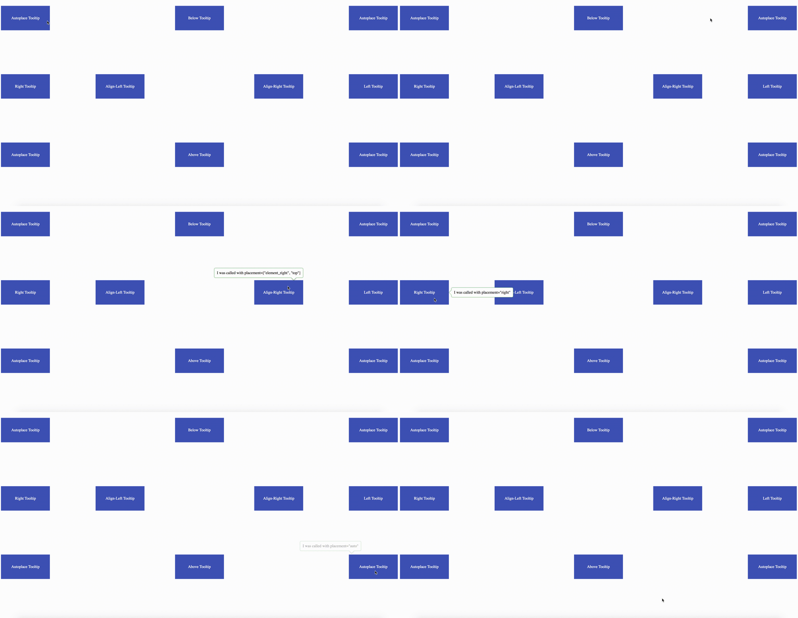
Every placement option has a corollary css class that gets applied, so that you can intelligently style your component based on its position. That mapping looks like this.
top            = TooltipAbove
bottom         = TooltipBelow
right          = TooltipRight
left           = TooltipLeft
element_right  = TooltipAlignRight
element_left   = TooltipAlignLeft
auto           = autoplace
Props
It may be helpful to look at the flow type definition for the component's props
type Props = {
    element         : HTMLElement,
    parent          : HTMLElement,
    placement       : string | Array<string>,
    open            : boolean,
    classes         : ?string | ?Array<string>,
    left_cushion    : ?number,
    top_cushion     : ?number,
    children        : Array<Element>
}
Dependencies
For obvious reasons:
- React
- React DOM