1.0.4 • Published 8 years ago
rn-animated-tabs v1.0.4
rn-animated-tabs
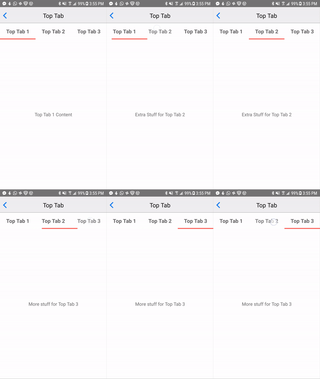
A react native animated tab bar
Installation
npm i rn-animated-tabs -SDemo
Make sure to check out the full working demo for more usage. It shows how to customize and align the tabbar in different positions.
Running the Demo
cd examplenpm i && react-native run-[android|ios]
Examples
You can check out the docs folder for more gifs/screenshots

Code Example
import React, { Component } from 'react';
import { StyleSheet, View, Text } from 'react-native';
import RNAnimatedTabs from 'rn-animated-tabs';
const DATA = ['Top Tab 1 Content', 'Extra Stuff for Top Tab 2', 'More stuff for Top Tab 3'];

export default class TabTop extends Component {
  constructor(props) {
    super(props);
    this.state = {
      currentTab: 0
    }
  }

  handleTabChange = (value) => this.setState({ currentTab: value });

  render() {
    return (
	  <View style={styles.container}>
	    <RNAnimatedTabs
	      tabTitles={['Top Tab 1', 'Top Tab 2', 'Top Tab 3']}
	      onChangeTab={this.handleTabChange} />
	     <View style={[styles.container, styles.center]}>
	       <Text>
	         {DATA[this.state.currentTab]}
	       </Text>
	     </View>
     </View>
    );
  }
}

const styles = StyleSheet.create({
  container: {
    flex: 1
  },
  center: {
    justifyContent: 'center',
    alignItems: 'center'
  }
});
API
| Name | Type | Default | Required | Description |
|---|---|---|---|---|
| tabTitles | Array | None | ✓ | The text |
| onChangeTab | Function | None | ✓ | Callback function that gets triggered when the tab button onPress is fired. It's called with the index as an arg |
| initialActiveTabIndex | Number | 0 | Determines what tab gets marked active on mount | |
| top | Boolean | false | Determines whether the active tab indicator should be rendered on top or below the component. Useful in order to position the tabbar at the top or bottom of a view. | |
| height | Number | 60 | The height of the tab container | |
| currentTab | Number | null | Useful if you want a controlled component where you determine what tab is pressed manually. See demo for example use case | |
| containerStyle | Object | {} | Allow to override the style of the tab view container | |
| tabButtonStyle | Object | {} | Allow to override the style of each button in the tab view | |
| tabTextStyle | Object | {} | If renderTabContent is not specified, then allow to override the default content view | |
| renderTabContent | Function | None | Overrides the default behaviour of displaying each title. Use if you want more fine-grain control over customizing the tabs. Get's called with the title and index as args. See demo for more details | |
| activeTabOpacity | Number | 0.8 | The active opacity of the tab button TouchableOpacity | |
| activeTabIndicatorHeight | Number | 3 | The height of the animated indicator for each active tab | |
| activeTabIndicatorColor | String | #FE5F55 | The color of the animated indicator for each active tab |
Contributions
Contributions are welcome. I'll be happy to merge any PR's.