rn-draggable-modal v1.0.3
rn-draggable-modal
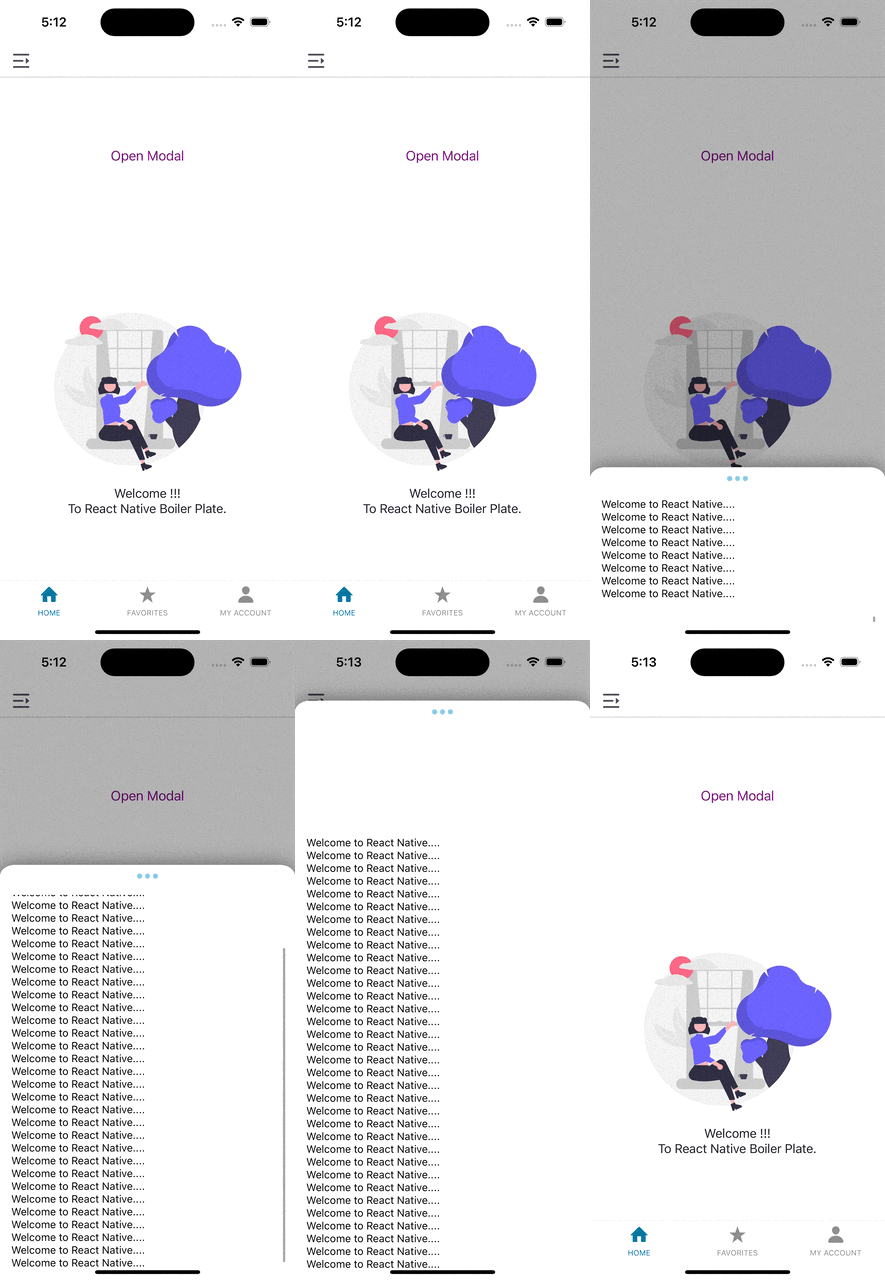
rn-draggable-modal is a tiny Javascript library which provides an elegant UI for the end user to use customize modal. It also features a carefully crafted flow to handle edge cases for volatile user gestures. We provide default UI, but you can always customize the appearance as you like.
Sample

Installation
npm install --save rn-draggable-modal
or
yarn add rn-draggable-modal
PeerDependencies
NOTES:
This packgae will support react@^17.0.0, react@^18.0.0,react-native@^0.68.0,react-native@^0.69.0,react-native@^0.70.0,react-native@^0.71.0,react-native@^0.72.0, react-native@^0.73.0, react-native@^0.75.0. Make sure you have install respective viersion.
npm install --save react@18.2.0 react-native@latest
or
yarn add react@17.0.0 react-native@latest
Basic Usage
import DraggableModal from 'rn-draggable-modal';

...
const [isHalfModalVisible, setHalfModalVisible] = useState(false);
...
      <DraggableModal
        modalVisible={isHalfModalVisible}
        setModalVisible={setHalfModalVisible}
        dragIconName="dots"
        modalInitialHeight={200}
        dragIconColor="skyblue"
        children={
          <ScrollView
            contentContainerStyle={{
              flexGrow: 1,
              paddingHorizontal: 5,
            }}>
            <Text>Welcome to React Native....</Text>
          </ScrollView>
        }
      />
More Advanced Usage
import DraggableModal from 'rn-draggable-modal';

...
const [isHalfModalVisible, setHalfModalVisible] = useState(false);
...
    <DraggableModal
        modalVisible={isHalfModalVisible}
        setModalVisible={setHalfModalVisible}
        dragIconName="dots"
        modalWidth="80%"
        modalInitialHeight={200}
        hasDraggable={false}
        dragIconColor="skyblue"
        numberOfDots={5}
        hasDraggableIcon={false}
         dragIconStyle={{    //dots style
           backgroundColor: 'green',
           width: 8,
           height: 8,
           borderRadius: 4,
           marginHorizontal: 3,
         }}
       children={
          <ScrollView
            contentContainerStyle={{
              flexGrow: 1,
              paddingHorizontal: 5,
            }}>
            <Text>Welcome to React Native....</Text>
          </ScrollView>
        }
      />
Parameters
| Parameter | Required | Type | Default | Description |
|---|---|---|---|---|
| modalVisible | Yes | Boolean | false | The visible prop determines whether your modal is visible.. |
| setModalVisible | No | Function | ()=>{} | This callback is called when user taps outside of a Modal. |
| dragIconName | No | String | bar | dragIconName can be bar or dots. |
| modalWidth | No | String | 100% | Width of modal in percentage. |
| modalInitialHeight | No | String | 50% of screen | Height of modal at inital render. |
| hasDraggable | No | Boolean | true | Enable draggable feature for modal. |
| dragIconColor | No | String | #A3A3A3 | Change dragIcon Color of modal . |
| numberOfDots | No | Number | 3 | Change number of dots in modal. |
| hasDraggableIcon | No | String | true | Enable draggable feature for draggable Icon. |
| dragIconStyle | No | String | {{width: 40,height: 6,borderRadius: 3,}} | Change the style of the dragIcon. |
| children | yes | Component | <ScrollView contentContainerStyle={{flexGrow: 1}}><Text>This is half modal</Text></ScrollView> | To render child component within modal. |
Contributing
Pull requests are always welcome! Feel free to open a new GitHub issue for any changes that can be made.
Author
License
MIT