0.0.13 • Published 5 years ago
rn-dropdown-picker v0.0.13
Simple dropdown picker for react-native

Caution
The package is under development, do not use it for production.
Description
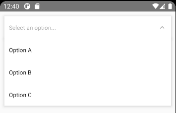
A simple searchable dropdown component for react-native. Components that I used had bugs when I tried to click on an option so I decided to create this component which uses absolute positioning to render the dropdown menu.
Usage
You have to insert <DropdownProvider /> in the top of your component hierarchy (e.g. <App />). Make sure there is no parent view up in the hierarchy so the dropdown can render itself relative to the app window. Specify the <DropdownExit /> component, this will render the dropdown menu.
Your App.tsx should look like this:
<DropdownProvider>
  // Other components...
  <DropdownExit />
</DropdownProvider>
Props
| Name | Description | Type | Default | Required |
|---|---|---|---|---|
options | The options for the component. | Option[] | [] | No |
onOptionClicked | This callback fires when you select an option from the dropdown list | (option: Option) => any | No | |
placeholder | Default text to be shown to the user when no option is selected. | string | 'Select an option' | No |
searchable | Set this to true to enable searching among options in the dropdown menu. | boolean | false | No |
searchablePlaceholder | Default text to be shown in the search input. | string | 'Search for an item' | No |
onSearch | This callback is called when user types into the search input. You have handle option filtering for yourself if you pass this. | (text: string) => any | No | |
searchPlaheolderTextColor | Color of the placeholder inside the search input. | string | ? | No |
showIndicatorIcon | Wether it should render indicator icon on the right to show dropdown state or not. | boolean | true | No |
indicatorIcon | A render prop to render custom indicator icon on the left. | (isOpen: boolean) => JSX.Element | No | |
leftIconForSelected | A render prop to render an icon on the left of the selected option. | () => JSX.Element | No | |
dropdownContainerStyle | Custom style for the container view of the dropdown menu. | StyleProp<ViewStyle> | No | |
selectedContainerStyle | Custom style for the <View /> that renders the selected option | StyleProp<ViewStyle> | No | |
openSelectedContainerStyle | Additional custom style for the <View /> that renders the selected option when the dropdown is open. | StyleProp<ViewStyle> | No |