1.0.4 • Published 8 months ago
rn-skeleton-loading v1.0.4
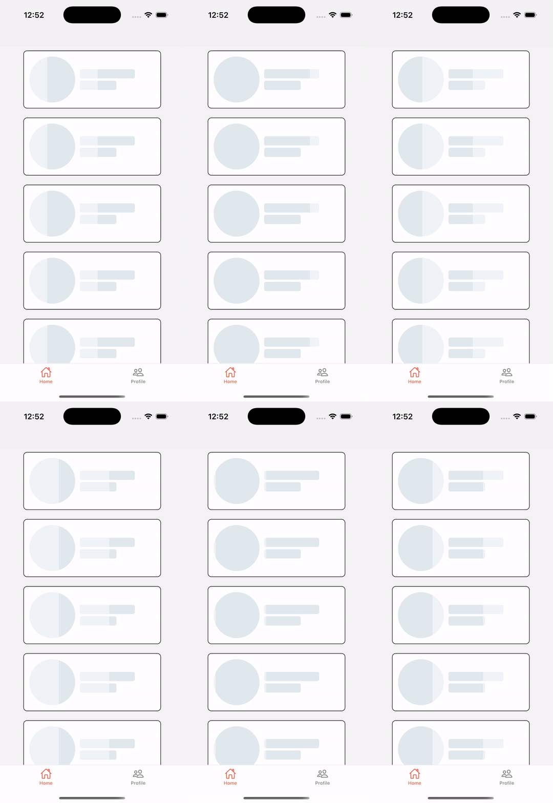
🎬 Demo

🦴 rn-skeleton-loading
A lightweight, customizable, and fast skeleton loading component for React Native.
🔥 Supports shimmer animation & fully customizable UI elements.

🚀 Installation
You can install it using npm or yarn:
npm install rn-skeleton-loadingor
yarn add rn-skeleton-loading🔥 Usage
Here is a basic usage example:
import { Skeleton } from "rn-skeleton-loading";
import { View } from "react-native";

export default function App() {
  return (
    <View style={{ padding: 20 }}>
      <Skeleton width="90%" height={20} />
      <Skeleton width="80%" height={20} />
      <Skeleton width={60} height={60} borderRadius={30} />
    </View>
  );
}
🎨 Customization
You can customize the skeleton UI by passing props.
| Prop | Type | Default | Description |
|---|---|---|---|
width | string / number | "100%" | Width of the skeleton |
height | number | 20 | Height of the skeleton |
borderRadius | number | 4 | Border radius |
color | string | "#E0E0E0" | Base color of the skeleton |
highlightColor | string | "#F5F5F5" | Shimmer effect color |
duration | number | 1000 | Duration of shimmer animation in ms |
🌟 Advanced Example (With Custom Props)
import { Skeleton } from "rn-skeleton-loading";
import { View } from "react-native";

export default function ProfileSkeleton() {
  return (
    <View style={{ padding: 20 }}>
      <Skeleton width={100} height={100} borderRadius={50} color="#ccc" />
      <Skeleton width="80%" height={15} style={{ marginTop: 10 }} />
      <Skeleton width="60%" height={15} style={{ marginTop: 5 }} />
    </View>
  );
}
✅ Features
✔ Lightweight & Fast
✔ Customizable Width, Height, Colors, Border Radius
✔ Works on both iOS & Android
✔ Supports shimmer animation
✔ Perfect for loading states in lists, cards, and avatars
🤝 Contributing
Pull requests are welcome! If you find a bug or have a feature request, please open an issue. 🚀
📜 License
MIT License – You are free to use, modify, and distribute this package!
🎉 💡 Happy Coding 🚀😊 😎
