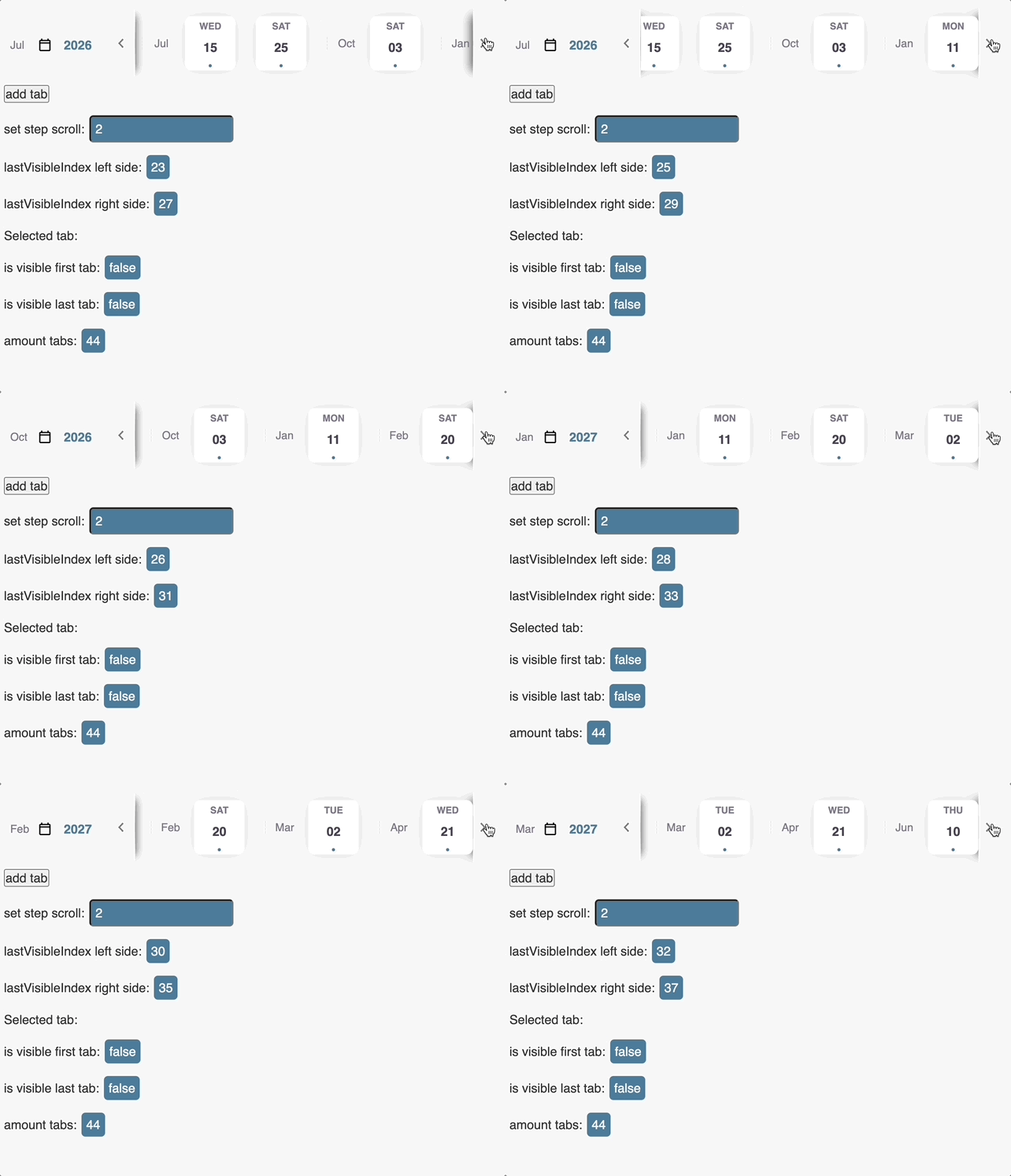
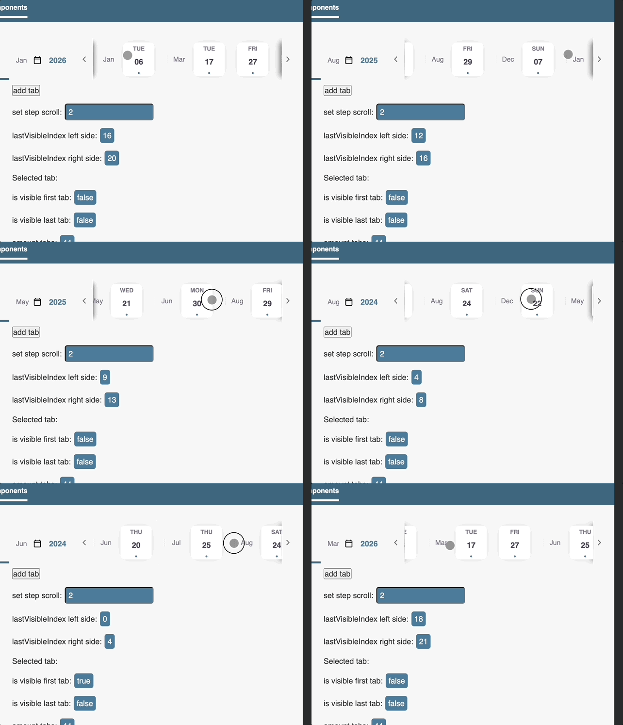
1.1.1 • Published 3 years ago
rt-tab-carousel v1.1.1
RT-TAB-CAROUSEL


Install
yarn add rt-tab-carouselor
npm install rt-tab-carouselrtCarouselContainer
Use for a ready-made container in which all the items lie
| Option | Default | Type | Description |
|---|---|---|---|
| scrollStep | 1 | Input | |
| uuidCarousel *required | null | Input | This is a required property that indicates ownership and creates relationships between controls, containers, and items |
| activeClass | null | Input | Apply class for styling for the last selected tab |
| antiBounce | 5 | Input | Anti bounce for scrolling |
IMPORTANT USE trackBy for *ngFor
rtCarouselTab
| Option | Default | Type | Description |
|---|---|---|---|
| disabledTab | false | Input | |
| uuidCarousel | null *required | Input | This is a required property that indicates ownership and creates relationships between controls, containers, and items. Please, take note, that applying the same UUID to the different carousels will cause a specific behavior: the service will treat them as the same item that will cause arrows to appear on every navigation no matter the real content visibility |
rtCarouselNextButton
rtCarouselPreviousButton
| Option | Default | Type | Description |
|---|---|---|---|
| activeClass | false | Input | Applies the given class to the active item |
| uuidCarousel | null *required | Input | This is a required property that indicates ownership and creates relationships between controls, containers, and items |
| autoHide | true | Input | If the content is placed in the container, the button will disappear automatically |
| buttonHidden | Output | boolean |
Button components
<rt-carousel-previous-button></rt-carousel-previous-button>
<rt-carousel-next-button></rt-carousel-next-button>| Option | Default | Type | Description |
|---|---|---|---|
| uuidCarousel | null *required | Input | This is a required property that indicates ownership and creates relationships between controls, containers, and items |
| autoHide | true | Input | If the content is placed in the container, the button will disappear automatically |
Service
RtCarouselService
| Option | Input | Output |
|---|---|---|
| setScrollStep(string, number) | uuidCarousel, value | void |
| previousPart(string) | uuidCarousel | void |
| nextPart(string) | uuidCarousel | void |
| selectedTab(string) | uuidCarousel | Observable\ |
| selectTab(string) | uuidCarousel | void |
| lastVisibleIndex(string) | uuidCarousel | Observable\ |
| lastVisibleIndexEnd(string) | uuidCarousel | Observable\ |
| isLastTabVisible(string) | uuidCarousel | Observable\ |
| isFirstTabVisible(string) | uuidCarousel | Observable\ |
Usages Directive
rt-carousel-directive-example.ts
import {ChangeDetectionStrategy, Component} from '@angular/core';

@Component({
  selector: 'rt-tab-carousel-directive-example',
  templateUrl: './rt-tab-carousel-root.component.html',
  styleUrls: ['./rt-tab-carousel-root.component.scss'],
  changeDetection: ChangeDetectionStrategy.OnPush
})
export class RtCarouselRootComponent {
  disableTab = false;
  selectedTabIndex: number;

  selectedTab(index: number): void {
    this.selectedTabIndex = index;
  }
}
rt-carousel-directive-example.html
<div class="rt-carousel-directive-example">

  <div
    rtCarouselPreviousButton
    [uuidCarousel]="'first-carousel'"
    [activeClass]="'rt-carousel__shadow-left-array'"
    class="rt-carousel__next-part"
  >
    <img ngSrc="/assets/images/icons/icn_chevron-left.svg" alt="" height="24" width="24">
  </div>

  <nav
    rtCarouselContainer
    [uuidCarousel]="'first-carousel'"
    [scrollStep]="4"
  >

    <div
      *ngFor="let tab of [].constructor(50); let index=index; trackBy: trackByFn"
      class="tab"
      [ngClass]="{'tab__active': selectedTabIndex === index}"
      rtCarouselTab
      [uuidCarousel]="'first-carousel'"
      [disabledTab]="disableTab"
    >
      First {{index + 1}}
    </div>

  </nav>


  <div
    rtCarouselNextButton
    [uuidCarousel]="'first-carousel'"
    [activeClass]="'rt-carousel__shadow-right-array'"
    class="rt-carousel__next-part"
  >
    <img ngSrc="/assets/images/icons/icn_chevron-right.svg" alt="" height="24" width="24">
  </div>

</div>
Note that you can also use ready-made button components
<rt-carousel-previous-button uuidCarousel="carousel-text-book"></rt-carousel-previous-button>
<rt-carousel-next-button uuidCarousel="carousel-text-book"></rt-carousel-next-button>
rt-carousel-directive-example.scss
.rt-carousel-example {
  display: flex;
  flex-direction: column;
  margin: 20px;
}

.rt-carousel-directive-example {
  display: flex;
  align-items: center;
  height: 100px;
  margin: 20px;
}

.tab {
  padding: 10px;
}

.tab__active {
  border-bottom: #6a88d9 solid 2px;
}

.rt-carousel-tab__disabled {
  opacity: .6;
  pointer-events: none;
}

.rt-carousel__next-part {
  cursor: pointer;
  width: 24px;
  align-items: center;
  display: flex;
  z-index: 1;
  transition: box-shadow .3s;
}

.rt-carousel__shadow-left-array {
  box-shadow: 10px 0 10px -10px #000000b5;
  border-right: solid 0.3px;
  border-image: linear-gradient(to bottom, transparent, #0e0e0e, rgb(0 0 0 / 0%)) 0 100%;
  height: 100%;
  align-items: center;
  display: flex;
}

.rt-carousel__shadow-right-array {
  box-shadow: -10px 0 10px -10px #000000b5;
  border-left: solid 0.3px;
  border-image: linear-gradient(to bottom, transparent, #0e0e0e, rgb(0 0 0 / 0%)) 0 100%;
  height: 100%;
  align-items: center;
  display: flex;
}1.1.1
3 years ago
1.1.0
3 years ago
1.0.22
3 years ago
1.0.21
3 years ago
1.0.20
3 years ago
1.0.19
3 years ago
1.0.18
3 years ago
1.0.17
3 years ago
1.0.16
3 years ago
1.0.15
3 years ago
1.0.14
3 years ago
1.0.13
3 years ago
1.0.12
3 years ago
1.0.11
3 years ago
1.0.10
3 years ago
1.0.9
3 years ago
1.0.8
3 years ago
1.0.7
3 years ago
1.0.6
3 years ago
1.0.5
3 years ago
0.0.0-watch
3 years ago
1.0.4
3 years ago
1.0.3
3 years ago
1.0.2
3 years ago
1.0.1
3 years ago
1.0.0
3 years ago