Scrolling Features React
Easily bootstrap your landing page website or any web view that requires showing infographic displays with descriptive texts and scrolling animations.
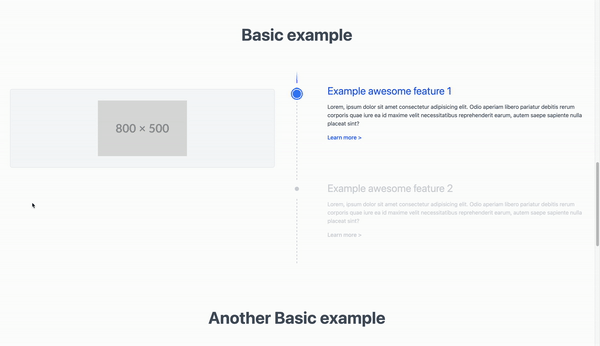
Table of contents
Main features
- Customizable scrolling item
- Customizable fixed item
- Customizable trailing line
- Customizable indicator
- Customizable tracking line color
- Customizable tracking ball
Installation
Install the NPM package using the below script
npm install scrolling-features-react # using npmUsage
Import the CSS file from the library to the root of your app e.g. _app.tsx for Next.JS or commonly called App.tsx for create-react-app.
import "scrolling-features-react/dist/style.css";Import ScrollingFeatures component from the library.
import { ScrollingFeatures } from 'scrolling-features-react';
...
<ScrollingFeatures />  // See props and options in the API and example section below
Add props as needed, see API section below for more information on the types and options available.
API
options/props
Name: features
Type: Array
Required: true
Description: An array of objects that contain all features to be displayed in a scrollable container. Each object should have at least one property named scrollingItem and fixedItem, indicator is optional
Prop definitions
Props
| Prop | Type | Specific | Required | Description |
|---|---|---|---|---|
features |
Array | AdFeature[] |
true |
List of items to be displayed |
trackingBall |
Element | ReactNode |
false |
The ball that follows the top of the screen |
trackingLineColor |
string | string |
false |
Highlight color of the active section |
trackingLineFadeColor |
string | string |
false |
Ideally the background color, helps add a fading effect to the beginning of the tracking line |
lineTrail |
Element | ReactNode |
false |
The center line for desktop and left line for mobile |
Type definitions
Types
| Property | Type | Specific |
|---|---|---|
AdFeature |
Object | {scrollingItem: ElementWithOptions; fixedItem: ElementWithOptions; indicator?: ElementWithOptions | undefined} |
ElementWithOptions |
Function | (options: FeatureItemOptions) => ReactNode; |
FeatureItemOptions |
Object | {isIntersecting: boolean} |
Example
The below example uses tailwindcss classes to style it's custom component for the fixed and scrolling item.
SimpleExampleTextComponent
```js
const SimpleExampleTextComponent: React.FC<{
title: string;
description: string;
isIntersecting: boolean;
}> = ({ isIntersecting, title, description }) => (
<>
{/* Title */}
<h4
className={`${
isIntersecting ? "text-blue-600" : "text-gray-300"
} transition duration-300 text-2xl lg:text-3xl -mt-3`}
>
{title}
</h4>
{/* Description */}
<p
className={`${
isIntersecting ? "text-gray-600" : "text-gray-300"
} transition duration-300 mt-4`}
>
{description}
</p>
{/* Link */}
<button
className={`${
isIntersecting ? "text-blue-600" : "text-gray-300"
} text-md font-medium mt-4 mb-8 lg:mb-32 lg:group-last:mb-0 transition duration-300`}
>
Learn more
<span className="ml-1">></span>
</button>
</>
);
```SimpleExampleImageComponent
```js

  const SimpleExampleImageComponent: React.FC<{
    imageUrl: string;
    isIntersecting: boolean;
  }> = ({ imageUrl }) => (
    <div className="bg-gray-50 border border-gray-200 p-8 rounded-md flex justify-center items-start">
      <img className="w-48 object-contain lg:w-64" src={imageUrl} />
    </div>
  );

```
const App: React.FC = () => (
<ScrollingFeatures
features={[
{
scrollingItem: ({ isIntersecting }) => (
<SimpleExampleImageComponent
isIntersecting={isIntersecting}
imageUrl="https://placehold.co/800x500"
/>
),
fixedItem: ({ isIntersecting }) => (
<SimpleExampleTextComponent
isIntersecting={isIntersecting}
title="Example awesome feature 1"
description="Lorem, ipsum dolor sit amet consectetur adipisicing elit. Odio aperiam libero pariatur debitis rerum corporis quae iure ea id maxime velit necessitatibus reprehenderit earum, autem saepe sapiente nulla placeat sint?"
/>
),
},
{
scrollingItem: ({ isIntersecting }) => (
<SimpleExampleImageComponent
isIntersecting={isIntersecting}
imageUrl="https://placehold.co/800x500"
/>
),
fixedItem: ({ isIntersecting }) => (
<SimpleExampleTextComponent
isIntersecting={isIntersecting}
title="Example awesome feature 2"
description="Lorem, ipsum dolor sit amet consectetur adipisicing elit. Odio aperiam libero pariatur debitis rerum corporis quae iure ea id maxime velit necessitatibus reprehenderit earum, autem saepe sapiente nulla placeat sint?"
/>
),
},
]}
/>
);Related packages
Scrolling Features Vue - Coming soon
Author
Precious OSSAI Website