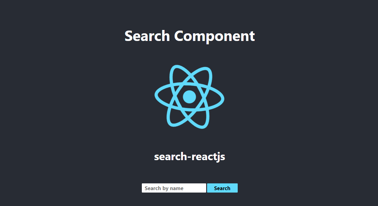
search-reactjs
Search-reactjs component allows the search or filter of objects by specifying a search criteria according to the properties of the object, providing flexibility to the developer at the time of implementation and allowing the fulfillment of the requested requirements.
The component displays an input text where the user enters the value they want to search for, it also displays the button to start the search action. This component also allows to perform the search automatically while the user enters the text in the input.
Installing
To install the component use the Node Package Manager (npm). You must open the command console at the root of your project and execute the command:
npm install search-reactjs --save Demo
Click me to go to the demo on codeSandbox!
Usage
Here is an example of how to implement the component:
import logo from './logo.svg';
import './App.css';
import SearchReact from 'search-reactjs';
function App() {
  const users = [
    {
      name:'marvin',
      home:{
        location:'Heredia',
        local:{
          number: 3
        }
      }
    },
    {
      name:'Jose',
      home:{
        location:'Puntarenas',
        local:{
          number: 5
        }
      }
    },
    {
      name:'Mario',
      home:{
        location:'Cartago',
        local:{
          number: 1
        }
      }
    },
    {
      name:'Luna',
      home:{
        location:'San Jose',
        local:{
          number: 2
        }
      }
    },
  ];
  let callBack = (result)=>{
    console.log('result',result);
  }
  return (
    <div className="App">
      <header className="App-header">
        <h1>Search Component</h1>
        <img src={logo} className="App-logo" alt="logo" />
        <h2>search-react</h2>
        <br/>
        <SearchReact
          listObjects={users}
          btnName={'Search'}
          placeholder={"Search by name"}
          borderRadius={'2px'}
          fontSize={'17px'}
          searchCriteria={'name'}
          btnHoverBackground={'red'}
          btnHoverTextColor={''}
          hideButton={false}
          callBack={callBack}
        />
      </header>


    </div>
  );
}

export default App;
Props of styles
Props for component styles are displayed as a table with Name, Type, Default, and Description as headings.
Required props are marked with *.
| Name | Type | Default | Description |
|---|---|---|---|
inputColor |
string |
blue |
Indicates the text color for the input text element. |
inputWidth |
string |
200px |
Indicates the width for the input text element. |
placeholder |
string |
Serach |
Indicates the placeholder for the input text element. |
height |
string |
30px |
Indicates the height for the input text element and the button element. |
borderRadius |
string |
5px |
Indicates the border radius for the input text element and the button element. |
fontSize |
string |
|
Indicates the text size for the input text element and the button element. |
btnColor |
string |
black |
Indicates the text color for the button element. |
btnWidth |
string |
100px |
Indicates the width for the button element. |
btnBorder |
string |
2px solid #61DAFB |
Indicates the border for the button element. |
btnHoverBackground |
string |
#3dbadc |
Indicates the background color for hover the button element. |
btnHoverTextColor |
string |
#ffff |
Indicates the text color for hover the button element. |
btnName |
string |
Serach |
Indicates the name for the button element. |
Additional usage information
Additional information about using the component pros.
- inputColor: Use this prop for indicate the text color for input text element. You can specify this value as a string, in the format RGB hex ("#AA00FF") or RGB decimal ("rgb (71, 98, 176)") or RGB percentage ("rgb (27%, 38%, 69% )") or the name of color ("blue").
- inputWidth: Use this prop for indicate the width of input text. Indicate this as a string and in pixel format("200px") or percentage format("10%").
- height: Use this prop for indicate the height of input text and the button element. Specify this as a string and in pixel format ("30px") or percentage format ("10%").
- borderRadius: Use this prop for indicate the border radius of input text and button elements. Specify this as a string and in pixel format ("5px") or percentage format ("10%").
- fontSize: Use this prop for indicate the size of text for input text and button elements. Specify this as a string and in pixel format ("20px") or REM format ("1rem") or EM format ("1em").
- btnColor: Use this prop for indicate the color of text for button element. You can specify this value as a string, in the format RGB hex ("#AA00FF") or RGB decimal ("rgb (71, 98, 176)") or RGB percentage ("rgb (27%, 38%, 69% )") or the name of color ("blue").
- btnWidth: Use this prop for indicate the width of button element. Specify this as a string and in pixel format ("200px") or percentage format ("10%")..
- btnBorder:Use this property to indicate the border size, border type, and border color for the button element. You can express these values in a string and in the same format as specified in css3, for example: "2px solid #61DAFB".
- btnHoverBackground: Use this prop to indicate the background of button element when hover. You can specify this value as a string, in the format RGB hex ("#AA00FF") or RGB decimal ("rgb (71, 98, 176)") or RGB percentage ("rgb (27%, 38%, 69% ) ") or the name of color ("blue").
- btnHoverTextColor: Use this prop to indicate the color of button element's text on hover. You can specify this value as a string, in the format RGB hex ("#AA00FF") or RGB decimal ("rgb (71, 98, 176)") or RGB percentage ("rgb (27%, 38%, 69% ) ") or the name of color ("blue").
Props for functionality
Props for component functionality are displayed as a table with Name, Type, Default, and Description as headers.
Required props are marked with *.
| Name | Type | Default | Description |
|---|---|---|---|
hideButton |
bool |
false |
Indicates if the search button will be shown. |
searchCriteria* |
string |
|
Specify the search criteria. |
listObjects* |
array |
|
Array of objects to be filtered. |
callBack* |
function |
|
Function that will receive array of filtered objects. |
Additional usage information
Additional information about using the component pros.
- hideButton: Use this prop for indicate whether to display the search button. You must indicate this value as a boolean. By default the value is false. By specifying the value as true, the search button will be hidden and the search will be done automatically when the user types the text in the input text element.
- listObjects: Use this prop to specify the list of objects. You must specify this as a list of objects in json format.
- callBack: Use this prop to specify the callback function where the result of the data filtering will be sent. The specified function must receive a parameter.
- searchCriteria: Use this prop to indicate the search criteria on the list of objects. This value is indicated as a string.To specify a search criteria on nested objects, you can do it using the curly brackets, for example:
//List objects
  const users = [
    {
      name:'marvin',
      home:{
        location:'Heredia',
        local:{
          number: 3
        }
      }
    },
    {
      name:'Jose',
      home:{
        location:'Puntarenas',
        local:{
          number: 5
        }
      }
    }
  ]
//Possible criteria
<SearchReact listObjects={users} searchCriteria={'name'} />
or
<SearchReact listObjects={users} searchCriteria={'home.location'} />
or
<SearchReact listObjects={users} searchCriteria={'home.local.number'} />
Authors
People who helped build the project from its inception
- Marvin Calvo Acuña - Software Development - marvinjesus
- Marvin Calvo Acuña - Documentation - marvinjesus
License
This project is licensed under the ISC License - see the file LICENSE.md for details.