0.1.2 • Published 4 years ago
sg-design-system v0.1.2
Design System
Website url:
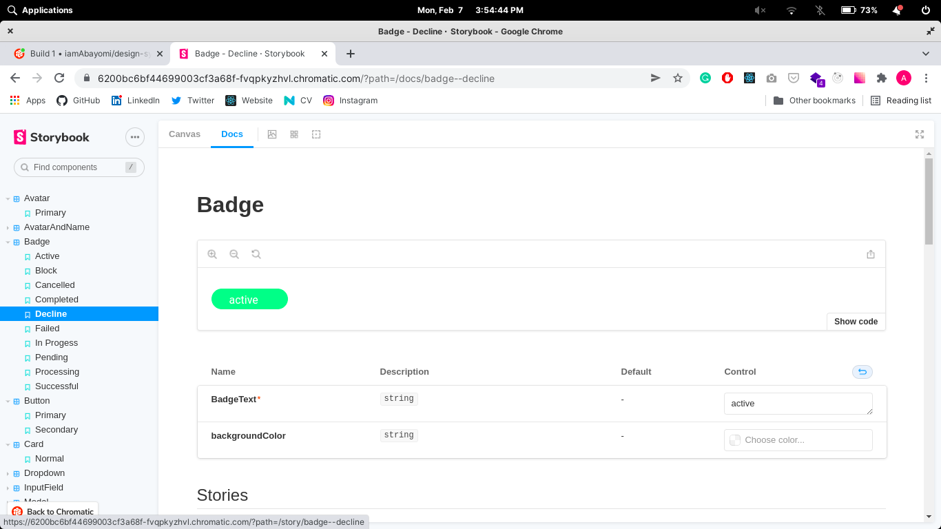
The website url hosted on chromatic at https://6200bc6bf44699003cf3a68f-fvqpkyzhvl.chromatic.com/
Table of Content:
About The App
This is a design system built in react and it contains these components
1. Avatar
2. AvatarAndName
3. Badge
4. Button
5. Card
6. Dropdown
7. InputField
8. Modal
9. OverviewCard
10. Table
11. Typography
Screenshots

Technologies
I used
ReactCSSHTMLJavascriptTypeScriptStyled ComponentsStorybookChromatic
Setup
- download or clone the repository
- run
npm install - then run
npm run storybookto display the components
Approach
I developed the components and added the stories file to display the stories in storybook
Status
Design system is still in progress. Version 2 will be out soon.
Credits
Resources:
License
MIT license @ Oladini Abayomi