1.0.0 • Published 7 years ago
shm-picker v1.0.0
react-native-picker


Documentation
Params
| Key | Type | Default | Support | Description |
|---|---|---|---|---|
| isLoop | Boolean | false | Android | |
| pickerTextEllipsisLen | number | 6 | Android | |
| pickerConfirmBtnText | string | confirm | iOS/Android | |
| pickerCancelBtnText | string | cancel | iOS/Android | |
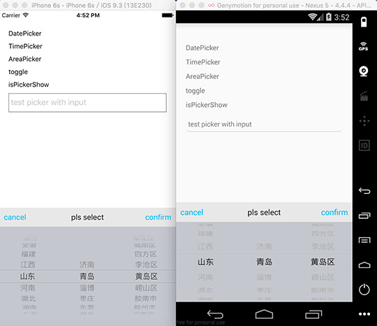
| pickerTitleText | string | pls select | iOS/Android | |
| pickerConfirmBtnColor | array | 1, 186, 245, 1 | iOS/Android | |
| pickerCancelBtnColor | array | 1, 186, 245, 1 | iOS/Android | |
| pickerTitleColor | array | 20, 20, 20, 1 | iOS/Android | |
| pickerToolBarBg | array | 232, 232, 232, 1 | iOS/Android | |
| pickerBg | array | 196, 199, 206, 1 | iOS/Android | |
| pickerToolBarFontSize | number | 16 | iOS/Android | |
| wheelFlex | array | 1, 1, 1 | iOS/Android | |
| pickerFontSize | number | 16 | iOS/Android | |
| pickerFontColor | array | 31, 31, 31, 1 | iOS/Android | |
| pickerFontFamily | string | iOS/Android | ||
| pickerRowHeight | number | 24 | iOS | |
| pickerData | array | iOS/Android | ||
| selectedValue | array | iOS/Android | ||
| onPickerConfirm | function | iOS/Android | ||
| onPickerCancel | function | iOS/Android | ||
| onPickerSelect | function | iOS/Android |
Methods
| Key | Support | Description |
|---|---|---|
| init | iOS/Android | init and pass parameters to picker |
| toggle | iOS/Android | show or hide picker |
| show | iOS/Android | show picker |
| hide | iOS/Android | hide picker |
| select | iOS/Android | select a row |
| isPickerShow | iOS/Android | get status of picker, return a boolean |
Usage
Step 1 - install
npm install react-native-picker --saveStep 2 - link
react-native linkStep 3 - import and use in project
import Picker from 'react-native-picker';
let data = [];
for(var i=0;i<100;i++){
    data.push(i);
}

Picker.init({
    pickerData: data,
    selectedValue: [59],
    onPickerConfirm: data => {
        console.log(data);
    },
    onPickerCancel: data => {
        console.log(data);
    },
    onPickerSelect: data => {
        console.log(data);
    }
});
Picker.show();
Integration With Existing Apps (iOS)
The Podfile will like below:
platform :ios, '8.0'
target 'YourTarget' do
    pod 'React', :path => '../YOUR_REACT_NATIVE_PROJECT/node_modules/react-native', :subspecs => [
    'Core',
    ...
    ]
    pod 'Picker', :path => '../YOUR_REACT_NATIVE_PROJECT/node_modules/react-native-picker'
end
After you have updated the Podfile of the existing app, you can install react-native-picker like below:
$ pod installNotice
support two modes:
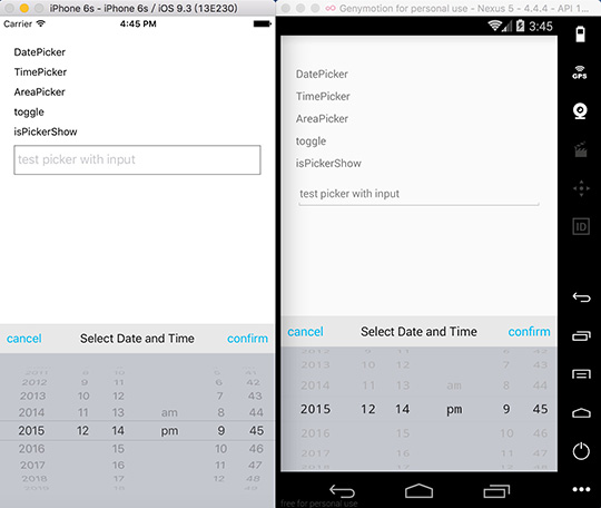
1. parallel: such as time picker, wheels have no connection with each other
2. cascade: such as date picker, address picker .etc, when front wheel changed, the behind wheels will all be reset
parallel:
- single wheel:
pickerData = [1,2,3,4];
selectedValue = 3;- two or more wheel:
pickerData = [
    [1,2,3,4],
    [5,6,7,8],
    ...
];
selectedValue = [1, 5];
cascade:
- two wheel
pickerData = [
    {
        a: [1, 2, 3, 4]
    },
    {
        b: [5, 6, 7, 8]
    },
    ...
];
selectedValue = ['a', 2];- three wheel
pickerData = [
    {
        a: [
            {
                a1: [1, 2, 3, 4]
            },
            {
                a2: [5, 6, 7, 8]
            },
            {
                a3: [9, 10, 11, 12]
            }
        ]
    },
    {
        b: [
            {
                b1: [11, 22, 33, 44]
            },
            {
                b2: [55, 66, 77, 88]
            },
            {
                b3: [99, 1010, 1111, 1212]
            }
        ]
    },
    {
        c: [
            {
                c1: ['a', 'b', 'c']
            },
            {
                c2: ['aa', 'bb', 'cc']
            },
            {
                c3: ['aaa', 'bbb', 'ccc']
            }
        ]
    },
    ...
]
For pure javascript version -> v3.0.5
1.0.0
7 years ago
