simple-react-calendar v2.2.8
simple-react-calendar 
A simple calendar component for React based applications.
A component that is easy to start using, yet flexible when you need customization.
Usage
You can find the component's online demo here.
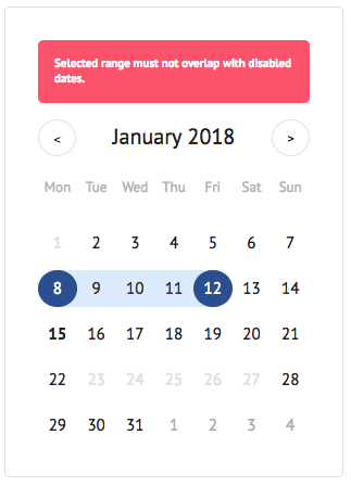
Screen

Install
Using npm
npm install simple-react-calendarUsing yarn
yarn add simple-react-calendarUsage
import React, { Component } from 'react'

import SimpleReactCalendar from 'simple-react-calendar'

class MyApp extends Component {
  render() {
    return <SimpleReactCalendar activeMonth={new Date()} />
  }
}
Available component properties
All of the properties are optional, just rendering <Calendar /> will already give you a working calendar component.
datePropType - number, string or instanceOf(Date)
Render Prop's Components
You can easily override any rendered part of the calendar by providing the proper render function as a Prop.
| Render Prop name | Default usage | Default Render Prop Component |
|---|---|---|
renderDay | (props) => <Day {...props} /> | RenderPropsComponents/Day/Day.tsx |
renderDayOfWeek | (props) => <DayOfWeek {...props} /> | RenderPropsComponents/DayOfWeek/DayOfWeek.tsx |
renderNotice | (props) => <Notice {...props} /> | RenderPropsComponents/Notice/Notice.tsx |
Expose date helper methods
You can easily override any helper methods, all of them exposed as pure functions.
| Helper function | Default function |
|---|---|
getDayFormatted | getDayFormatted |
getISODate | getISODate |
getNoticeContent | getNoticeContent |
Class Names
simple-react-calendar follows BEM-like class naming approach and uses
single block name as a prefix. Default block class name is calendar, so
elements will have names like calendar-day, calendar-month etc.
Block class name can be overrided with blockClassName prop (see above).
| Description | Default Class Name | Modifier Class Names |
|---|---|---|
| Calendar (root element) | .calendar | |
| Calendar month header | .calendar-month_header | |
| Calendar month header title (month name) | .calendar-month_header_title | |
| Calendar header button (month switcher) | .calendar-header_button | .is-prev - when is the previous month button.is-next - when is the next month button.is-disabled - when the button is disabled |
| Calendar week header (week days) | .calendar-days_of_week | |
| Calendar week header day (week day) | .calendar-days_of_week_day | .is-weekend - when the day is the weekend |
| Calendar month (weeks wrapper element) | .calendar-month | |
| Calendar week (days wrapper element) | .calendar-week | |
| Calendar day | .calendar-day | .is-selected - when the date is selected.is-highlighted - when the date is highlighted.is-today - when the date is current one.is-start_selection - when the date is start day of selection.is-end_selection - when the date is end day of selection.is-current_month - when the date belongs to the current month.is-prev_month - when the date belongs to the previous month.is-next_month - when the date belongs to the next month.is-weekend - when the date is the weekend.is-working_day - when the date is the working day.is-selectable - when the date can be selected.is-not_selectable - when the date can't be selected |
| Calendar notice (notice element) | .calendar-notice |
Local development environment
Fork this repository and clone your version of the repository
Install dependencies
yarnStart example server locally
yarn startYou now have examples running on http://localhost:9000
Local StoryBook
Fork this repository and clone your version of the repository
Install dependencies
yarnStart example server locally
yarn storybookYou now have examples running on http://localhost:6006
6 years ago
6 years ago
6 years ago
6 years ago
6 years ago
6 years ago
6 years ago
6 years ago
6 years ago
6 years ago
6 years ago
7 years ago
7 years ago
8 years ago
9 years ago
9 years ago
10 years ago
10 years ago
10 years ago
10 years ago
10 years ago
10 years ago
10 years ago
10 years ago
10 years ago
11 years ago


