1.1.2 • Published 3 years ago
sl-vue-tree-atomic v1.1.2
This project was forked from sl-vue-tree. Some modifications were made: Added possibility to add restrictions for drag and drops.
sl-vue-tree
Customizable draggable tree component for Vue.js

install
npm i sl-vue-tree
Quick start
<div id="app">
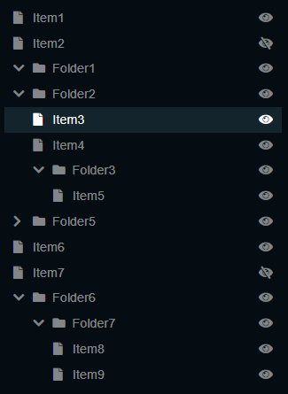
  <sl-vue-tree v-model="nodes"/>
</div>

<link rel="stylesheet" href="dist/sl-vue-tree-dark.css">
<script src="dist/sl-vue-tree.js"></script>

<script>

  var nodes = [
    {title: 'Item1', isLeaf: true},
    {title: 'Item2', isLeaf: true, data: { visible: false }},
    {title: 'Folder1'},
    {
      title: 'Folder2', isExpanded: true, children: [
        {title: 'Item3', isLeaf: true},
        {title: 'Item4', isLeaf: true}
      ]
    }
  ];

  new Vue({
    el: '#app',
    components: { SlVueTree },
    data: function () {
     return {
       nodes: nodes
     }
    }
  });

</script>
The value property is an array of ISlTreeNodeModel nodes:
interface ISlTreeNodeModel<TDataType> {
    title: string;
    isLeaf?: boolean;
    children?: ISlTreeNodeModel<TDataType>[];
    isExpanded?: boolean;
    isSelected?: boolean;
    isDraggable?: boolean;
    isSelectable?: boolean;
    data?: TDataType; // any serializable user data
}
For convenience the component's events return ISlTreeNode objects. Those actually are ISlTreeNodeModel
with some computed props:
interface ISlTreeNode<TDataType> extends ISlTreeNodeModel<TDataType> {
    isFirstChild: boolean;
    isLastChild: boolean;
    isVisible: boolean;	// node is visible if all of its parents are expanded
    level: number; // nesting level
    ind: number; // index in the array of siblings
    path: number[]; // path to node as array of indexes, for example [2, 0, 1] in the example above is path to `Item4`
    pathStr: string; // serialized path to node
    children: ISlTreeNode<TDataType>[];
}
You can get the list of ISlTreeNode from the computed slVueTree.nodes property
Props
| prop | type | default | description |
|---|---|---|---|
| value | ISlTreeNodeModel[] | [] | An array of nodes to show. Each node is represented by ISlTreeNodeModel interface |
| allowMultiselect | Boolean | true | Disable or enable the multiselect feature |
| allowToggleBranch | Boolean | true | Disable or enable the expand/collapse button |
| edgeSize | Number | 3 | Offset in pixels from top and bottom for folder-node element. While dragging cursor is in that offset, the dragging node will be placed before or after the folder-node instead of being placed inside the folder. |
| scrollAreaHeight | Number | 70 | Offset in pixels from top and bottom for the component element. While dragging cursor is in that area, the scrolling starts. |
| maxScrollSpeed | Number | 20 | The scroll speed is relative to the cursor position. Defines the max scroll speed. |
| multiselectKey | String/String[] | 'ctrlKey', 'metaKey' | The keys for multiselect mode. Allowed values are 'ctrlKey', 'metaKey', 'altKey' |
Computed props
| prop | type | description |
|---|---|---|
| nodes | ISlTreeNode[] | List of nodes with some computed props. See ISlTreeNode interface. |
| cursorPosition | ICursorPosition | Represents the current cursor position that describes the action that will be applied to the dragged node on mouseup event. See ICursorPosition interface |
| selectionSize | Number | The count of selected nodes |
| dragSize | Number | The count of selected and draggable nodes |
| isDragging | Boolean | True if nodes are dragging |
interface ICursorPosition<TDataType> {
  node: ISlTreeNode<TDataType>;
  placement: 'before' | 'inside' | 'after';
}
Events
| event | callback arguments | description |
|---|---|---|
| input | nodes: ISlTreeNodeModel[] | triggers for any changes to value property |
| select | selectedNodes: ISlTreeNode[], event: MouseEvent | triggers when a node has been selected/deselected |
| toggle | toggledNode: ISlTreeNode, event: MouseEvent | triggers when a node has been collapsed/expanded |
| drop | draggingNodes: ISlTreeNode[], position: ICursorPosition, event: MouseEvent | triggers when dragging nodes have been dropped |
| nodeclick | node: ISlTreeNode, event: MouseEvent | handle click event on node |
| nodedblclick | node: ISlTreeNode, event: MouseEvent | handle dblclick event on node |
| nodecontextmenu | node: ISlTreeNode, event: MouseEvent | handle contextmenu event on node |
| externaldrop | cursorPosition: ICursorPosition, event: MouseEvent | handle drop event for external items demo |
Methods
Slots
| slot | context | description |
|---|---|---|
| title | ISlTreeNode | Slot for item title |
| toggle | ISlTreeNode | Slot for expand/collapse button |
| sidebar | ISlTreeNode | Sidebar content |
| draginfo | SlVueTree | Slot that follows the mouse cursor while dragging. By default shows the dragging nodes count. |
| empty-node | ISlTreeNode | Slot for (optional) message when folder is open, but empty |
IE 11 support
You must add a babel-polyfill for it to work correctly in IE11
See IE11 example
Examples
Add a folder or item icon via title slot
<sl-vue-tree v-model="nodes">
    <template slot="title" slot-scope="{ node }">

      <span class="item-icon">
        <i class="fa fa-file" v-if="node.isLeaf"></i>
        <i class="fa fa-folder" v-if="!node.isLeaf"></i>
      </span>

      {{ node.title }}

    </template>
</sl-vue-tree>
Select all nodes
slVueTree.traverse((node, nodeModel, path) => {
    Vue.set(nodeModel, 'isSelected', true);
})
Handle keydown and keyup events via getNextNode and getPrevNode methods
Contributing
Changelog
v1.8.5
v1.8.4
- added
insertmethod https://github.com/holiber/sl-vue-tree/pull/39
v1.8.3
- Allow to disable or enable the expand/collapse button https://github.com/holiber/sl-vue-tree/pull/33
v1.8.1
- added IE11 support https://github.com/holiber/sl-vue-tree/issues/17
v1.8.0
- added
empty-nodeslot
v1.7.1
- added
multiselectKeyproperty
v1.7.0
- added
isSelectableandisDraggableflags
v1.6.0
- added
getNextNodeandgetPrevNodemethods https://github.com/holiber/sl-vue-tree/issues/6
v1.5.1
- improve drop on the bottom of tree https://github.com/holiber/sl-vue-tree/issues/5
v1.5.0
SlVueTree.selectmethod addedSlVueTree.@nodeclickevent fixed