slidev-theme-smile v0.8.2
slidev-theme-smile
Smile theme for Slidev.


Install
Add the following frontmatter to your slides.md. Start Slidev then it will prompt you to install the theme automatically.
Learn more about how to use a theme.
Components
This theme provides the following components:
Alert
Display an alert box.
Usage:
<alert>This is an info</alert>
<alert>

Content with `markdown` should be surrounded by **blank lines**.

</alert>
Parameters:
type(type:'info' | 'warning' | 'error', default:'info'): Type for the alert
DownloadButton
Display a button you can click to download a file.
Usage (demo.html is in the public folder):
<DownloadButton filename="demo.html">Download code</DownloadButton>Or:
<DownloadButton content="<h1>Hello world!</h3>" filename="demo.html">Download code</DownloadButton>Parameters:
content(type:string): Content of the filefilename(type:string): Filename of the downloaded file and content file ifcontentis empty.type(type:string, default'text/plain'): mime type of the content
Icon + IconSprite
Display a Smile icon.
Usage:
<icon-sprite/>
<icon icon="rocket-filled" />
You have to include the IconSprite component only once and at the beginning of your presentation.
Parameters:
class(type:string): HTML class to apply to the iconcolor(type:'primary' | 'secondary'): Color of the iconicon(type:string, required): The icon name
Logo
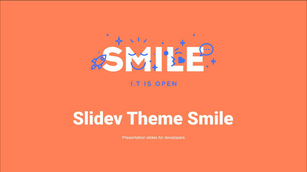
Display the Smile logo.
Usage:
<logo/>Parameters:
color(type:'white' | 'primary', default:'white): The main color of the logoiconColor(type:'primary' | 'secondary', default:'primary'): The color of the icons on the logo
PaintWorklet
Import a CSS paintWorklet module.
Usage:
<PaintWorklet src="https://unpkg.com/@houdini-modules/border-radius-reverse@0.0.1/border-radius-reverse.js"></PaintWorklet>Parameters:
src(type:string): Source URL of the worklet to load.
vScript
Like the classical <script> tag.
Usage:
<vScript scoped type="module">
  import intersection from 'https://cdn.jsdelivr.net/npm/lodash-es@4.17.21/intersection.js';
  const result = intersection([1,2,3,4], [2,4,6,8]);
  document.querySelector('#result').innerText = JSON.stringify(result);
</vScript>
Parameters:
scoped(type:boolean, default:false): Wrap the content of the<script>with an IIFE to create an isolated scope.- Other attributes are passed down to the
<script>tag.
Layouts
two-cols-with-title
Display two columns with a top content for the title.
Usage:
---
layout: two-cols-with-title
---

## Top title

::left::

Left col content

::right::

Right col content
two-cols-demo
Display code on the left and demo on the right.
Usage:
---
layout: two-cols-demo
---

## Demo

::left::

```html
<button class="button" type="button">Click me</button>
```

::right::

<button class="button" type="button">Click me</button>
Contributing
npm installnpm run devto start theme preview ofexample.md- Edit the
example.mdand style to see the changes npm run exportto generate the preview PDFnpm run screenshotto generate the preview PNG
3 years ago
3 years ago
3 years ago
3 years ago
4 years ago
4 years ago
4 years ago
4 years ago
4 years ago
4 years ago
4 years ago
4 years ago
4 years ago
4 years ago
4 years ago
4 years ago
4 years ago
4 years ago
4 years ago
4 years ago
4 years ago
4 years ago
4 years ago
4 years ago
4 years ago
4 years ago
4 years ago
