smooth-shadow v1.0.0
smooth-shadow
Generate smooth, consistent and always-sexy box-shadows, no matter the size, ideal for design token generation.

As Tobias already pointed out in 2019, a regular singular CSS box-shadow statement is as dull as it gets. Which is fine as long as you use it as a low-level API. And that's what we do by layering multiple box-shadows in a way to make them look a lot more physically realistic. No, the shadows are not really raytraced, but we borrow some concepts.
Many great people tackled the issue from Tobias Sahlin, to Philipp Brumm and Josh W Comeau, but none of them offered their solution as OSS-code. The previous attempts at libraries of other folks give you lots of settings like direct alpha, blur and spread settings, but on the flipside that means and you have to find good values for small and large shadows yourself.
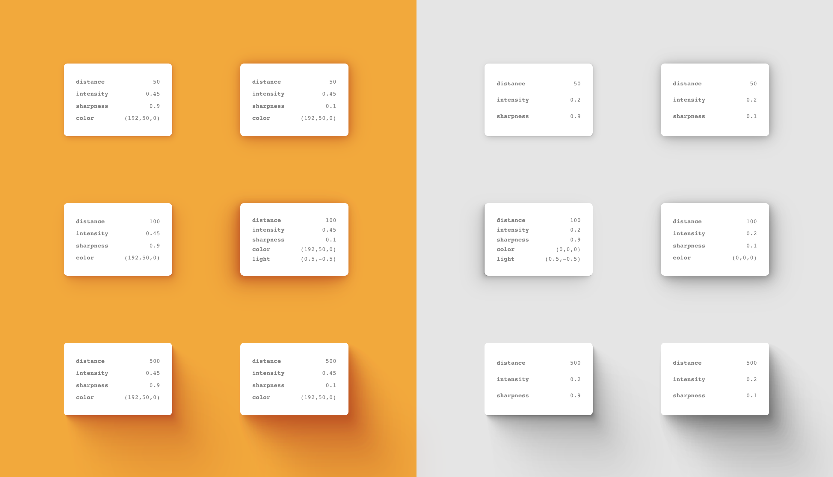
smooth-shadow is largely opinionated in what makes a great smooth shadow and only offers you relevant options for your usecase:
- Distance (basically the elevation/size of the shadow)
- Intensity (which should vary depending on environment color)
- Sharpness (which - although largely opinionated - leaves a little room for the projects style)
- Color (as real cast shadows pick up the color of reflected light from the surface they are cast on)
- Light Position (to determine in which direction the shadow should cast)
And as always:
- zero dependencies
- fully typed in typescript
- small footprint (2.3kb minified)
- CommonJS bundle, .mjs bundle, .d.ts bundle + type-checking & Source maps
Installation
npm i smooth-shadow or yarn add smooth-shadow
Usage
import { getSmoothShadow } from 'smooth-shadow'

// it returns a box-shadow css statement ready to use
const boxShadow = getSmoothShadow()

// eg. on a jsx component
<div style={{ boxShadow }} />

// or eg. in a styled component
styled.div`box-shadow: ${boxShadow}`

// or eg. even better in a styled-component (or any other framework) theme
const cardShadow = getSmoothShadow({ distance: 100 })
const theme = { cardShadow }
<ThemeProvider theme={theme} />
styled.div`box-shadow: ${({ theme }) => theme.cardShadow};`

// or eg. even better better as a shadow factory
const appShadow = (distance: number) => getSmoothShadow({
  distance,
  intensity: 0.2,
  sharpness: 0.7,
  color: [69,69,69],
  lightPosition: [0, -0.5]
})
const cardShadowSmall = appShadow(50)
const cardShadowBig = appShadow(200)
const theme = { cardShadowSmall, cardShadowBig }
<ThemeProvider theme={theme} />
const SmallCard = styled.div`box-shadow: ${({ theme }) => theme.cardShadowSmall};`
const BigCard = styled.div`box-shadow: ${({ theme }) => theme.cardShadowBig};`
getSmoothShadow({
// the distance the shadow travels, larger distance = larger shadow
distance?: number, // default 100 (between 0 & 1000)
// sort of your "opacity" parameter if you will
intensity?: number, // default 0.5 (between 0 & 1)
// low values result in a more mellow shadow, high values in a more crispy experience
sharpness?: number, // default 0.5 (between 0 & 1)
// on colored backgrounds you should tint your shadows for more sexiness, totally optional though
color?: [number, number, number], // default [0, 0, 0] ([0-255, 0-255, 0-255])
// position of the lighton x/y axis. 0 is the center, -1 left/top, 1 right/bottom
lightPosition?: [number, number] // [-1 - 1, -1 - 1], where 0 is the center
}) => stringFor the code example of the screenshot / the Demo, check out /docs/index.js.
How it works
Depending on distance a good amount of layers (more layers means softer result but less performance, so we try to find the best tradeoff) is determined and then through linear interpolation and carefully self-crafted bezier-easing-functions in combination with the sharpness and intensity arguments realistic looking results are plotted. color and lightPosition are rather straightforward.
Performance
With 179 818 ops/s, ±1.92% it's considerably fast. That being said I would not suggest you to try animate generated shadow-values directly as there can be up to 24 layers of shadows and animating them directly is costly. Instead animate the opacity of an element that has said shadow. Read more