1.0.3 • Published 1 year ago
solar-kit v1.0.3
Solar Kit
Advanced UI made using Ant Design for React.
Filter Component
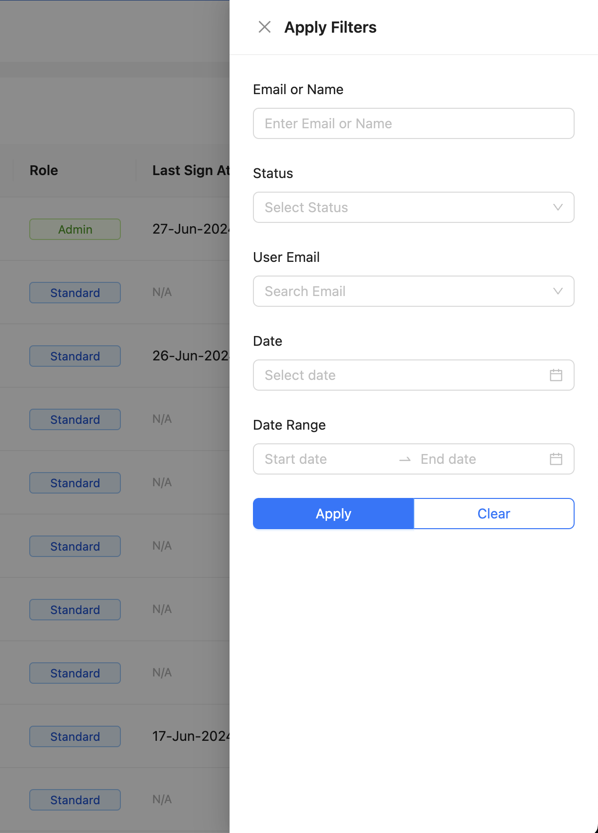
The Filter component is used to provide a filtering interface for data in the application.
Props
filters: An array of filter configurations. Each configuration should be an object with properties that define the filter.filtersCallback: A function that is called when the filters are applied. The function should take the applied filters as its argument.open: A boolean that controls whether the filter interface is open or closed.setOpen: A function that is called to open or close the filter interface. The function should take a boolean as its argument.
Usage
Here is an example of how to use the Filter component:
import { Filter } from "solar-kit"

function MyComponent() {
  // Enable Disable state from Button, initial set as enable to check how filter looks
  const [open, setOpen] = React.useState(true);

  const handleApplyFilters = (filters) => {
    console.log(filters);
  };

  return (
    <Filter
      filters={[
        {
          id: 'email',
          label: 'Email or Name',
          placeholder: 'Enter Email or Name',
          type: 'TEXT-INPUT',
        },
        {
          id: 'status',
          label: 'Status',
          placeholder: 'Select Status',
          type: 'SELECT',
          options: [
            { label: 'Pending', value: 'PENDING' },
            { label: 'Done', value: 'DONE' },
          ],
        },
        {
          id: 'user_email',
          label: 'User Email',
          placeholder: 'Search Email',
          type: 'SELECT-REMOTE',
          remoteOptions: async (search) => {
            console.log('search', search);
            // Mocked response
            return [
              { label: 'user1@example.com', value: 'user1@example.com' },
              { label: 'user2@example.com', value: 'user2@example.com' },
            ];
          },
        },
        {
          id: 'date',
          label: 'Date',
          placeholder: 'Select Date',
          type: 'DATE',
        },
        {
          id: 'date_range',
          label: 'Date Range',
          placeholder: 'Select Date Range',
          type: 'DATE-RANGE',
        },
      ]}
      filtersCallback={handleApplyFilters}
      open={open}
      setOpen={setOpen}
    />
  );
}
Filter Demo UI
