srit v0.2.2
Svelte Responsive Image Tag (SRIT)
Svelte Responsive Image Tag (SRIT) is a Svelte component that makes it easy to create responsive images with automatic format selection based on browser support.
The component uses the picture element to provide multiple sources for the image in different formats, and the img element with the srcset and sizes attributes to select the appropriate source based on the device's screen size and resolution.
Installation
pnpm i -D sritUsage
To use the Srit component, import it in your Svelte file and pass the required and optional props:
<script lang="ts">
  import { Srit } from 'srit';

  const imageSrc = 'images/test-image.jpg';
  const imageSizes = [100, 200, 400, 800];
  const imageAlt = 'Test Image';
</script>

<Srit src="{imageSrc}" sizes="{imageSizes}" alt="{imageAlt}" />
The above code creates the following output:
<picture>
  <source
    type="image/avif"
    srcset="
      images/test-image-2-100.avif?width=100 100w,
      images/test-image-2-200.avif?width=200 200w,
      images/test-image-2-400.avif?width=400 400w,
      images/test-image-2-800.avif?width=800 800w
    "
  />
  <source
    type="image/webp"
    srcset="
      images/test-image-2-100.webp?width=100 100w,
      images/test-image-2-200.webp?width=200 200w,
      images/test-image-2-400.webp?width=400 400w,
      images/test-image-2-800.webp?width=800 800w
    "
  />
  <img
    src="images/test-image-2.jpg"
    srcset="
      images/test-image-2-100.jpg?width=100 100w,
      images/test-image-2-200.jpg?width=200 200w,
      images/test-image-2-400.jpg?width=400 400w,
      images/test-image-2-800.jpg?width=800 800w
    "
    sizes="(max-width: 800px) 100vw, 50vw"
    loading="lazy"
    decoding="async"
    alt="Test Image"
  />
</picture>
Props
The following props are available for the Srit component:
| Name | Description | Default |
|---|---|---|
| src | A required prop that specifies the URL of the image to display. | |
| avif | An optional prop that specifies whether to include an avif source in the picture element. | true |
| webp | An optional prop that specifies whether to include a webp source in the picture element. | true |
| sizes | An optional prop that specifies an array of image sizes to include in the srcset attribute of the img element. | 100, 200, 400, 800 |
| alt | An optional prop that specifies the alternative text for the image. | |
| loading | A string indicating whether the image should be lazily loaded. Can be "lazy", "eager", null, or undefined. | lazy |
| decoding | A string indicating the decoding mode for the image. Can be "async", "auto", "sync", null, or undefined. | async |
Component document
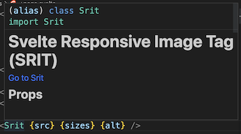
If you are using an LSP-compatible editor, such as VSCode, Atom, Sublime Text, or Neovim, hovering over a component name will display a documentation link, features, props, events, and an example.

How to generate all images
Use bimgc. bimgc converts PNG and JPG images to AVIF and WebP format with various sizes and saves them in a specified output directory. The output images are named based on the input file and include information about their size and format.