Introduction
My waffle-chart library will soon release to support up to three values. I think this is the sweet spot for showing portions on this kind of visualization.
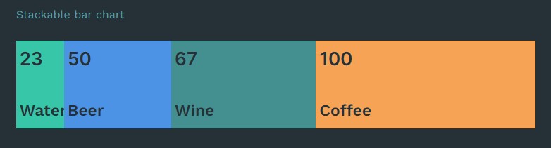
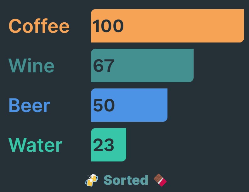
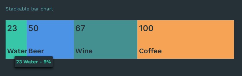
That's why I created stackable-bar-chart. This library will visualize either a stack of bars (like a bar chart) or a single bar with proportional segments (sort of like a one-dimensional treemap) based on a collection of values of up to basically any amount. You can also sort from largest to smallest and pass in any colors to help tell the story of your data.
Chocolate Bars are better than Pies & Donuts
🍫 > 🍩
Sorting in many ways!
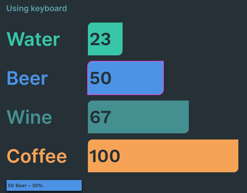
Tooltip by mouse hover or keyboard focus for smaller or hard to see values
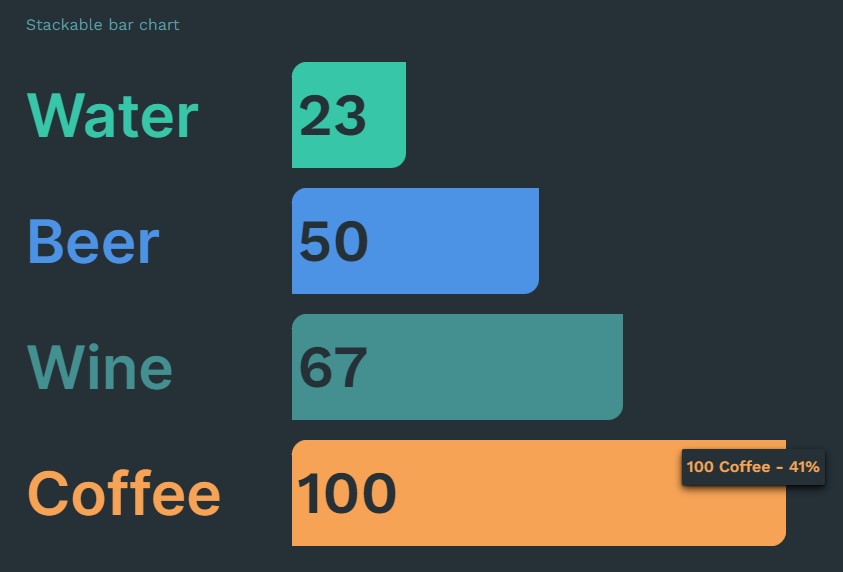
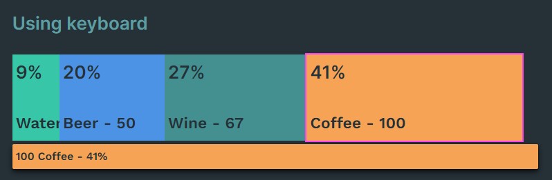
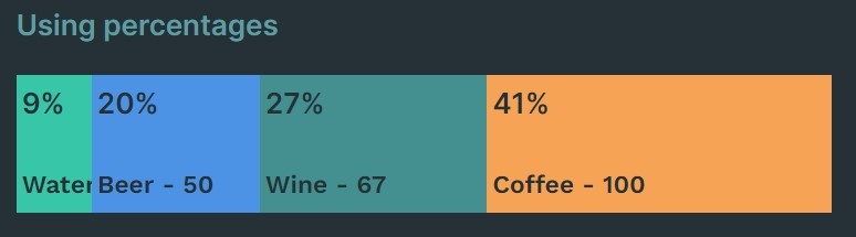
Rather focus on the percentage than the value?
This is a zero-dependency library built with React, Typescript & Vite.
No D3 only HTML, CSS, and JS/TS.
Usage in commercial projects
If you are using this in a commercial project, please consider leaving a donation/tip. Cheers!

Limitations
- Negative values are normalized to 0 since this chart was meant to show proportions of a whole in different ways, so when using
stackedmode a negative value won't have a bar. If a negative bar is requested enough by users, I will consider supporting it.
Demo
Live demo via Storybook coming soon.
Supporting reads
When to use a bar chart instead of a pie chart
API
The chart will render with just the default props, you just want see any bars without any data.
The API follows the ChartProp interface
| Prop | Type | Default | Notes |
|---|---|---|---|
| data | ChartData[] | [] | |
| mode | 'stacked' , 'linear' | 'stacked' | |
| roundTo | 'nearest' , 'up' , 'down' | 'nearest' | |
| sortBy | 'none' , 'largest' , 'smallest' | 'none' | |
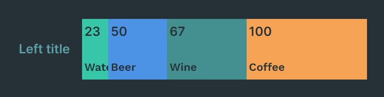
| titlePosition | 'none' , 'top' , 'bottom' , 'left' , 'right' , 'default' | 'default' | |
| showTooltip | boolean | true | |
| showPercentage | boolean | false | |
| clickHandler | (Partial) => any | undefined | |
| colorBackground | string | undefined | |
| children | any | undefined | Use this to insert any jsx, positioned by titlePosition |
export interface ChartData {
label: string;
value: number;
color?: string;
}
// The part in emitted in click
export interface BarData extends ChartData {
label: string;
value: number;
percentage?: number;
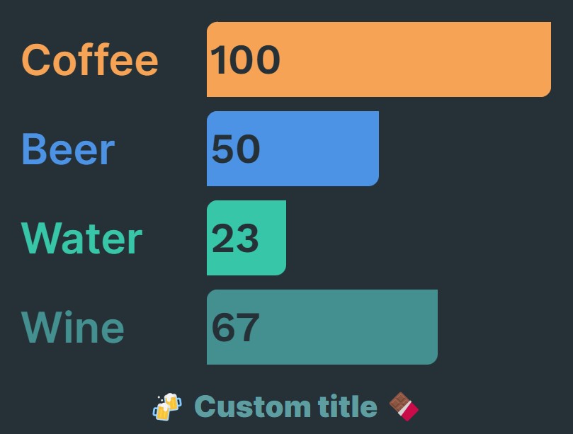
}Chart title
You can pass anything in children as the title and will be subjected to the titlePosition prop.
I recommend you add the following styling rule when using left or right positioning to prevent the title from wrapping:
.your-title-wrapper-classname {
   whiteSpace: 'nowrap'
}
For example:
<StackableBarChart {...props}>
    <h3 style={{ whiteSpace: 'nowrap' }}>🍻 Custom title 🍫</h3>
</StackableBarChart>
Colors
You can pass in colors via color in ChartData or just override in :root or some scope above the component for the following:
--color-fallback: Note that this will only change the fallback color for all bars and labelscolorBrackgroundAPI prop can be any color but to get the 'punch-out' look in sample images where the text matches the background in the bar, this prop should match the container background.
The colors can be in any valid CSS color prop (HEX, RGB, HSL, RGBA, HSLA, etc) as long as it's passed as a string.
Fonts and other styling
This chart will inherit the fonts from the the upper scope (e.g., :root).
Installing
Using NPM:
npm i stackable-bar-chartUsing Yarn:
yarn add stackable-bar-chartUsage
I recommend as a practice to wrap components like this in your own wrapper component that exposes the same API. This way you aren't married to this library and can easily swap it out without breaking consumers of your component.
// Import the CSS at the highest scope possible without coupling e.g. Shared or Vendor or Lib directory.
import 'node_modules/stackable-bar-chart/dist/style.css';
import type { ChartData, ChartProps, BarData } from 'stackable-bar-chart';
import { StackableBarChart } from 'stackable-bar-chart';
type Props = ChartProps;
const MyChart: React.FC<Props> = (props: Props) => <StackableBarChart {...props}>Chart title</StackableBarChart>
export default MyChart;For Remix projects just import the style url in the links at the root.tsx.
import stackableBarChartStyleUrl from 'node_modules/stackable-bar-chart/dist/style.css';

export const links: LinksFunction = () => [
    {
        rel: 'stylesheet',
        href: stackableBarChartStyleUrl,
    },
];
Updating
Using NPM:
npm updateUsing Yarn:
yarn upgrade stackable-bar-chart@^

#or

yarn upgrade stackable-bar-chart --latest
Contributing
This package is free for you to clone and change to your needs in accordance with the MIT license terms. If you want to contribute back to this codebase for improvements, please fork it, create an issue and then initiate a pull request that details the changes and problem or enhancement. Thanks!
Developing
Starting development server:
yarn devTesting
Testing methodology follows the testing-library guiding principles and focusing user interactions and integration testing.
Latest coverage report:
-------------------|---------|----------|---------|---------|-------------------
File               | % Stmts | % Branch | % Funcs | % Lines | Uncovered Line #s
-------------------|---------|----------|---------|---------|-------------------
All files          |     100 |    98.55 |      88 |     100 |
 Bar               |     100 |      100 |   77.77 |     100 |
  index.tsx        |     100 |      100 |   77.77 |     100 |
 ChartContainer    |     100 |      100 |     100 |     100 |
  index.tsx        |     100 |      100 |     100 |     100 |
 Label             |     100 |      100 |     100 |     100 |
  index.tsx        |     100 |      100 |     100 |     100 |
 StackableBarChart |     100 |    97.56 |    92.3 |     100 |
  index.tsx        |     100 |    97.56 |    92.3 |     100 | 135
 Tooltip           |     100 |      100 |     100 |     100 |
  index.tsx        |     100 |      100 |     100 |     100 |
-------------------|---------|----------|---------|---------|-------------------
Testing is built and run with:
You'll notice very sparse snapshots for each component and a focus on the integrations.
Run tests once:
yarn testRun tests and watch for changes:
yarn watchCheck coverage:
yarn coverageRun Vitest UI:
yarn testuiBuilding
yarn buildMerging
See Contributing.