storybook-addon-contentful-preview v0.0.21
Storybook Addon Contentful Preview
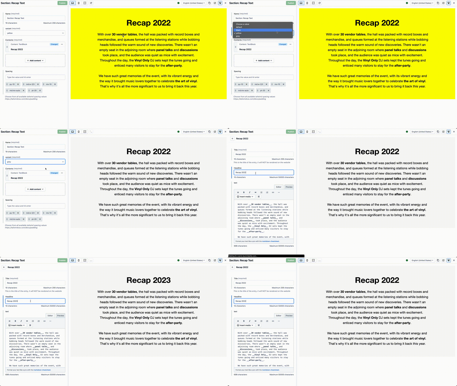
Preview your components with contentful data. Connect your storybook to contentful and live preview your components with real data.

Installation
First, install the package.
npm install -D storybook-addon-contentful-previewThen, register it as an addon in .storybook/main.{js|ts}.
export default {
  addons: ['storybook-addon-contentful-preview'],
};
Usage
Plugin
When registered, The plugin will automatically add the required decorators to your storybook.
You can then use the contentfulPreview parameter to connect your storybook to contentful. The decorators will be
ignored, if the contentfulPreview parameter is not set.
Manual
The decorators can also be used manually, if you want to have more control over the behavior.
Parameters
This addon contributes the following parameters to Storybook, under the contentfulPreview namespace:
| Name | Type | Description | Required |
|---|---|---|---|
spaceId | string | The space id of your contentful space | Yes |
accessToken | string | The access token of your contentful space | Yes |
entryId | string | The entry id of the content you want to preview | Yes |
locale | string | The locale of the content you want to preview | No |
host | string | The host of the contentful api (defaults to api.contentful.com | No |
livePreview | boolean | Enables the live preview sdk | No |
argsMutator | function | Mutator for the loaded entry data. By default, all fields will be populated as top-level args to the story | No |
Define Parameters
You can set the parameters globally, by adding the contentfulPreview parameter to the globals object of your .storybook/preview.js file (example).
import type {Preview} from "@storybook/react";

const preview: Preview = {
  parameters: {
    globals: {
      contentfulPreview: {
        space: "<space-id>",
        accessToken: "<access-token>",
        host: 'preview.contentful.com',
      }
    }
  },
};

export default preview;
You can also set the parameters per story, by adding the contentfulPreview parameter to the story (example)
export default {
  title: 'Button',
  parameters: {
    contentfulPreview: {
      spaceId: 'your-space',
    }
  }
}
The parameters set on the story level will override the global parameters.
Decorators
withContentful
When you want to preview your component with contentful data, you can use the withContentful decorator. This decorator
will fetch the data from contentful and pass it to your component.
import {withContentful} from 'storybook-addon-contentful-preview';

export default {
  title: 'Button',
  decorators: [withContentful],
  parameters: {
    contentfulPreview: {
      spaceId: 'your-space',
      accessToken: 'your-access-token',
      entryId: 'your-entry-id',
    }
  }
};
withContentfulLivePreview
When you want to preview your component with contentful data, you can use the withContentfulLivePreview decorator to enable the live preview sdk. This decorator will fetch the data from contentful and pass it to your component when renderer inside the contentful UI.
import {withContentful, withLivePreview} from 'storybook-addon-contentful-preview';

export default {
  title: 'Button',
  decorators: [withLivePreview, withContentful],
  parameters: {
    contentfulPreview: {
      spaceId: 'your-space',
      accessToken: 'your-access-token',
      entryId: 'your-entry-id',
      livePreview: true,
    }
  }
};
Only tested in conjunction with the
withContentfuldecorator
withEntryArgMutator
When you want to modify the loaded entry data, you can use the withEntryArgMutator decorator.
The loaded the entry will be provided as args.contentful_entry.
You can use this decorator to modify the loaded entry data before it is passed to your component to match your component props.
WHen used as plugin, the default behavour is to populate all fields as top-level args to the story.
import {withContentful, withEntryArgMutator} from 'storybook-addon-contentful-preview';

export default {
  title: 'Button',
  decorators: [withEntryArgMutator, withContentful],
  parameters: {
    contentfulPreview: {
      spaceId: 'your-space',
      accessToken: 'your-access-token',
      entryId: 'your-entry-id',
      livePreview: true,
      // optionally, you can use the argsMutator param to modify the default behaviour
      argsMutator: (entry, args) => {
        return {
          ...args,
          // ...entry.fields  <-- default behaviour
          headline: entry.fields.title
        }
      }
    }
  }
};
Contentful Preview
To preview your components inside the contentful app, it's best to use the fullscreen mode of storybook.
- Open the storybook in your browser
- Open fullscreen mode
- Copy URL
- Open contentful
- Got to settings for "Contentful Preview"
- Paste URL into (add parameters)

The "Contentful Preview" panel will provide you the matching url for your components including all dynamic parameters.
Development
Development scripts
npm run startruns babel in watch mode and starts Storybooknpm run buildbuild and package your addon code
2 years ago
2 years ago
2 years ago
2 years ago
2 years ago
2 years ago
2 years ago
2 years ago
2 years ago
2 years ago
2 years ago
2 years ago
2 years ago
2 years ago
2 years ago
2 years ago
2 years ago
2 years ago
2 years ago
2 years ago
2 years ago
2 years ago
2 years ago


