storybook-addon-grid v0.5.2
npm install storybook-addon-grid keeps your stories in rhythm
A tiny utility for batching and caching operations
This is free to use software, but if you do like it, consider supporting me ❤️

⚙️ Install
npm install storybook-addon-grid// .storybook/main.js
const config = {
addons: ['storybook-addon-grid'],
};Include this additional preset to configure the column guides for your Chromatic screenshots.
// .storybook/main.js
const config = {
  addons: ['storybook-addon-grid', 'storybook-addon-grid/chromatic'],
};
🚀 Usage
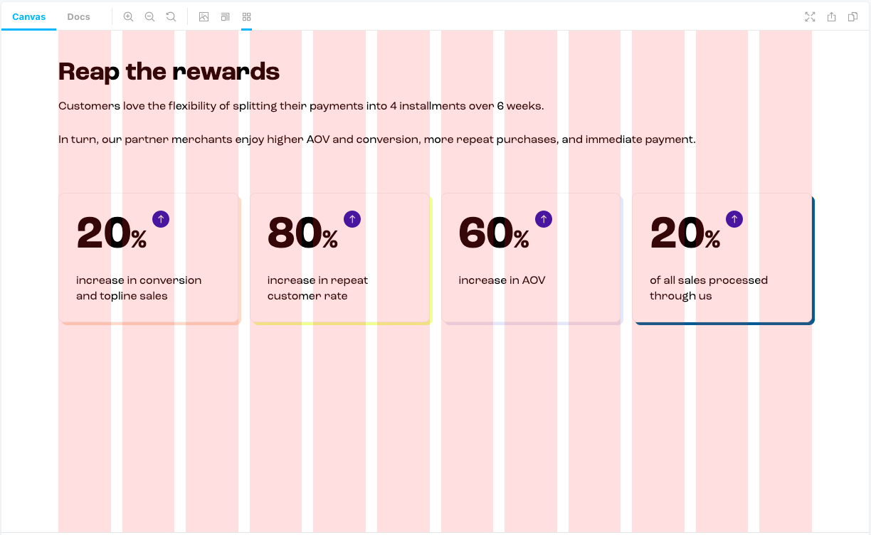
The column guides are controlled with parameters and as such you can define this globally or per story.
The column guides can be turned on either via clicking the toolbar button, or via a keyboard shortcut Ctrl + G.
Note: Due to the nature of
z-index, the rootdivof the stories will have aposition: relativeandz-index: 0applied to it, allowing the column guides to sit over the top.
Parameters
Column design system is defined by 3 values:
- the number of
columns - the
gapbetween them - the
gutter— minimal margin between the system and the screen maximal-widthfor the system to limit maximum width of all columns as well.
columns?: number = 12
The number of columns guides.
gap?: string = '20px'
The gap between columns.
gutter?: string = '50px'
System's gutter (margin) for both left and right.
Define to override the gutter defined on the right-hand-side.
maxWidth?: string = '1024px'
The maximum width our columns should grow.
color?: string = 'rgba(255, 0, 0, 0.1)'
Sets the color used for the column guides.
Global Parameters~
// .storybook/preview.js
export const parameters = {
  grid: {
    gridOn: true,
    columns: 12,
    gap: '20px',
    gutter: '50px',
    maxWidth: '1024px',
  },
};
Per story~
// MyComponent.stories.js
export const Example = () => {...};
Example.parameters = {
	grid: {
		columns: 6,
	},
};
Responsive properties
The way storybook-addon-grid solves responsive properties is leaving this up to you. We don't you to build
abstractions and implementations for this addon, we want to reuse existing patterns you may already be using.
In fact all properties map through to css, so any css variable you expose is consumable.
eg:
// file: my-styles.css
@media (min-width: 768px) {
  :root {
    --columns: 8;
    --gap: 12px;
    --gutter: 24px;
  }
}
Story.parameters = {
grid: {
// a custom variable names for the number of columns
columns: 'var(--columns)',
// or the gutter
gutter: 'var(--gutter)',
// or the gap
gap: 'var(--gap)',
},
};You can see this in action over at our example story ResponsiveGrid.
📚 Further Readings
❤ Thanks
Special thanks to Marina for the initial implementation and design.
License
MIT © Marais Rossouw
2 years ago
2 years ago
2 years ago
2 years ago
2 years ago
2 years ago
4 years ago
4 years ago
4 years ago
4 years ago
4 years ago
5 years ago
5 years ago
5 years ago
5 years ago
5 years ago
5 years ago
5 years ago
5 years ago
5 years ago
5 years ago
5 years ago
5 years ago
5 years ago
5 years ago
5 years ago