storybook-addon-multiselect v2.0.1
Storybook Addon Multiselect
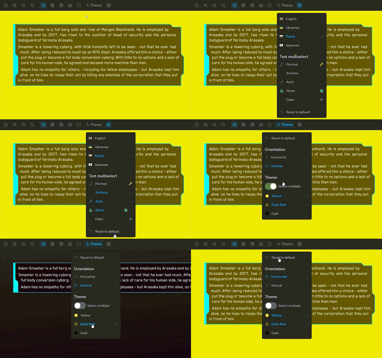
Toolbar addon for Storybook that allows to create dropdown(s) to select single or multiple options. Also, there's user defined type of options - that allows user to toggle between select single/multiple option(s).
onChange callback returns an array of selected options with exposing Storybook API. This callback allows to manipulate with both selected options and Storybook API.\
IMPORTANT NOTE: with Storybook 8 you cannot pass any function parameters - Storybook clears it up. So, passing onChange as function won't work with version 8. As a workaround you can make a function to be a string and then plugin will parse it back to function. See example below.API.
To access selected options in your stories, you need to implement your own decorator component that will access globals.multiselect and you can use it in your stories.
Optional Reset to default button that resets all options to default values.

Live demo
https://cyberpunk-ui-library.vercel.app \ Source code
Here, in the top bar you can see two dropdowns: 'Theme Storybook' and 'Theme & Language'. Both of them are implemented with this addon.
'Theme Storybook' is a single select dropdown that allows to change Storybook theme (outer shell) - for this onChange callback used as it allows to reach Storybook API.
'Theme & Language' is a complex dropdown that has single and multiple select groups, as well as reset button.
Quick start
Here's a quick and minimal example of how to use this addon:
npm i -D storybook-addon-multiselect// .storybook/main.ts
const config: StorybookConfig = {
// ... (other config)
addons: [
// ... (other addons)
'storybook-addon-multiselect'
]
// ... (other config)
}// .storybook/preview.ts(x)
// ... (other imports)
import { Addon } from 'storybook-addon-multiselect'
import ExampleDecorator from '../src/ExampleDecorator'
const multiselect: Addon = {
example: {
icon: <>💾</>,
elements: [
{
type: 'singleSelect',
queryKey: 'example',
options: [
{ title: 'Option 1', value: 'option1' },
{ title: 'Option 2', value: 'option2' },
{ title: 'Option 3', value: 'option3' }
]
}
]
}
}
const preview: Preview = {
parameters: {
// ... (other parameters)
multiselect
},
decorators: [
// ... (other decorators)
ExampleDecorator
]
}// src/ExampleDecorator.tsx
import type { Decorator } from '@storybook/react'
const ExampleDecorator: Decorator = (Story, context) => {
const { globals } = context
const multiselect: { [key: string]: string | string[] } = globals.multiselect
const example = multiselect.example as 'option1' | 'option2' | 'option3'
console.log('example value', example)
return <Story />
}
export default ExampleDecorator
## `onChange` callback
`onChange` callback returns an array of selected options with exposing Storybook API. This callback allows to manipulate with both selected options and Storybook API. If you return nothing, then selected options won't change. If you return an array, then selected options will be replaced with this array.
As mentioned above, Storybook 8 clears up any function parameters, so you can't pass `onChange` as function. As a workaround you can make a function to be a string and then plugin will parse it back to function.
```ts
const multiselect: Addon = {
example: {
icon: <>💾</>,
elements: [...],
onChange: `(values, api) => {
const { emit } = api
emit('customEmit', values)
if (values.includes('parzival')) {
return [...values, 'art3mis']
}
return values
}`,
}
}If yours version of Storybook below 8, you can pass onChange as function:
const multiselect: Addon = {
  example: {
    icon: <>💾</>,
    elements: [...],
    onChange: (values, api) => {
      api.emit('customEmit', values)

     if (values.includes('parzival')) {
        return [...values, 'art3mis']
      }
      return values
    },
  }
}
onfig: StorybookConfig = { // ... addons: // ... 'storybook-addon-multiselect' // .... }
Set up options in `.storybook/preview.tsx`:

```ts
// Addon is heavily typed and have jsdoc comments, so you can see all the clues in your IDE
import { Addon } from 'storybook-addon-multiselect'

// implement your own decorator component that will access `globals.multiselect` and you can use it in your stories
import YourDecoratorComponent from '../src/decorators/YourDecoratorComponent'

const multiselect: Addon = {
  // how many keys is how many dropdowns will be rendered
  theme: {
    // (optional)
    name: 'Theme',
    // put your svg or emoji (optional)
    icon: <svg />,
    // (optional)
    description: 'Change theme of Storybook (outer shell)',
    elements: [
      // reset button (optional)
      { type: 'reset' },
      // single select
      {
        type: 'singleSelect',
        // key that will be used in query string (required)
        queryKey: 'priority',
        // title of dropdown (required)
        title: 'Priority',
        // default value (optional)
        defaultValue: 'theme',
        // options (required)
        options: [
          {
            // title of option (required)
            title: 'Theme',
            // value of option (required)
            value: 'theme',
            // left side of option (optional)
            left: <svg />
          },
          {
            title: 'Language',
            value: 'lang',
            left: <svg />
          }
        ]
      }
    ]
  },
  themeAndLanguage: {
    // ...
  }
}

const preview: Preview = {
  // ...
  parameters: {
    // ...
    multiselect
  },
  decorators: [
    // ...
    YourDecoratorComponent
  ]
}
Things to do
- Add boolean flag to close toolbar after selection
- Measure performance and optimize
- Finish readme
Known issues
- Performance issues. No
memoused intentionally to avoid premature optimization. However, profiling and optimization is planned.
2 years ago
2 years ago
2 years ago
2 years ago
2 years ago
2 years ago
2 years ago
2 years ago
2 years ago
2 years ago
2 years ago
2 years ago
2 years ago
2 years ago
3 years ago
3 years ago
3 years ago
3 years ago
3 years ago
3 years ago
3 years ago
3 years ago
3 years ago
3 years ago
3 years ago
3 years ago
3 years ago
3 years ago
3 years ago
3 years ago
3 years ago
3 years ago
3 years ago
3 years ago
3 years ago
3 years ago
3 years ago
3 years ago
3 years ago
3 years ago
3 years ago
3 years ago
3 years ago
3 years ago
3 years ago
3 years ago
3 years ago
3 years ago
3 years ago
3 years ago