Licence
MIT
Version
1.1.0
Deps
2
Size
43 kB
Vulns
0
Weekly
0
storybook at minimums
TRY IT OUT ON VERCEL
The solution if you need some tool similar to storybook, but
You just need to have some simple "test page" with all custom components, and you don't want so much features, that storybook offers
You don't want to set up build (from project to project it can be very hard to set up storybook). With storybox you can use same build config as you use in prod, since storybox doesn't care where you use it or how you build the project.
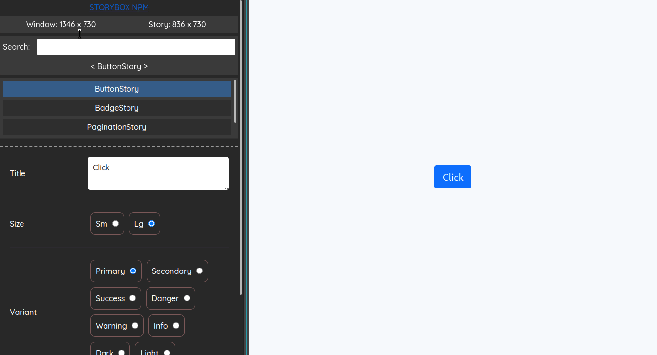
Usage examples
Clone this repo and go to examples directory.
- private-page is about when you want to place storybox in the same app, but within some private page.
npm start - separate-entry-point is about when you don't want to include storybox to your prod bundle, but instead, use separate
entrypoint for storybox page (e.g. with react-app-rewired or craco)
npm run start:storybox
Usage
- Define stories for each component you want. There are 6 types of controls available: boolean, checkbox, radio, button, number, number, string. (see controls API below)
import {Button} from '../components/button';
import {
    useBooleanControl,
    useNumberControl,
    useRadioControl,
    useStringControl,
} from 'storybox-react';

export const ButtonStory = () => {
    const [children] = useStringControl({
        defaultValue: 'my button',
        name: 'children',
        minLength: 0,
        maxLength: 30,
    });
    const [padding] = useNumberControl({
        defaultValue: 10,
        name: 'padding',
        max: 100,
        min: 10,
        integerOnly: true,
        appearance: 'range',
    });
    const [type] = useRadioControl({
        name: 'type',
        options: ['primary', 'danger'],
        defaultValue: 'primary',
    });
    const [disabled] = useBooleanControl({
        name: 'disabled',
        defaultValue: false,
    });
    return <Button children={children} padding={padding} type={type} disabled={disabled}/>;
};
- Define a story container. Import stories and place it in stories prop. Render
StoryBoxsomewhere in the app and that's it
import React from 'react';
import ReactDOM from 'react-dom/client';
import 'storybox-react/dist/styles.css'; // import storybox css
import {StoryBox} from 'storybox-react'; // import stories container
import {ButtonStory} from '../stories/button.story'; // import your stories

const stories = {ButtonStory};

<StoryBox stories={stories}/> // and that's just it!
<StoryBox/> component API
export type StoryBox<T extends Record<string, FC> = Record<string, never>> = FC<{
    /** All your stories placed in one object */
    stories: T;
    /** Default selected story key */
    defaultSelectedStory?: keyof T;
    /** Callback triggers on story key change.
     * [string] if some story has been selected
     * [undefined] - if unselected
     */
    onStoryKeyChange?: (key?: string) => void;
    /** Decorate each story */
    decorator?: (Story: FC) => FC;
}>;
Controls API
useBooleanControl
type UseBooleanControlParams = {
    /** name for control that will be displayed on the left panel */
    name: string;
    /** initial value */
    defaultValue: boolean;
}

type UseBooleanControlReturn = [
    /** current control value */
    boolean,
    /** handler for manually value updating */
    (newValue: boolean) => void
]

export type useBooleanControl = (params: UseBooleanControlParams) => UseBooleanControlReturn;
useStringControl
type UseStringControlParams = {
    /** name for control that will be displayed on the left panel */
    name: string;
    /** initial value */
    defaultValue: boolean;
    /** validating input for min length if passed */
    minLength?: number;
    /** validating input for max length if passed */
    maxLength?: number;
    /**
     * "washing" input with that regex if passed
     * @example
     * you need a string only with numbers and spaces.
     * so you create a regex that will match all EXCEPT numbers and spaces.
     * all matches will be removed
     * "a4 bcd 123".replace(/[^\s\d]/g, "") => "4  123"
     */
    washRegex?: RegExp;
}

type UseStringControlReturn = [
    string, /** current control value */
    (newValue: string) => void /** handler for manually value updating */
]

export type useStringControl = (params: UseStringControlParams) => UseStringControlReturn;
useNumberControl
type UseNumberControlParams = {
    /** name for control that will be displayed on the left panel */
    name: string;
    /** initial value */
    defaultValue: boolean;
    /** validating input for min if passed */
    min?: number;
    /** validating input for max if passed */
    max?: number;
    /** accepts only integer if passed
     * @default [integerOnly=false]
     */
    integerOnly?: boolean;
    /** plain input or range appearance on left panel
     * @default [appearance="input"]
     */
    appearance?: "input" | "range";
    /** step for changing values if you have chosen "range" appearance
     * @default [step=1]
     */
    step?: number;
}

type UseNumberControlReturn = [
    number, /** current control value */
    (newValue: number) => void /** handler for manually value updating */
]

export type useNumberControl = (params: UseNumberControlParams) => UseNumberControlReturn;
useRadioControl
type UseRadioControlParams = {
    /** name for control that will be displayed on the left panel */
    name: string;
    /** initial value */
    defaultValue: string;
    /** options for radio group */
    options: string[];
}

type UseRadioControlReturn = [
    /** current control value */
    string,
    /** handler for manually value updating */
    (newValue: string) => void
]

export type useRadioControl = (params: UseRadioControlParams) => UseRadioControlReturn;
useCheckboxControl
type UseCheckboxControlParams = {
    /** name for control that will be displayed on the left panel */
    name: string;
    /** initial value */
    defaultValue: string[];
    /** options for checkbox group */
    options: string[];
}

type UseCheckboxControlReturn = [
    /** current control value */
    string,
    /** handler for manually value updating */
    (newValue: string[]) => void
]

export type useCheckboxControl = (params: UseCheckboxControlParams) => UseCheckboxControlReturn;
useButtonControl
type UseButtonControlParams = {
    /** name for control that will be displayed on the left panel */
    name: string;
    /** click handler */
    onClick?: () => void;
}

type UseButtonControlReturn = [
    /** counter: how many times the button has been clicked */
    number,
    /** update counter above */
    (newValue: number) => void,
]

export type useButtonControl = (params: UseButtonControlParams) => UseButtonControlReturn;
CHANGELOG
0.0.1 06.07.2022
- Initial release
0.0.2 06.07.2022
- Fix prepare script
0.0.3 06.07.2022
- Correct dist files
0.0.4 07.07.2022
- Add controls informers
0.0.5 07.07.2022
- Add examples
0.0.6 07.07.2022
- Fix description
0.1.0 17.07.2022
- Fix updating controls on min/max change
1.0.0 17.07.2022
- Change contracts
1.0.1 17.07.2022
- Style fixes
1.0.2 18.07.2022
- Style fixes
1.0.3 18.07.2022
- Update readme
1.0.4 18.07.2022
- Remove useless dependency
1.0.5 19.07.2022
- Export types
1.0.6 19.07.2022
- Style fixes
1.0.7 19.07.2022
- Small fixes
1.0.8 19.07.2022
- Add wash regex to string input
1.0.9 19.07.2022
- Fixes
1.0.10 21.07.2022
- Update readme
1.0.11 22.07.2022
- Add default story key prop
1.0.12 23.07.2022
- Fixes
1.0.13 23.07.2022
- Add invariant context
1.0.14 07.08.2022
- Update readme
1.0.15 18.09.2022
- Add error boundary to the active story
1.0.16 18.09.2022
- Replace with react-error-boundary npm
1.0.17 18.09.2022
- Add more readable typings. Fix readme
1.0.18 19.09.2022
- Add error boundary to stories container
1.0.19 19.09.2022
- Style fix
1.0.20 26.09.2022
- Fix error {nothing was returned from render}
1.0.21 26.09.2022
- Fix checkbox force disappearance
1.0.22 27.09.2022
- Add onStoryKeyChange prop
1.0.23 28.09.2022
- Fix drag resizer
1.1.0 04.02.2023
- Now you can double shift to hide/show panel
- Added ability to decorate each story