styleguidist-knobs v0.1.4
styleguidist-knobs
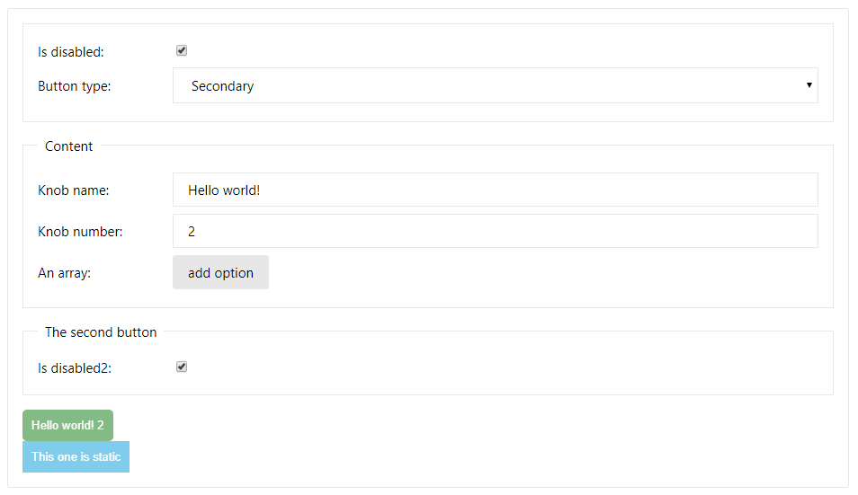
A react-styleguidist addon that adds a set of knobs to your examples, that users can interact with and change parameters of rendered components.

Getting Started
To add styleguidist-knobs to your react-styleguidist configuration, follow these steps:
install the package using yarn or npm:
yarn add --dev styleguidist-knobsenhance the configuration in
styleguide.config.js:module.exports = { components: 'src/components/**/[A-Z]*.js', defaultExample: true, webpackConfig: { module: { rules: [ { test: /\.jsx?$/, exclude: /node_modules/, loader: 'babel-loader', }, { test: /\.css$/, loader: 'style-loader!css-loader', }, ], },
- }
- },
- require: [
- require('styleguidist-knobs')
- ]
};
- add knobs to your examples!
Adding knobs to your examples
The addon uses the render prop patterns to provide UI and functionality for your examples. This can be done by editing the Markdown files or via the live editor directly. Please note however that when using the live editor the example will keep reloading and might result in errors.
The first step is wrapping your code in the KnobsUI component (available globally in all your examples!):
- <Button>Hello world!</Button>
+ <KnobsUI>
+   {() => <Button>Hello world!</Button>}
+ </KnobsUI>
Check your examples to verify that it is rendered as previously.
Next, you'll want to add some actual knobs to your component:
-  {() => <Button>Hello world!</Button>}
+  {({ text }) => <Button>{text('Button label', 'Hello world!')}</Button>}
After this change, you should see a new knob UI with the "Button label" label, and an input field. Interacting with the field should change the example in real time!
Available knobs
text
Allows you to set a text value, used mainly for PropTypes.string props. Please note that the default value is required, as otherwise undefined will be passed, and you will get an error about changing an uncontrolled field to a controlled one.
text(label, value)number
Similar to text, but produces a numeral value, using <input type="number" />. Use where a PropTypes.number is expected
number(label, value)bool
Using this knob, a checkbox will be rendered. Use with PropTypes.bool. If no value is passed, undefined will be used.
bool(label[, value])oneOf
Can be used whenever an PropTypes.oneOf is expected.
oneOf(label, value, options);The options argument is required, and is expected to be an Object mapping the expected values to labels, example:
const options = {
  small: 'Small variant',
  large: 'Large variant',
};
In current version the keys will be casted to
string, this is expected to change in future release. This knob API might also change.
array
An array of PropTypes.text elements can be generated with this knob. It will present an UI that can be used to add and remove entries in the array.
array(label, array)Grouping
By default, all labels are grouped into one UI element - this makes it a little hard to manage. To fix that, you can use the group function (also provided as part of the render prop!)
<input value={group('Sub-ui name').text('Input value', '')} />Authors and license
This library was created by Bartosz Szczeciński.
MIT License, see the included LICENSE file.