supertable-react-javascript v0.1.4
SuperTable : JavaScript Component for Customizable and Responsive Tables with React
Introduction to SuperTable
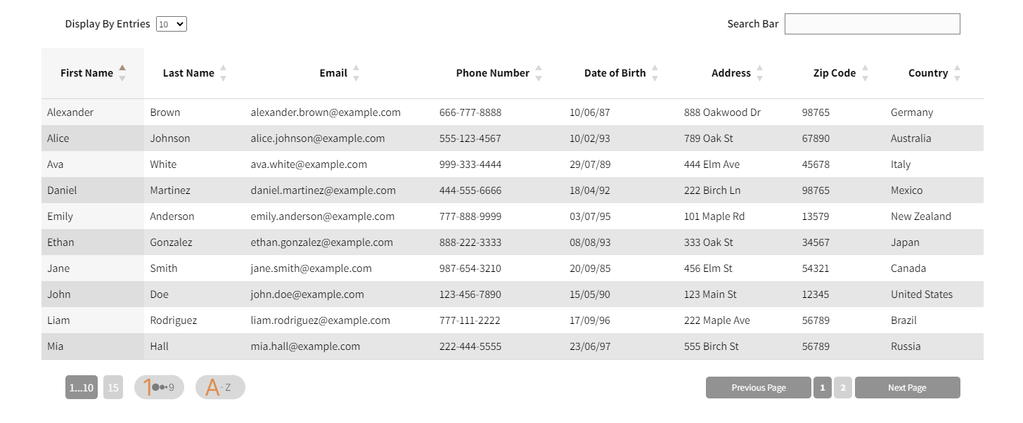
SuperTable is a versatile JavaScript component designed to simplify data display in a customizable table using React.
Why Use SuperTable?
Time-Saving :
SuperTable allows you to quickly create custom tables without writing many lines of HTML and CSS code. Save precious front-end development time.
Maximum Flexibility :
This component offers maximum flexibility to customize the appearance and behavior of your tables. Customize every aspect, from cell colors to user event handling.
Advanced Interactivity :
SuperTable includes advanced features to make your tables interactive. Sort, filter, and paginate your data with a single click.
Key Features of SuperTable
Easy Customization : Customize the appearance of your table using predefined themes or by creating your own CSS styles.
Data Management : SuperTable makes data management easy, whether you're displaying complex information, real-time data, or data from an API.
Seamless Integration : Seamlessly integrate SuperTable into your existing React projects with ease.
Customization Functions
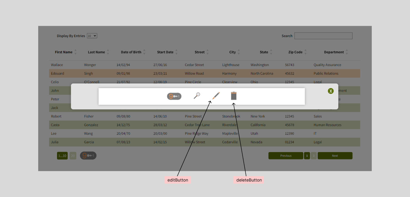
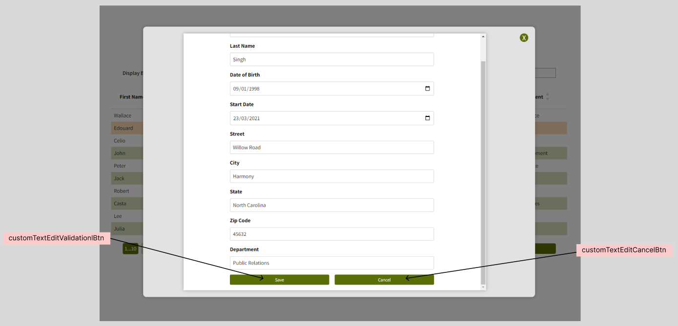
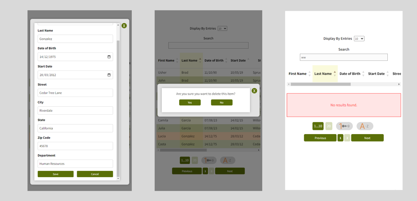
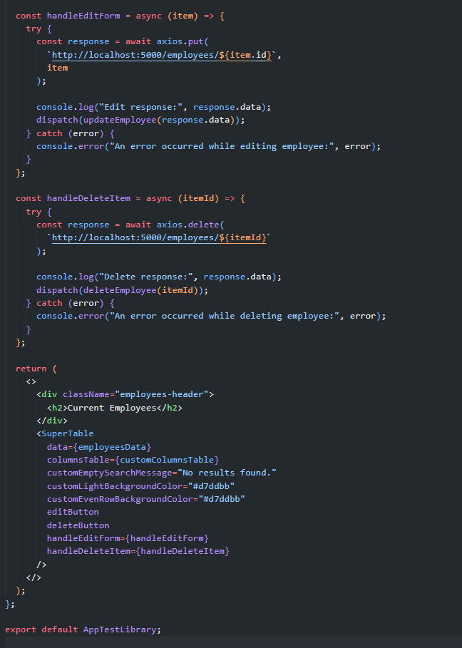
Edit Function : Create an edit function to allow users to modify data directly from the table.
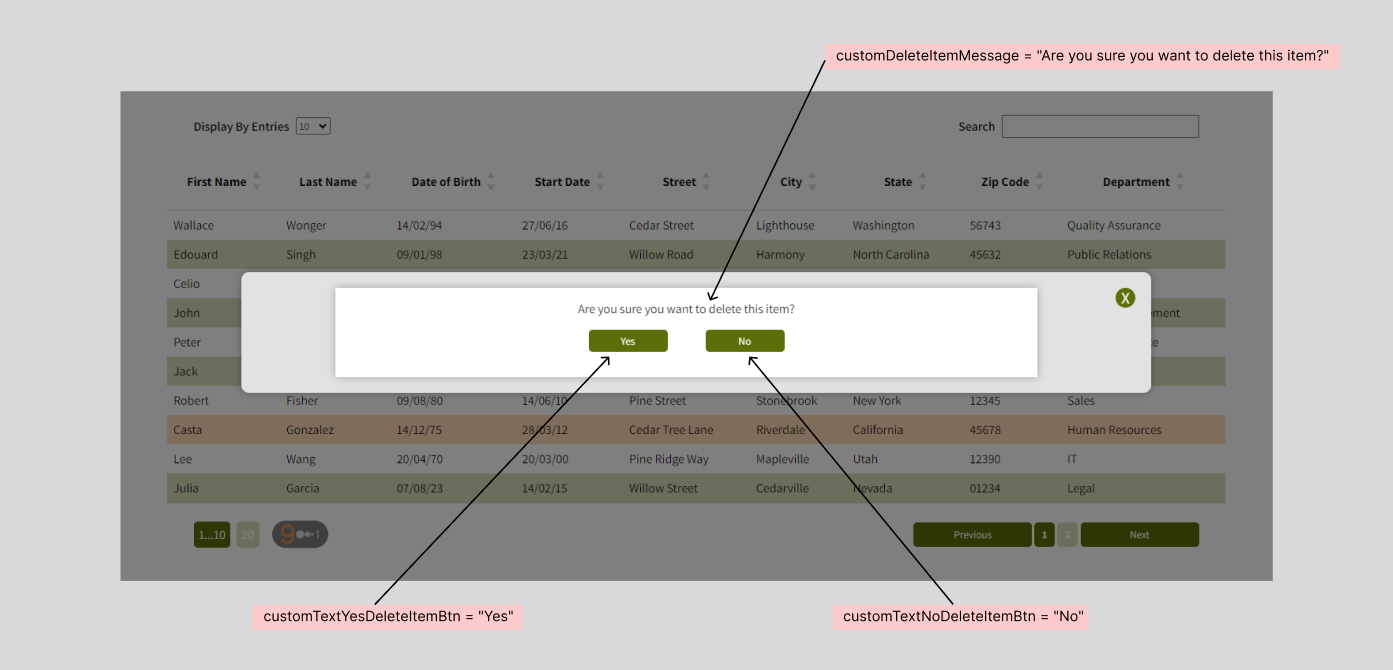
Delete Function : Set up a delete function to enable users to remove items from the table effortlessly.
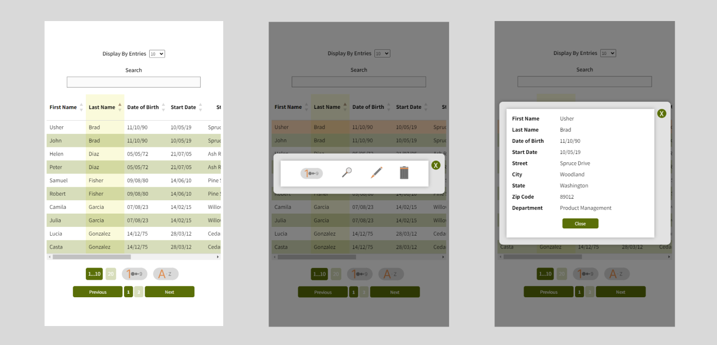
Mobile Adaptability : SuperTable is designed to be responsive and adapt to mobile devices. Tables are user-friendly on smartphones and tablets.
Getting Started
To start using SuperTable, simply follow these steps :
- Installation : Install SuperTable using npm or yarn.
npm i supertable-react-javascript- Import : Import the library into your React component.
import SuperTable from "supertable-react-javascript";- Usage : Use SuperTable to create and customize your data table.
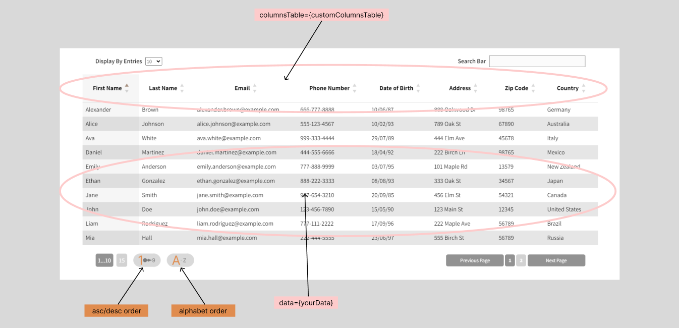
<SuperTable data={yourData} />Customizing Columns
To customize the columns of your table with SuperTable, you need to provide an array of objects containing three properties: "key," "label," and optionally "type." These properties are essential for determining what data will be displayed in the table, what labels will be used for column headers, and for advanced customization if needed.
Here's how you can explain this:
"To customize the columns of your table with SuperTableReact, you need to create an array of objects called customColumnsTable. Each object in this array must contain three properties:
key: This property represents the column key, which should match the key of the data you want to display in this column.label: This property represents the column label, which will be displayed as the column header in the table.type(optionnel) : This property allows you to specify the data type of the column, for example, "text" or "date." When using the library's internal edit form, this information can be useful for setting appropriate input controls and data validation."
const customColumnsTable = [
  { key: "firstName", label: "First Name", type: "text" },
  { key: "lastName", label: "Last Name", type: "text" },
  { key: "birthDate", label: "Date of Birth", type: "date" },
  { key: "startDate", label: "Start Date", type: "date" },
  { key: "street", label: "Street", type: "text" },
  { key: "city", label: "City", type: "text" },
  { key: "state", label: "State", type: "text" },
  { key: "zipCode", label: "Zip Code", type: "number" },
  { key: "department", label: "Department", type: "text" },
];
Once you've defined your customColumnsTable array, you can pass it as the columnsTable prop to your component. Here's how you can use it in your code :
<SuperTable data={yourData} columnsTable={customColumnsTable} />By specifying these custom columns, you have full control over the data you want to display and the column headers you want to use in your table.
Handling Empty Searches
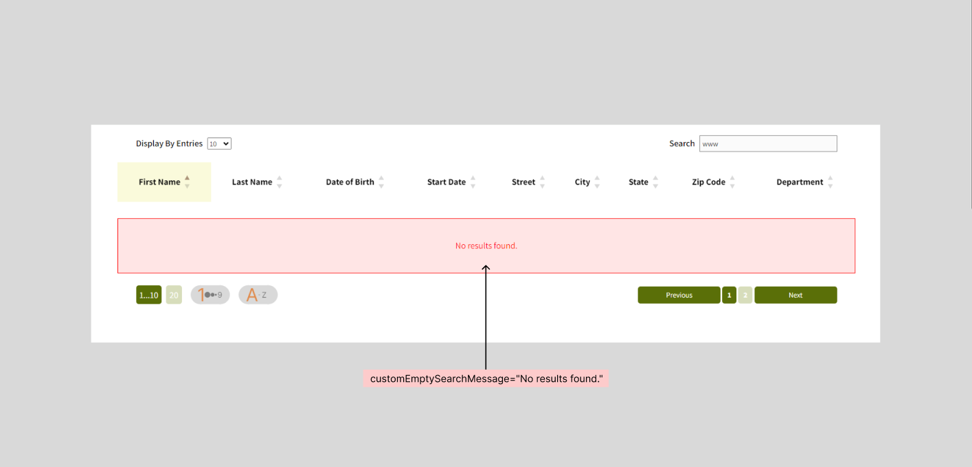
SuperTable includes intelligent handling of cases where the search bar doesn't find matches in the displayed data. When a user performs a search that returns no results, SuperTable displays an informative message to inform the user that no match was found.
This informative message is designed to enhance the user experience by letting them know that the search didn't yield any results and encouraging them to adjust their search criteria. This ensures a smooth user experience and reduces any confusion that may arise from unsuccessful searches.
SuperTable strives to make searching and navigating data as simple and efficient as possible, and handling empty searches is an example of that. It helps users find the information they need more easily while maintaining a clean and intuitive user interface.

Customizing Table Appearance
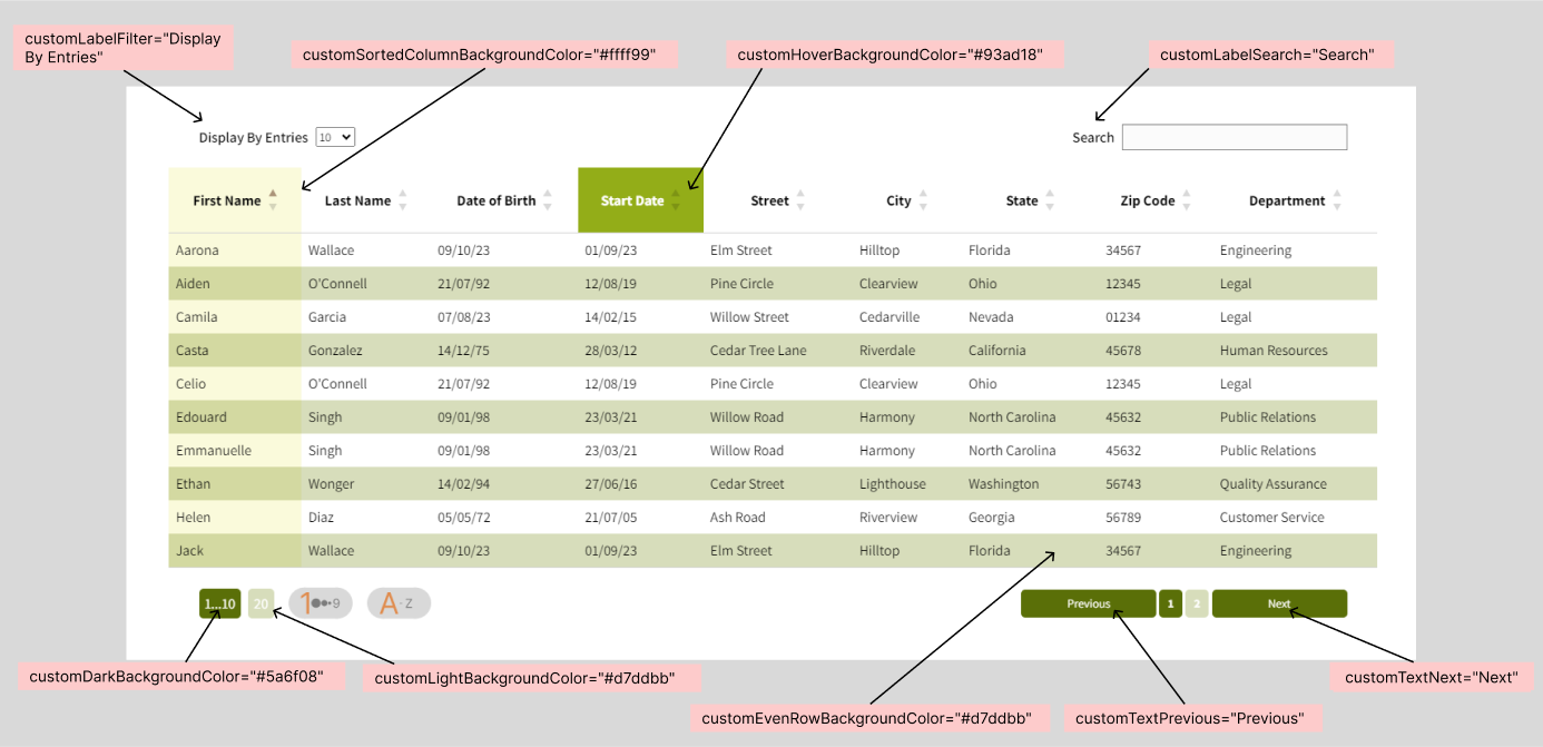
SuperTable offers a wide range of customization options so you can tailor the appearance of your table to your specific needs. Here's how each customization affects the table's appearance :
customLabelSearch : This customization replaces the default text "Search Bar" in the table's search bar. You can use this option to localize the search bar in the language of your choice.
customLabelFilter : This customization replaces the default text "Display By Page Number" in the table's filter dropdown. Use this option to customize the filter label to your preferences.
customTextPrevious and customTextNext : These customizations replace the default "Previous Page" and "Next Page" texts on the pagination buttons. Customize these buttons to match your application's style and language.
customEmptySearchMessage : When a search returns no results, this custom message is displayed to inform the user that no match was found. Customize this message to fit your application.
customSortedColumnBackgroundColor : This customization allows you to set a custom background color for the sorted column.
customHoverBackgroundColor : When a user hovers over a table cell, this customization determines the background color of the highlighted cell.
customEvenRowBackgroundColor : This customization allows you to set the background color for even rows of the table. You can specify a custom color for all even rows to create a distinct alternating color scheme.
customDarkBackgroundColor : You can use this customization to set a darker background color.
customLightBackgroundColor : Conversely, this customization allows you to set a lighter background color.
customHoverRowBackgroundColor : Allows you to set a custom color that will be applied when the user hovers over a row in the table.
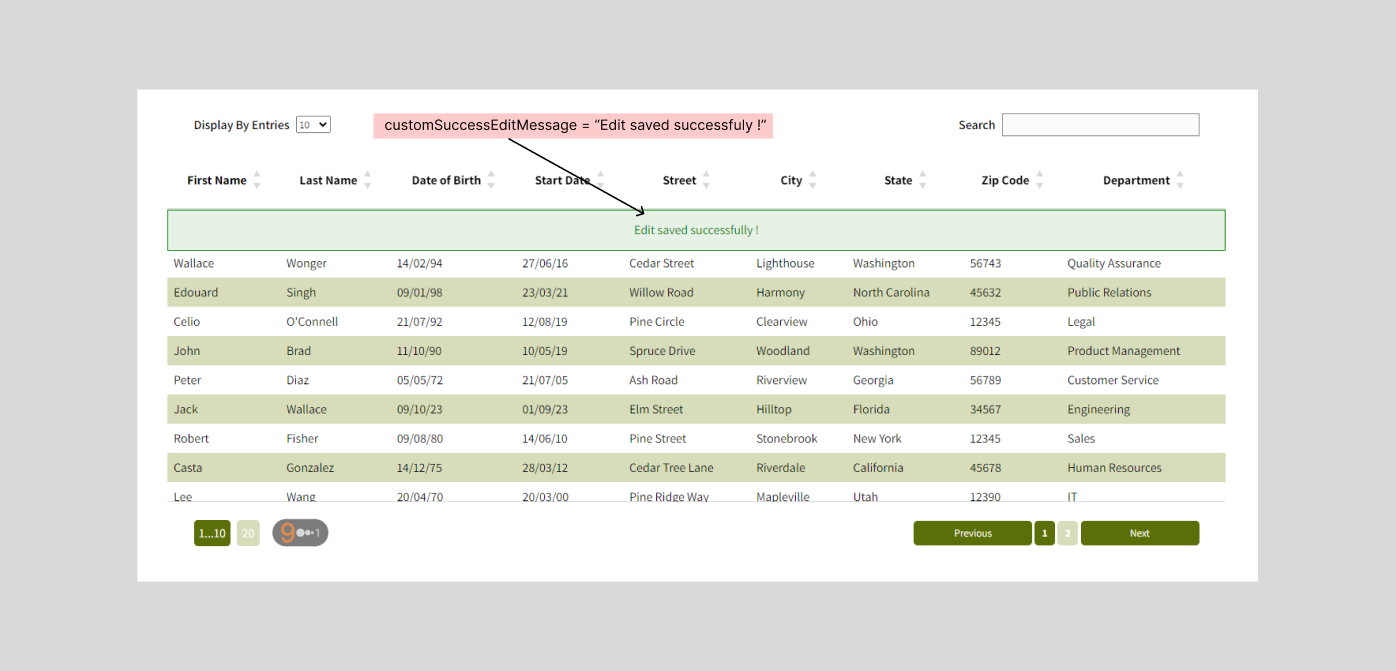
customSuccessEditMessage : Allows you to set a custom message that will be displayed upon successfully editing an item in the table.
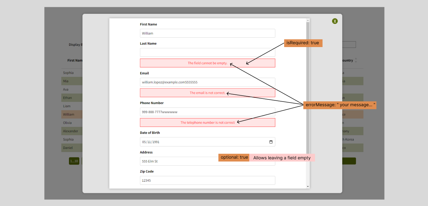
isRequired : Indicates whether a field must be filled in when submitting a form.
optional : Allows leaving a field empty when submitting the form if enabled.
errorMessage : A customizable error message for each field, displayed in case of validation failure to guide the user on correcting the error.Allows leaving a field empty when submitting the form if enabled.
By using these customization options, you can create a table that seamlessly fits the look and style of your application while providing a smooth and intuitive user experience.
<SuperTable
  data={employeesData}
  columnsTable={customColumnsTable}
  customLabelSearch="Search"
  customLabelFilter="Show"
  customTextPrevious="Previous"
  customTextNext="Next"
  customEmptySearchMessage="No results found."
  customSortedColumnBackgroundColor="#ffff99"
  customHoverBackgroundColor="#93ad18"
  customDarkBackgroundColor="#5a6f08"
  customLightBackgroundColor="#d7ddbb"
  customEvenRowBackgroundColor="#d7ddbb"
  editButton
  deleteButton
  handleEditForm={handleEditForm}
  handleDeleteItem={handleDeleteItem}
/>
Mobile Adaptability
Using Attributes isRequired, optional, and errorMessage
You can customize the behavior and validation of fields using the isRequired, optional, and errorMessage attributes when defining your table columns.
Here's an example of how to use these attributes:
const customColumnsTable = [
  { key: "firstName", label: "First Name", type: "text", isRequired: true },
  { key: "lastName", label: "Last Name", type: "text", isRequired: true },
  { key: "email", label: "Email", type: "email", errorMessage: "The email is not correct.", optional: true },
  { key: "phoneNumber", label: "Phone Number", type: "tel", errorMessage: "The telephone number is not correct", optional: true },
  { key: "dateOfBirth", label: "Date of Birth", type: "date", errorMessage: "Invalid date" },
  { key: "address", label: "Address", type: "text" },
  { key: "zipCode", label: "Zip Code", type: "number" },
  { key: "country", label: "Country", type: "text" },
];
Customizing Edit and Delete Functions in SuperTable
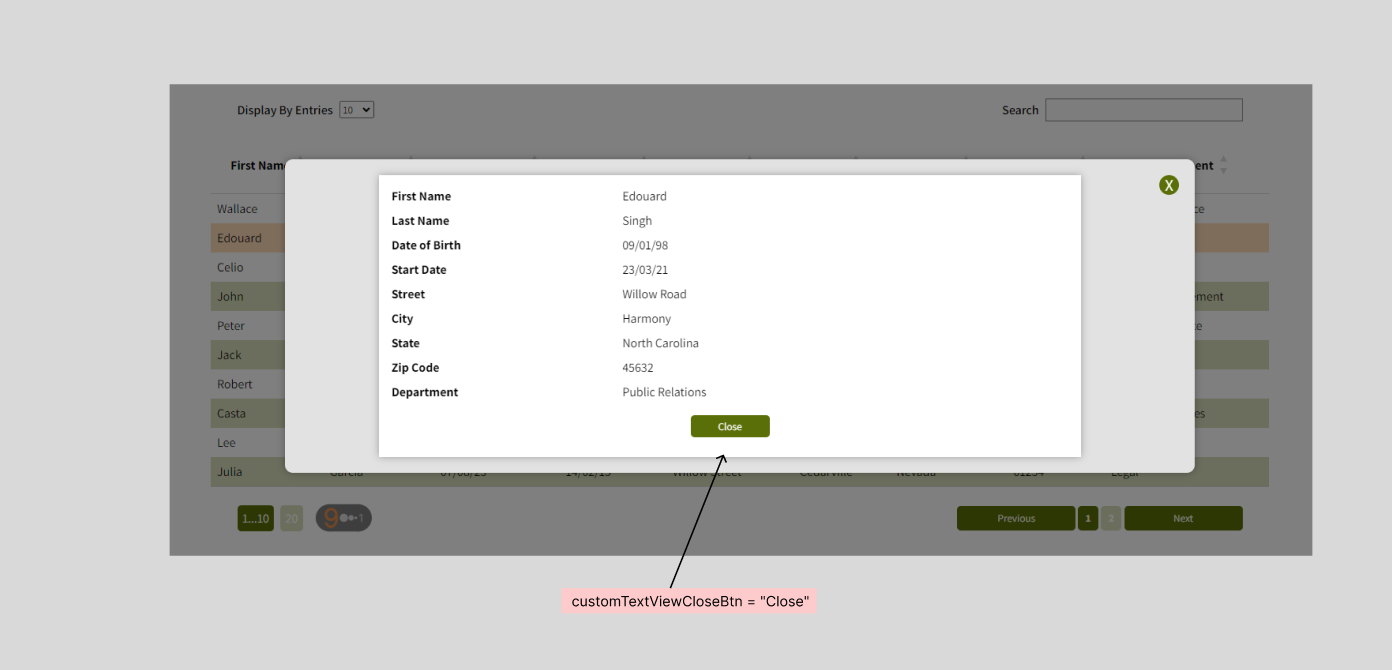
SuperTable provides the ability to customize edit and delete functions to allow users to edit and delete items directly from the table. Here's how to do it:
Keywords
- Data display
- React library
- Customizable table
- JavaScript
- Front-end development
- Data management
- Filter
- Search
- Pagination