0.0.6 • Published 2 years ago
svelte-choreography v0.0.6
svelte-choreography
Responsive Layout with SSR support, content re-ordering for correct tab-order (for accessibility), and retained focus.

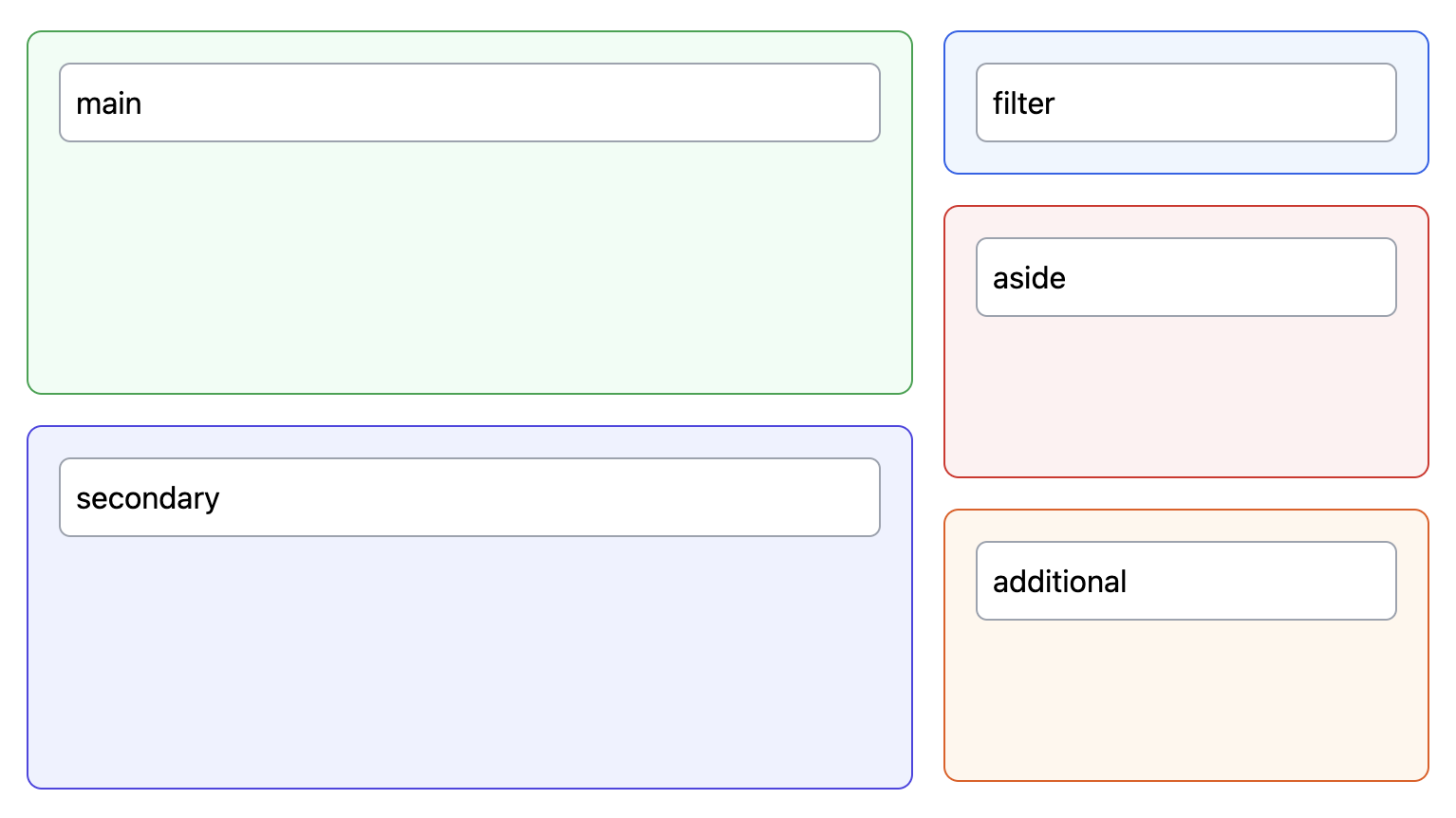
SSR support prevents any flicker on load whatever the breakpoint. The content re-ordering on change of breakpoint allows for layouts that cannot be achieved with CSS alone without breaking the tab-order. Click this then tab between inputs and try resizing the browser ...
Usage
Install using your package manager of choice, e.g.
pnpm i -D svelte-choreographyImport into a svelte component and define the beakpoints and layout (this is the layout used in the demo):
<script lang="ts">
  import { createBreakpoints, Responsive } from 'svelte-choreography'

  createBreakpoints({
    xs: 0,
    md: 768,
  })
</script>

{#snippet filter()}
  <div class="p-4 border border-blue-600 bg-blue-50 rounded-lg">
    <input class="p-2 border border-gray-400 w-full rounded-md" type="text" value="filter" />
  </div>
{/snippet}

{#snippet aside()}
  <div class="p-4 h-36 border border-red-600 bg-red-50 rounded-lg">
    <input class="p-2 border border-gray-400 w-full rounded-md" type="text" value="aside" />
  </div>
{/snippet}

{#snippet main()}
  <div class="p-4 h-48 border border-green-600 bg-green-50 rounded-lg">
    <input class="p-2 border border-gray-400 w-full rounded-md" type="text" value="main" />
  </div>
{/snippet}

{#snippet secondary()}
  <div class="p-4 h-48 border border-indigo-600 bg-indigo-50 rounded-lg">
    <input class="p-2 border border-gray-400 w-full rounded-md" type="text" value="secondary" />
  </div>
{/snippet}

{#snippet additional()}
  <div class="p-4 h-36 border border-orange-600 bg-orange-50 rounded-lg">
    <input class="p-2 border border-gray-400 w-full rounded-md" type="text" value="additional" />
  </div>
{/snippet}

<div class="mt-4 flex gap-4 flex-col md:flex-row">
  <div class="contents md:flex flex-col gap-4 flex-grow">
    <Responsive at={{ xs: filter, md: main }} />
    <Responsive at={{ xs: main, md: secondary }} />
  </div>
  <div class="contents md:flex flex-col gap-4 w-64">
    <Responsive at={{ xs: aside, md: filter }} />
    <Responsive at={{ xs: secondary, md: aside }} />
    <Responsive at={{ xs: additional, md: additional }} />
  </div>
</div>
Be sure to add node_modules/svelte-choreography/**/*.{html,js,svelte,ts} to the TailwindCSS content configuration or, alternatively, add the following classes to the safelist:
contents,sm:contents,md:contents,lg:contents,xl:contents,2xl:contentshidden,sm:hidden,md:hidden,lg:hidden,xl:hidden,2xl:hidden