Licence
MIT
Version
0.6.0
Deps
2
Size
18 kB
Vulns
6
Weekly
0
svelte-swiper-matrix


A minimal swiper for Svelte
Contents
Features
- Intuitive matrix layout
- One component, few-to-no props
- No or ; just swipe (mobile) or use arrow keys / mouse wheel
Install
npm i svelte-swiper-matrixUsage
To properly display swiper arrows, add the following to *.css:
@import "material-symbols";Or *.svelte;
<script>
  import "material-symbols";
</script>
Then, simply do something like this:
<script>
import { Swiper } from "svelte-swiper-matrix";
</script>
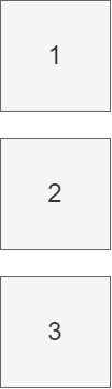
<Swiper dim="2x1">
<div class="full-size">...</div>
<div class="full-size">...</div>
</Swiper>
<style>
.full-size {
width: 100%;
height: 100%;
}
</style>- Each
Swiperchild is positioned in the next available cell - In general,
Swiperchildren should be fully sized containers
dimprop can actually be omitted for one-column matrices like2x1,3x1, etc.
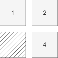
Make sure the number of Swiper children
==the number of available cells
- If your browser shows an
outlinearound Swiper whenfocus:visibleis triggered, remove it like this:#swiper:focus-visible { outline: none; }
Props
| Prop Name | Type | Default Value | Description |
|---|---|---|---|
dim |
string |
"${children.length}x1" |
Swiper row x col dimensions |
omit |
number[] |
[] |
Swiper cells to omit |
noArrows |
boolean |
false |
Boolean for hiding arrows |
arrowProps |
Record<string, any> |
{} |
SwiperArrows.$restProps |
Technically, all props are optional
Examples
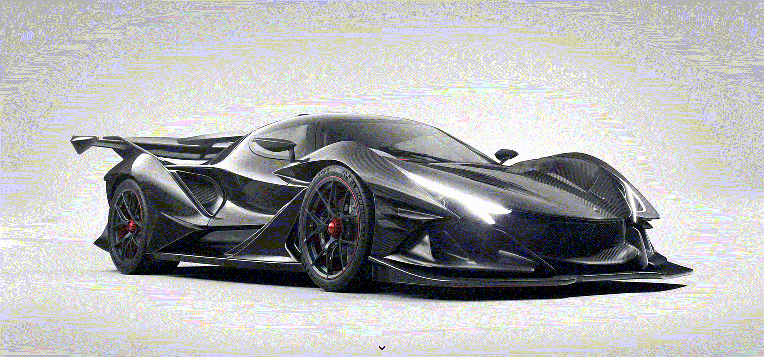
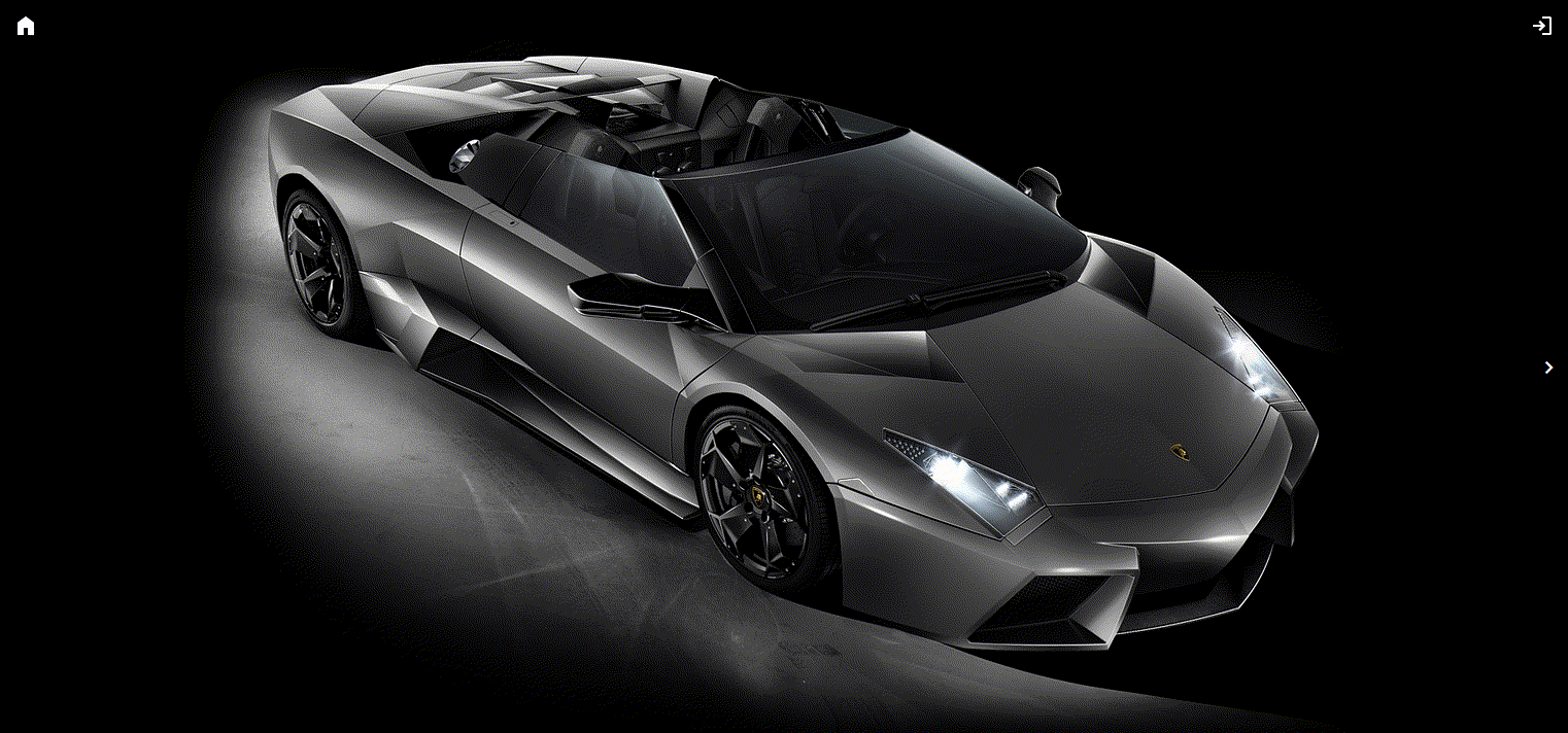
Car images source: https://www.wsupercars.com/