0.0.6 • Published 1 year ago
svelte-tailwind-colorpicker v0.0.6
Tailwind Color Picker for Svelte
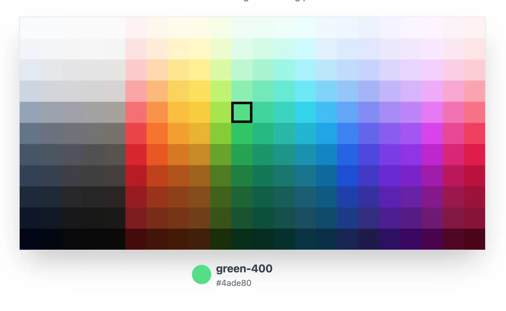
A simple, customizable color picker component for Svelte that uses Tailwind CSS color palettes.

Features
- HTML Canvas for optimal performance
- Flexible color options: Use Tailwind default colors or your own
- Lightweight with no dependencies
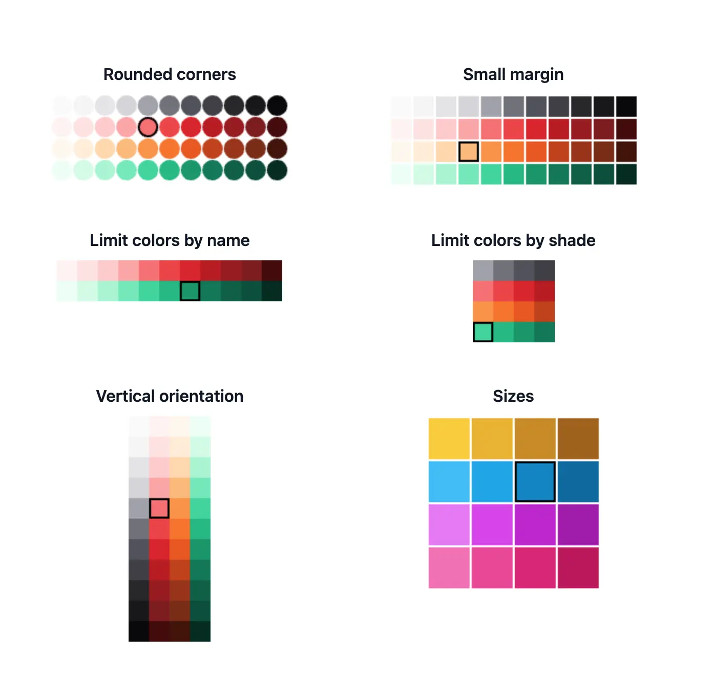
- Customizable appearance (size, margins, borders, rounded corners)
- Vertical or horizontal orientation
- Ability to limit color and shade choices

Installation
npm i svelte-tailwind-colorpickerUsage
- Import the component in your Svelte file:
import TailwindColorPicker from 'svelte-tailwind-color-picker';- Use the component in your Svelte template:
<TailwindColorPicker bind:activeSwatch />- Access the selected color:
{#if activeSwatch}
	<p>Selected color: {activeSwatch.color}-{activeSwatch.shade} ({activeSwatch.swatch.hex})</p>
{/if}
Props
| Prop | Type | Default | Description |
|---|---|---|---|
| swatchSize | number | 35 | Size of each color swatch |
| swatchMargin | number | 0 | Margin between swatches |
| borderColor | string | '#000000' | Border color of swatches |
| borderThickness | number | 4 | Border thickness of swatches |
| roundedCorners | boolean | false | Enable rounded corners |
| cornerRadius | number | 0 | Radius of rounded corners |
| orientation | 'horizontal' | 'vertical' | 'horizontal' | Orientation of the color picker |
| includeColors | string[] | all colors | Array of color names to include |
| includeShades | string[] | all shades | Array of shade values to include |
| activeSwatch | ActiveSwatch | null | null | Currently active swatch (optional) |
| palette | ColorGroup[] | tailwindColors | Custom color palette |
Examples
Basic Usage
<TailwindColorPicker bind:activeSwatch />Customized Appearance
<TailwindColorPicker
	swatchSize={40}
	swatchMargin={2}
	borderColor="#cccccc"
	borderThickness={2}
	roundedCorners={true}
	cornerRadius={8}
	orientation="vertical"
	includeColors={['red', 'blue', 'green']}
	includeShades={['400', '500', '600']}
	bind:activeSwatch
/>
Handling Color Selection
<script>
	import TailwindColorPicker from 'svelte-tailwind-color-picker';
	import type { ActiveSwatch } from 'svelte-tailwind-color-picker';

	let activeSwatch: ActiveSwatch | null = null;

	function handleColorChange(event: CustomEvent<ActiveSwatch>) {
		const selectedSwatch = event.detail;
		console.log(`Selected color: ${selectedSwatch.color}-${selectedSwatch.shade}`);
		console.log(`Hex value: ${selectedSwatch.swatch.hex}`);
	}
</script>

<TailwindColorPicker bind:activeSwatch on:change={handleColorChange} />
Using a Custom Palette
<script>
	import TailwindColorPicker from 'svelte-tailwind-color-picker';
	import type { ColorGroup } from 'svelte-tailwind-color-picker';

	const customPalette: ColorGroup[] = [
		{
			name: 'customRed',
			swatches: {
				'500': { hex: '#ff0000' },
				'600': { hex: '#cc0000' },
				'700': { hex: '#990000' },
			}
		},
		// Add more custom color groups as needed
	];
</script>

<TailwindColorPicker palette={customPalette} />
Development
To set up the project for development:
- Clone the repository
- Install dependencies with
npm install - Start the development server with
npm run dev
Building
To build the library:
npm run packagePublishing
To publish the library to npm:
- Update the version in
package.json - Build the package
- Run
npm publish
License
MIT License