Licence
MIT
Version
1.0.4
Deps
4
Size
28 kB
Vulns
21
Weekly
0
Tagelect.js


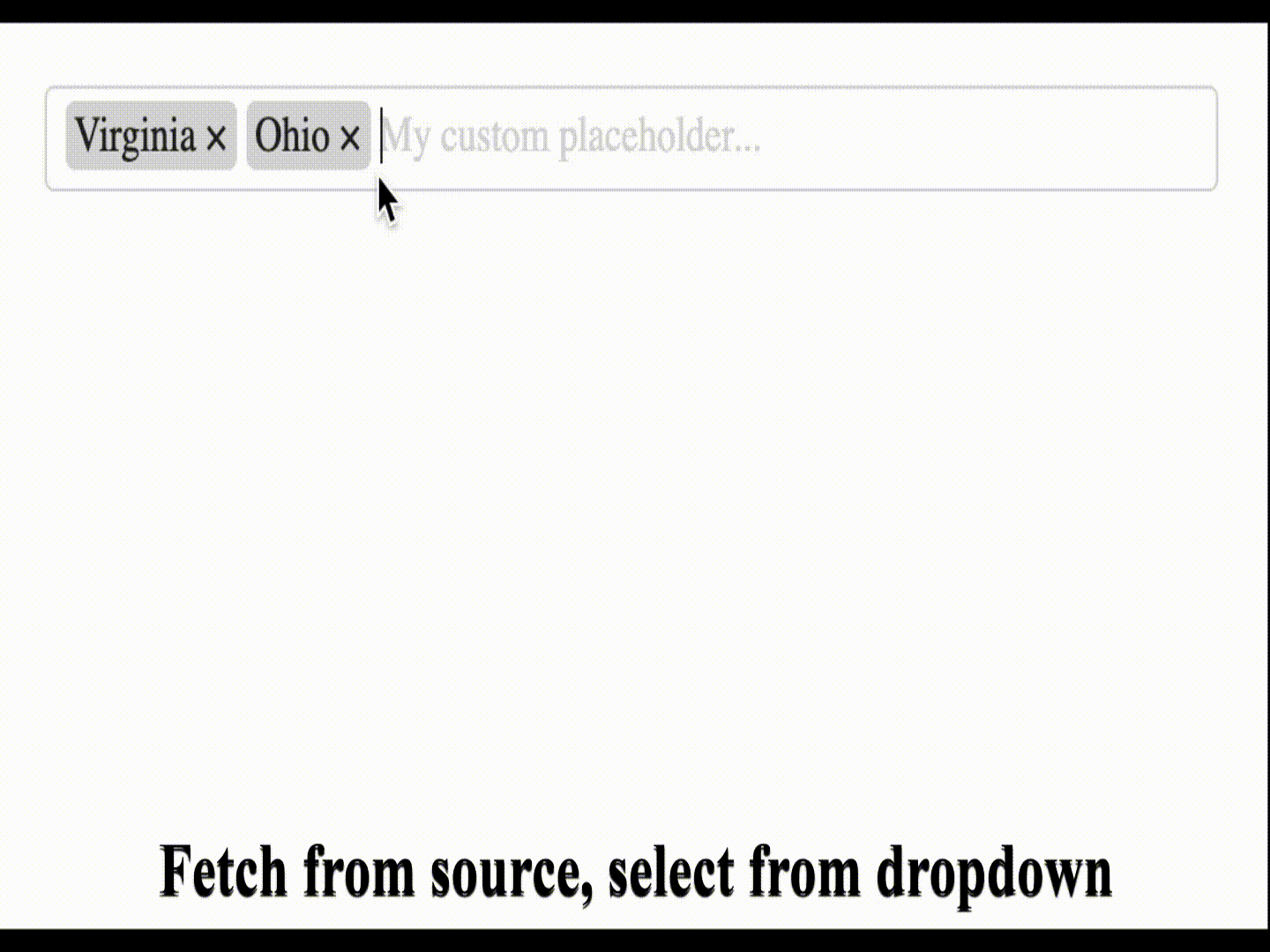
Simple and neat tag input element that allows you to enter new tags, performs auto-completion fetching from specified source and has tag validations.
Key features
- Allow user to add and remove tags
- Can have an auto-complete from source
- Tab-completes the first suggestion from source
- Has validations for duplicate tags, maximum allowed tags and tag format
- Has a default set of CSS style rules , but custom class names can be specified
Getting started
Install package
With NPM:
npm install tagelectWith Yarn:
yarn add tagelectUsage
Tagelect can be initialized with options or without giving any options.
Without any options
  import Tagelect from 'tagelect';
  import 'tagelect/dist/tagelect.min.css';

  const myInput = document.getElementById('my-input');
  new Tagelect(myInput);
With options
  import Tagelect from 'tagelect';
  import 'tagelect/dist/tagelect.min.css';

  const myInput = document.getElementById('my-input');
  // These are the default options.
  // You should specify only the ones you want to change.
  const options = {
    maxTags: undefined,
    maxTagsError: "can't contain more than %TAGS% tags",
    validationRegex: undefined,
    validationRegexError: 'permitted characters used',
    noDuplicates: false,
    noDuplicatesMessage: 'duplicates are not allowed',
    placeholder: 'Enter a tag...',
    removeButton: true,
    tagDelimiter: ',',
    suggestionsCount: 5,
    suggestionHeaders: () => ({}),
    suggestionsSource: null,
    classNames: {
      wrapper: 'tagelect',
      container: 'tagelect-content',
      tagInput: 'tagelect-input',
      tag: 'tagelect-tag',
      removeButton: 'tagelect-tag-remove-btn',
      tagText: 'tagelect-tag-text',
      dropdown: 'tagelect-dropdown',
      dropdownItem: 'tagelect-dropdown-item',
      dropdownItemSelected: 'tagelect-dropdown-item--selected',
      error: 'tagelect-error'
    }
  }

  new Tagelect(myInput, options);
Options
| Option | Type | Description |
|---|---|---|
| maxTags | Number | if set validates that up to the number of tags only |
| maxTagsError | String | validation message for max. tags validation |
| validationRegex | Regex | if set validates that new tags match the regex |
| validationRegexError | String | validation message for tag regex validation |
| noDuplicates | Boolean | if true, duplicates tags are not allowed |
| noDuplicatesError | String | validation message for duplicate tags validation |
| placeholder | String | placeholder for the tag input |
| removeButton | Boolean | if true, tags have a remove button |
| tagDelimiter | String | delimiter used to read or write to input value |
| suggestionsCount | Number | number of suggestions that are fetched from source |
| suggestionHeaders | Function | func. returning headers to send when fetching suggestions |
| suggestionsSource | String | if set, enables the fetching of suggestions from this URI |
| classNames | Object | can be used to set custom classes for various elements |
CSS customization
Tagelect can be initialized with custom CSS classes (by providing the classNames option),
but you can also use the default CSS classes and re-assign the CSS variables with your own colors to match your color scheme.
These are the default variable values:
  --tagelect-text-color: #232323;
  --tagelect-bg-color: white;
  --tagelect-border-color: #d9d9d9;
  --tagelect-tag-bg-color: #d9d9d9;
  --tagelect-placeholder-color: #d9d9d9;
  --tagelect-remove-btn-color: #232323;
  --tagelect-remove-btn-hover-color: #ea0000;
  --tagelect-dropdown-bg-color: white;
  --tagelect-dropdown-text-color: #232323;
  --tagelect-dropdown-border-color: #d9d9d9;
  --tagelect-dropdown-hover-color: #232323;
  --tagelect-dropdown-hover-bg-color: #e3e3e3;
  --tagelect-suggestion-color: #d9d9d9;
  --tagelect-error-color: #ea0000;