tailspin.css v1.0.7
Tailspin.css
Tailspin is a customizable, class-based, utility-first CSS library that helps you work within the constraints of a unified system, instead of littering style sheets with arbitrary values. It’s purpose is to help with rapid front-end style development, which is based on consistent design patterns. It can work with any other framework or library such as Bootstrap or React.
Tailspin acts as a single source library of truth, for repeating utility styles in your code.
Skip the boring stuff, and check out the guide.
How To Use
- Install using npm.
npm i tailspin.css- Choose a Tailspin CSS type for your project. You can either use all of Tailspin, or pick and choose multiple or individual utilities, helpers, and/or modifiers. Each type has its very own CSS file.
tailspin-all.min.css
tailspin-helpers-animations.min.css
tailspin-modifiers-border-radius.min.css
tailspin-modifiers-font-size.min.css
tailspin-modifiers-margin-padding.min.css
tailspin-modifiers-opacity.min.css
tailspin-modifiers-z-index.min.css
tailspin-utilities-ratios.min.css
tailspin-utilities-typography.min.css
tailspin-utilities.min.css
Example
<link rel="stylesheet" type="text/css" href="tailspin.css/prod/css/tailspin-all.css" media="all">- Include the Fill Media to Container javascript file written by John Ludena.
This file will work with either tailspin-all.min.css or tailspin-utilities.min.css.
tailspin-fill.media.to.container.jsExample
<script type="text/javascript" src="tailspin.css/prod/js/fill.media.to.container.js"></script>- Add classes to your code.
The following code will display a div block, with 30 pixels (converted to rems) of padding, and a border. The paragraph inside the div block has zero margin, and a font size of 20 (1.25rem by default).
<div class="padding-30 border">
  <p class="margin-0 font-size-20">This is a paragraph of text.</p>
</div>
How To Customize
Tailspin is a compilation of several individual SCSS files that run through a set of task modules using Webpack. Customizing Tailspin is a two step process. The first process is modifying a configuration settings SCSS file called _vars.scss. The second process is compiling all the files using Webpack and npm.
Modify The SCSS Settings
Tailspin comes packaged with a settings SCSS file called _vars.scss.
This file can be located under \dev\src\css\settings.
The following items are currently available to modify in the Tailspin library.
- Border Radius - define the maximum border radius
- Breakpoints - defining breakpoint minimum widths
- Default Border Color - change the color
- Font Sizes - define an incremental value, and maximum font size
Example - an incremental value of 2 with a maximum size of 40 will produce 2, 4, 6, 8 … 38, 40 - Margins - define the maximum value needed
Example - margin: 0 to margin: 60 and all values in between - Padding - define the maximum value needed
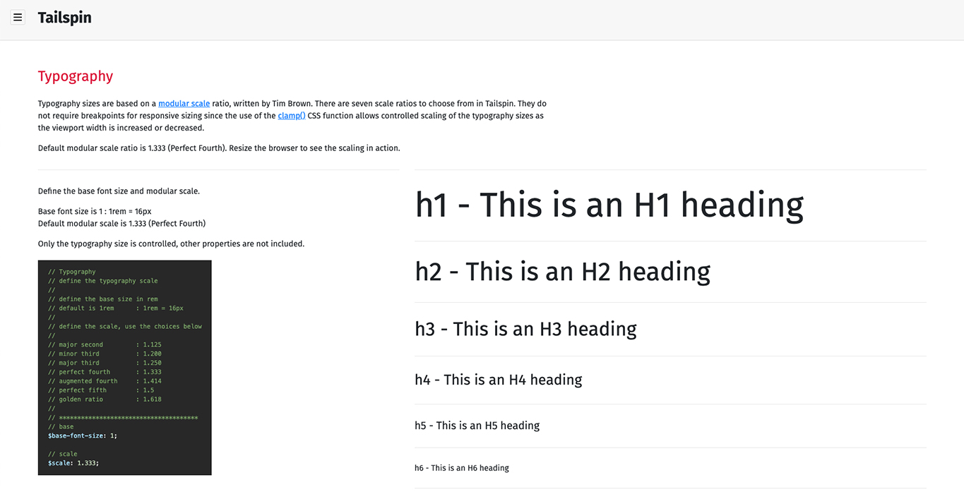
Example - margin: 0 to margin: 60 and all values in between - Typography - based on an algorithmic scale, you can define a base size, and a predefined scale
- Z-Index - define an incremental value, and maximum z-index
Example - an incremental value of 5 with a maximum size of 50 will produce 5, 10, 15, 20 … 45, 50
Here is an example for defining the maximum margin value in the settings file.
Changing the $max-margins variable will define the maximum value margins will end at. Below, the margins start at a minumum value of 0, and will end at a maximum value of 90, and will produce all values in between (0 thru 90).
// Margin
// define the maximum margin value needed
//
// example: margin: 0px to margin: 90px and all values in between
//
// **************************************
$max-margin: 90;
The output from the above setting will produce the following CSS.
.margin-0 {
  margin: 0rem !important; }
.margin-1 {
  margin: 0.0625rem !important; }
.margin-2 {
  margin: 0.125rem !important; }

// ending at ...

.margin-90 {
  margin: 5.625rem !important; }
Use the classes in your markup.
<div class="margin-left-right-30">
  <p class="margin-0">This is a paragraph of text.</p>
</div>
Naming Patterns
Tailspin classes use a consistent naming pattern with full words, no abbreviations.
Below are examples of naming patterns and is a small indication of what class names are available.
.margin-5
.margin-left-5
.margin-right-5
.margin-left-right-5
.margin-top-5
.margin-bottom-5
.margin-top-bottom-5

.border-radius-5
.border-radius-6
.border-radius-7
Responsiveness
Some, not all, classes come with a responsive naming pattern.
Below are examples of responsive naming patterns and is a small indication of what class names are available.
.tablet-margin-5
.tablet-margin-left-5
.tablet-margin-right-5
.tablet-margin-left-right-5

.phone-margin-5
.phone-margin-left-5
.phone-margin-right-5
.phone-margin-left-right-5
Sample Page & Guide
A sample page comes packaged with Tailspin that includes all Tailspin functionality, displays explanations with code snippets, and working animation examples. The page is a full guide to using the Tailspin library. The page can also be used to test any modifications made to the _vars.scss settings file on a local development environment, and uses the compiled development version of the library.
Check out the sample page guide here.

Compiling
There are two different configurations of the compiled SCSS files.
- A version for development, used for updates and testing (webpack.config.dev.js).
- A version for production, which produces the files to add to projects (webpack.config.prod.js).
To compile the development version, run the following command within OSX Terminal or Windows Terminal.
npm run watchTo compile the production version, run the following command within OSX Terminal or Windows Terminal.
npm run buildThings To Keep in Mind
- Pixel units are automatically converted to rem units using Webpack.
- Inline styles will not override Tailspin CSS classes.
- When customizing the _vars.scss settings file, the larger any maximum values are, the larger the compiled CSS file sizes will be.
- There is a separate font-size CSS file, and the typography CSS file. The font-size CSS file is for adding generalized font size classes, and the typography CSS file is for establishing a specific base font size, and automatically sizing heading elements.
- Font size classes can override the heading element sizes, but only if a font size class is added to a heading element.