tailwindcss-antdesign-preset v0.1.7
tailwindcss-antdesign-preset
Make ant design tokens to a tailwindcss theme config preset
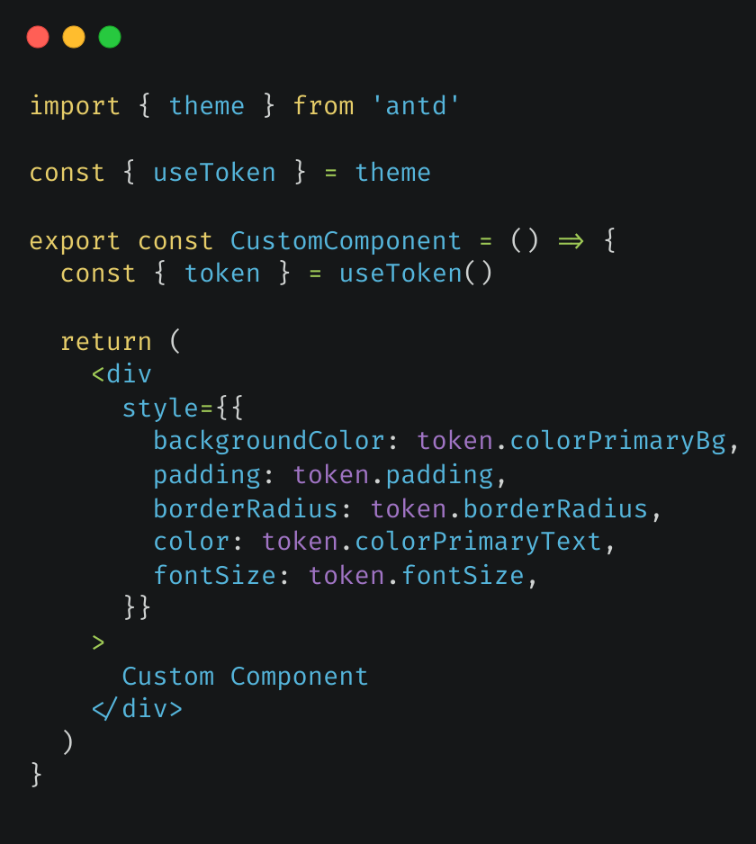
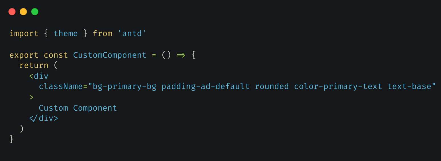
Result on custom components
| Before | After |
|---|---|
 |  |
NOTE
This package is used to make your custom components' design more consistent with ant design like above code. For ant design components's className, you may need to add important modifier in nextjs projects since the globals.css file is imported before ant design components style
Here's the sample code(only for example, the danger attribute is more suitable for red buttons):
// This won't work
const CustomAntButton = () => <Button className="p-0 bg-error">Custom Button</Button>

// This works
const CustomAntButton = () => <Button className="!p-0 !bg-error">Custom Button</Button>
Usage
Prerequisites
antd:antdpackage(version > 5) is installed for your projecttailwindcss:tailwindcssis installed and configured for your project
Copy file
Copy index.js to your project and use it. You need to install lodash.kebabcase to convert the camelCase tokens to tailwind's kebab-case(tailwind suggested) and lodash.merge to merge preset
Install npm package
Run the command:
# npm
npm i -D tailwindcss-antdesign-preset

# yarn
yarn add --dev tailwindcss-antdesign-preset

# pnpm
pnpm add -D tailwindcss-antdesign-preset

# bun
bun add --dev tailwindcss-antdesign-preset
Use default theme
Add to tailwind.config.js(or tailwind.config.ts)
const config = {
  presets: [require('tailwindcss-antdesign-preset')()],
  // ...other settings
}
Use custom theme
You can use ant design's theme config object to define custom theme. Here's the example:
// Define your theme somewhere

const customTheme = {
  token: {
    colorPrimary: '#00b96b',
  },
}

// Use it in your ConfigProvider Component

function Layout({ children }) {
  return <ConfigProvider theme={customTheme}>{children}</ConfigProvider>
}

// Use it in tailwind css config

const config = {
  presets: [require('tailwindcss-antdesign-preset')(customTheme)],
  // ...other settings
}
Default preset
Look at the sample file or preview page
Available configs
Special
I've found these special rules in my use. If you'v found a special rule, issue or pull request is welcomed
- ant design token
colorIconto tailwindcsstheme.extend.color.iconc(usage:text-iconc)- explain: text-icon includes two styles in tailwindcss:
fontSize.iconandcolor.icon. Split them for a better readability
- explain: text-icon includes two styles in tailwindcss:
- ant design token
colorTextto tailwindcsstheme.extend.color.textc(usage:text-textc)- explain: better readibility instead of
text-text
- explain: better readibility instead of
Override
These ant design tokens override tailwindcss theme default values:
| Ant Design | TailwindCSS Config | Example Usage |
|---|---|---|
| variant colors(blue, etc.) | theme.color.*.{ variant(1-10): color } | bg-blue/text blue |
| fontSize* | theme.fontSize.* | text-sm |
| fontFamily* | theme.fontFamily.* | font-mono/font-sans |
| borderRadius* | theme.borderRadius.* | rounded-md |
| screen* | theme.screens.* | sm: |
Extend
These ant design tokens extend tailwindcss theme config:
| Ant Design | TailwindCSS Config | base |
|---|---|---|
| extend colors(colorBg, etc.) | theme.extend.color.* | |
| padding* | theme.extend.padding.* | v |
| margin* | theme.extend.margin.* | v |
| size* | theme.extend.size.* | v |
| boxShadow* | theme.extend.boxShadow.* | v |
| lineHeight* | theme.extend.lineHeight.* | v |
base: you need use such as padding-base for ant design default value(padding)