termblock v1.0.0
What it is
A small, stateless react library that lets you render faux terminals with command inputs and outputs.
Example usage
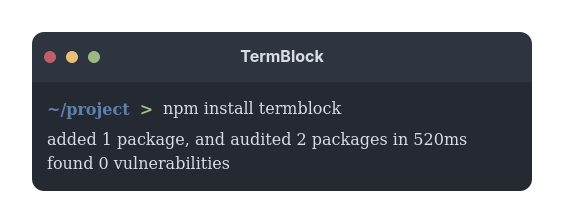
For the absolute basic usage, you probably only want to render a single terminal with a single command, and the text that the command outputs. For example:
import TermBlock from "termblock";

function App() {
  return (
    <TermBlock
      commands={[
        {
          command: "npm install termblock",
          output: [
            "added 1 package, and audited 2 packages in 520ms",
            "found 0 vulnerabilities",
          ],
        },
      ]}
    />
  );
}
Themes
Themes can either be configured globally or provided as props when you render each terminal (or a combination of both!).
Built in themes
There are a few built in themes, and this list is expected to continue to grow.
Nord

One Dark Pro

Paper Color

Windows 10

MacOS

Custom theme
You can create your own theme by creating an object that implements either the TerminalTheme or PartialTerminalTheme interface. For example:
import { TerminalTheme } from "termblock";
const customTheme: TerminalTheme = {
  titleBar: {
    colors: {
      background: "#2b2a28",
      foreground: "#c4a244",
    },
    buttons: {
      colors: {
        close: "#a53731",
        max: "#585e3c",
        min: "#b4a681",
      },
    },
  },
  content: {
    colors: {
      background: "#585e3c",
      foreground: "#b4a681",
      context: "#c4a244",
      separator: "#2b2a28",
      scrollbar: "#585e3c",
    },
  },
  footer: {
    colors: {
      background: "#585e3c",
      foreground: "#b4a681",
    },
  },
},
Note:
If you want to apply a custom global theme, you must implement the TerminalTheme interface (see Configure global theme). Otherwise, if you just want to override certain styles of the global theme, you can implement PartialTerminalTheme and pass that object in to the TermBlock component's theme prop (see Theme props).
Configure global theme
To configure a theme globally, you need to call the configureGlobal function and pass in the theme you want. For example:
import TermBlock, { themes } from "termblock";
themes.configureGlobal(themes.oneDarkPro);
Note that you only need to do this once, so probably most suitable to do this in your App.tsx.
Theme props
In addition to configuring a global theme, you can also pass in a theme to the TermBlock component. For example:
import TermBlock, { themes } from "termblock";

function App() {
  return <TermBlock theme={themes.paperColor} />;
}
Note that all properties of the theme props are optional. Any values provided will be the priority, and any props omitted will fall back on the global theme. For example, the following will simply override the default button position, and the rest of the global theme will apply:
import TermBlock, { PartialTerminalTheme } from "termblock";

const partialCustomTheme: PartialTerminalTheme = {
  titleBar: {
    buttons: {
      position: "right"
    }
  }
};

function App() {
  return <TermBlock theme={{ titleBar: { buttons: { position: "right" } } }} />;
  // or
  // return <TermBlock theme={partialCustomTheme} />;
}