themer-utils v1.2.0
themer 


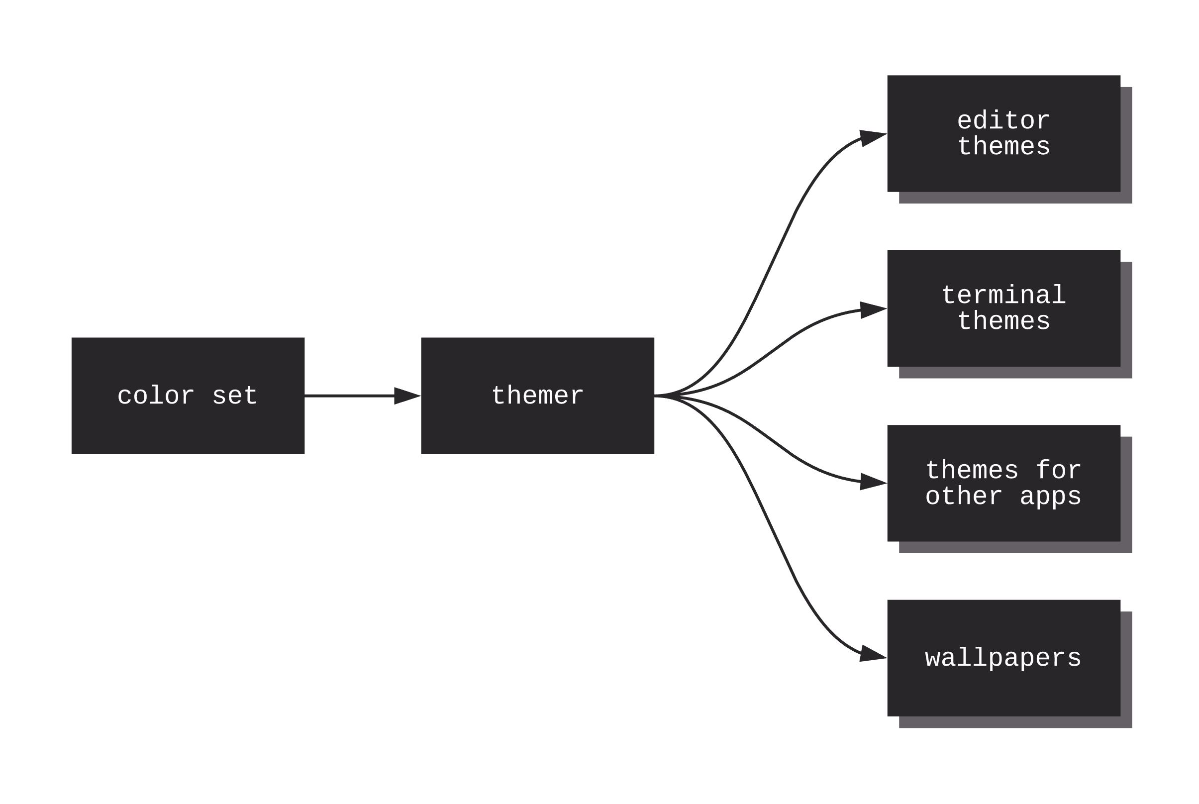
themer takes a set of colors and generates editor themes, terminal themes, themes for other apps, and desktop/device wallpapers.

Table of Contents
Installation
Don't love the command-line? Check out the Web UI.
mkdir my-dotfiles && cd my-dotfiles
npm install themer
If you do not keep your dotfiles under version control, you can simply install themer globally with npm -g install themer.
themer can also be used without installing, via npx—see example below.
Usage
Pass themer a color set, as many templates as you wish, and an output directory.
themer \
  --colors <npm package name OR file> \
  --template <npm package name OR file> \
  [--template <npm package name OR file>...] \
  --out <directory>
themer can create themes from your custom color sets (see "Create your own color set" below) or from color sets published on npm (see themer-colors-default). The same is true for templates.
Example workflow
Say you wanted to generate a vim theme and desktop background using themer's default color set. First, install themer, the color set, and the templates:
cd my-dotfiles
npm install themer themer-colors-default themer-vim themer-wallpaper-block-wave
Then edit your package.json:
  ...
  "scripts": {
    "build": "themer -c themer-colors-default -t themer-vim -t themer-wallpaper-block-wave -o gen"
  },
  ...
Then run your new script:
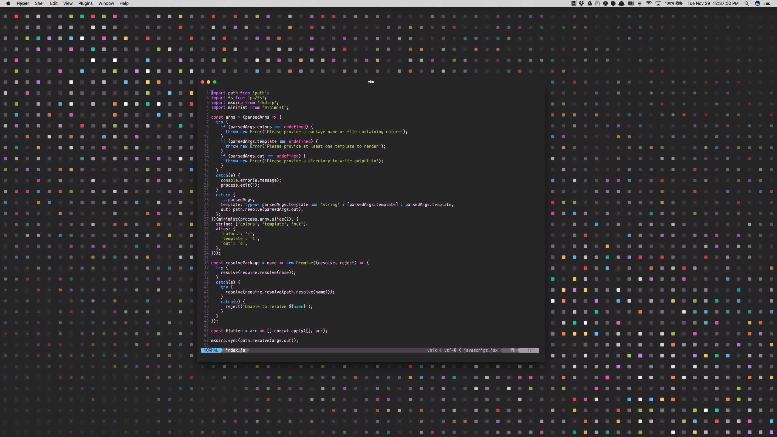
npm run buildNow check the gen/ folder for your generated themes. Here's the result:

Example usage with npx
npx \
  -p themer \
  -p themer-colors-default \
  -p themer-vim \
  -p themer-wallpaper-block-wave \
  themer \
  -c themer-colors-default \
  -t themer-vim \
  -t themer-wallpaper-block-wave \
  -o output
Themer color sets
Original color sets
| Name | Dark Preview | Light Preview |
|---|---|---|
| themer-colors-default |  |  |
| themer-colors-night-sky |  | (dark only) |
| themer-colors-polar-ice |  |  |
| themer-colors-finger-paint |  |  |
| themer-colors-monkey |  |  |
Ports from third-party themes
| Name | Dark Preview | Light Preview |
|---|---|---|
| themer-colors-one |  |  |
| themer-colors-lucid |  |  |
| themer-colors-solarized |  |  |
| themer-colors-github-universe |  | (dark only) |
| themer-colors-nova |  | (dark only) |
| themer-colors-mojave |  |  |
| themer-colors-rivet |  |  |
Create your own color set
To create your own color set, create a JavaScript file that exports a colors object, like so:
module.exports.colors = {

  // A color set can have both light and dark variants, but is only required
  // to have one.
  dark: {

    // Colors can be defined in any valid CSS format.

    // accent0-7 should be the main accent colors of your theme. See the table
    // in the "Color mappings" section for how the colors will be used in your
    // new themes.
    accent0: '#FF4050',
    accent1: '#F28144',
    accent2: '#FFD24A',
    accent3: '#A4CC35',
    accent4: '#26C99E',
    accent5: '#66BFFF',
    accent6: '#CC78FA',
    accent7: '#F553BF',

    // shade0-7 should be shades of the same hue, with shade0 being the
    // background and shade7 being the foreground. If you omit the
    // intermediate shades (1 through 6), they will be calculated automatically
    // for you.
    shade0: '#282629',
    shade1: '#474247',
    shade2: '#656066',
    shade3: '#847E85',
    shade4: '#A29DA3',
    shade5: '#C1BCC2',
    shade6: '#E0DCE0',
    shade7: '#FFFCFF'

  },

  // Same as above, except that shade0 should be the lightest and shade7 should
  // be the darkest.
  light: { ... },

};
Then pass the path to your JS file to the --colors argument of themer.
themer -c path/to/my/colors.js ...Color mappings
To help you choose colors for your own color set, this is approximately how most themer templates will utilize your colors:
| Color Key | Typical Usage |
|---|---|
accent0 | error, VCS deletion |
accent1 | syntax |
accent2 | warning, VCS modification |
accent3 | success, VCS addition |
accent4 | syntax |
accent5 | syntax |
accent6 | syntax, caret/cursor |
accent7 | syntax, special |
shade0 | background color |
shade1 | UI |
shade2 | UI, text selection |
shade3 | UI, code comments |
shade4 | UI |
shade5 | UI |
shade6 | foreground text |
shade7 | foreground text |
Tips
- If you omit
shade1throughshade6,themerwill interpolate them automatically for you, using color-steps. themersupports any valid CSS color format; that means you can usechartreuse,rgb(127, 255, 0),rgb(50%, 100%, 0%),#7FFF00,hsl(90, 100%, 50%), etc.- I would recommend checking your color set into your dotfiles repo. Once you've fine-tuned it, you might consider publishing it to npm for others to use! (If you do, consider naming your package starting with
themer-colors-so that others can easily find it.)
Using base16 schemes with Themer
In place of a themer color set file or npm package, you can also provide themer with any base16 scheme YAML file.
themer --colors path/to/base16-scheme.yml ...Refer to the base16 repository for a list of base16 schemes.
Themer templates
Terminals
- themer-hyper
- themer-iterm
- themer-terminal
- agarrharr/themer-gnome-terminal
- themer-conemu
- themer-cmd
- 0x52a1/themer-termite
- 0x52a1/themer-kitty
Editors/IDEs
- themer-atom-syntax
- themer-atom-ui
- themer-sublime-text
- themer-vim
- themer-vim-lightline
- themer-vscode
- themer-xcode
- themer-bbedit
- tomselvi/themer-jetbrains
Wallpapers
- themer-wallpaper-block-wave
- themer-wallpaper-octagon
- themer-wallpaper-triangles
- themer-wallpaper-trianglify
- themer-wallpaper-shirts
Other
- themer-slack
- themer-alfred
- themer-brave
- themer-chrome
- PDDStudio/themer-android
- themer-sketch-palettes
- tomselvi/themer-tmux
Create your own template
To create your own template, create a JavaScript file that exports a render function, like so:
module.exports.render = function(colors, options) {

  // colors is an object that will have one or both keys: 'light' and
  // 'dark', each being an object with keys 'accent0' through 'accent7'
  // and 'shade0' through 'shade7'.

  // options is an object representing the original command-line args
  // passed to themer. This allows you to add special arguments that
  // will apply only to your template. An example of this is allowing a
  // themer user to specify custom resolutions for rendering a wallpaper.

  // This function should return an array of Promises, each Promise
  // resolving to an object of the following structure:
  // {
  //   name: '<the name of the file to be written>', // can include subdirectories, too
  //   contents: <a Buffer of the contents of the file to be written>,
  // }

};
Your JS file can then be passed to a --template argument of themer. That's it!
Here's an example template render function that generates a Slack sidebar theme from a themer color set.
Once you've developed your template, consider publishing it on npm (with repository name starting with themer-) so that others can use it!
About
themer is inspired by trevordmiller/nova and chriskempson/base16.
Conceptually, themer is very similar to base16, but:
- It is lighter, and simpler to use.
- It is more easily extensible with your own color sets and templates.
- It integrates better with your dotfiles, especially if you keep them under version control.
Themer's Web UI
If you'd prefer to develop your themes visually, check out themer's Web UI, an offline-ready Progressive Web App.