0.0.2 • Published 5 years ago
time-picker-io v0.0.2
TimePicker
This library currently uses Luxon.
Typescript friendly.
An accessible and customisable React TimePicker.
This is fork from @bonobos repo and from the repo below. This is a simplified fork of rc-time-picker with the following changes:
Styling
- uses styled components instead of less
- uses flexbox for columns instead of floating & fixed widths
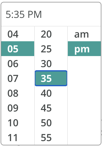
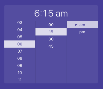
- the panel now expands inline instead of popping above the content
- in collapsed state the element is now a div (instead of an input). AM/PM is separated so it can be styled independently:


Accessibility improvements
- keyboard navigation
- press space/enter to open or select options
- press escape to close panel
- change time and navigate between lists with arrow keys
- focus trap
- focus stays within open time picker panel and doesn't get lost to background content
- when the panel is expanded the input is focused, and focus is returned when collapsed
- uses ul/li elements with radiogroup/radio roles - so when you select hour 3 screenreader will read "3, radio, 1 of 12, Select hour, radio group".
- This also allows for navigating between radio groups (from "Select hour" to "Select minute") in Group mode.
aria-checkedis used to indicate the currently selected element
- screen-reader friendly
aria-labels with no leading zeros (so screenreader says "one" instead of "zero one"), and labels on radio groups (e.g. "Select AM or PM"). aria-invalidis used to indicate incorrectly formatted time (when entering time manually)
Usage
import TimePicker from 'time-picker-io'
import ReactDOM from 'react-dom'
import styled from 'styled-components'
import { DateTime } from 'luxon'

 // You can import your own local styles based on the css base below.
import 'index.css'

// You can use styled components
const StyledTimePicker = styled(TimePicker)`
  /* your CSS here */
`

const App = () => (
  <StyledTimePicker
    showSecond={false} // hide seconds
    use12Hours={true} // show AM/PM
    value={DateTime.local()} // show current time
    onChange={date =>
      // on change log the updated time to the console
      console.log(date.format('LTS'))
    }
    // set a custom aria-label when collapsed
    ariaLabelFunc={time => `A ${time} reminder is set, editable`}
  />
)

ReactDOM.render(<App />, container)
CSS Base
- Use the css style base as a reference to you porject.
You can either use as a reference, or copy and paste on a local file on your project.
.rc-time-picker {
  display: inline-block;
  box-sizing: border-box;
}
.rc-time-picker * {
  box-sizing: border-box;
}
.rc-time-picker-input {
  width: 100%;
  position: relative;
  display: inline-block;
  padding: 4px 7px;
  height: 28px;
  cursor: text;
  font-size: 12px;
  line-height: 1.5;
  color: #666;
  background-color: #fff;
  background-image: none;
  border: 1px solid #d9d9d9;
  border-radius: 4px;
  transition: border 0.2s cubic-bezier(0.645, 0.045, 0.355, 1), background 0.2s cubic-bezier(0.645, 0.045, 0.355, 1), box-shadow 0.2s cubic-bezier(0.645, 0.045, 0.355, 1);
}
.rc-time-picker-input[disabled] {
  color: #ccc;
  background: #f7f7f7;
  cursor: not-allowed;
}
.rc-time-picker-panel {
  z-index: 1070;
  width: 170px;
  position: absolute;
  box-sizing: border-box;
}
.rc-time-picker-panel * {
  box-sizing: border-box;
}
.rc-time-picker-panel-inner {
  display: inline-block;
  position: relative;
  outline: none;
  list-style: none;
  font-size: 12px;
  text-align: left;
  background-color: #fff;
  border-radius: 4px;
  box-shadow: 0 1px 5px #ccc;
  background-clip: padding-box;
  border: 1px solid #ccc;
  line-height: 1.5;
}
.rc-time-picker-panel-narrow {
  max-width: 113px;
}
.rc-time-picker-panel-input {
  margin: 0;
  padding: 0;
  width: 100%;
  cursor: auto;
  line-height: 1.5;
  outline: 0;
  border: 1px solid transparent;
}
.rc-time-picker-panel-input-wrap {
  box-sizing: border-box;
  position: relative;
  padding: 6px;
  border-bottom: 1px solid #e9e9e9;
}
.rc-time-picker-panel-input-invalid {
  border-color: red;
}
.rc-time-picker-panel-clear-btn {
  position: absolute;
  right: 6px;
  cursor: pointer;
  overflow: hidden;
  width: 20px;
  height: 20px;
  text-align: center;
  line-height: 20px;
  top: 6px;
  margin: 0;
}
.rc-time-picker-panel-clear-btn-icon:after {
  content: "x";
  font-size: 12px;
  font-style: normal;
  color: #aaa;
  display: inline-block;
  line-height: 1;
  width: 20px;
  transition: color 0.3s ease;
}
.rc-time-picker-panel-clear-btn-icon:hover:after {
  color: #666;
}
.rc-time-picker-panel-select {
  float: left;
  font-size: 12px;
  border: 1px solid #e9e9e9;
  border-width: 0 1px;
  margin-left: -1px;
  box-sizing: border-box;
  width: 56px;
  max-height: 144px;
  overflow-y: auto;
  position: relative;
}
.rc-time-picker-panel-select-active {
  overflow-y: auto;
}
.rc-time-picker-panel-select:first-child {
  border-left: 0;
  margin-left: 0;
}
.rc-time-picker-panel-select:last-child {
  border-right: 0;
}
.rc-time-picker-panel-select ul {
  list-style: none;
  box-sizing: border-box;
  margin: 0;
  padding: 0;
  width: 100%;
}
.rc-time-picker-panel-select li {
  list-style: none;
  box-sizing: content-box;
  margin: 0;
  padding: 0 0 0 16px;
  width: 100%;
  height: 24px;
  line-height: 24px;
  text-align: left;
  cursor: pointer;
  -webkit-user-select: none;
    -moz-user-select: none;
      -ms-user-select: none;
          user-select: none;
}
.rc-time-picker-panel-select li:hover {
  background: #edfaff;
}
li.rc-time-picker-panel-select-option-selected {
  background: #f7f7f7;
  font-weight: bold;
}
li.rc-time-picker-panel-select-option-disabled {
  color: #ccc;
}
li.rc-time-picker-panel-select-option-disabled:hover {
  background: transparent;
  cursor: not-allowed;
}
Todo
- Use Date.io as base time library.
License
MIT