toggle-details v0.3.2
toggle-details
A mini JS library to enable responsive content hiding and a details hide/expand button
Demo

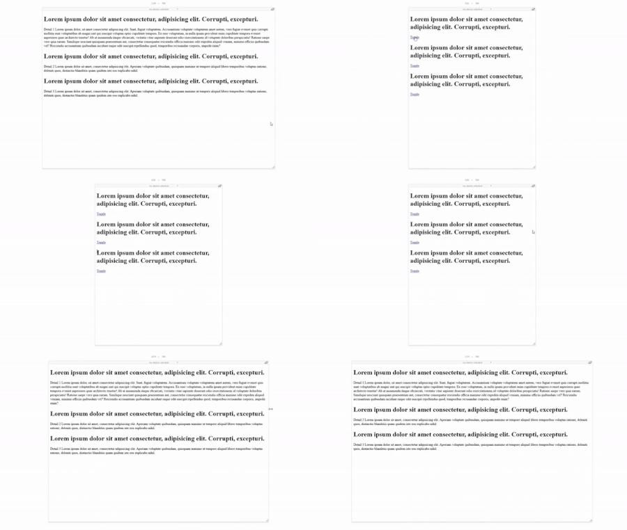
Clone or download the repo to your desktop and run index.html in your browser. Resize the window. The demo will react once the screen width is less 768px.
Installation
Setup
NPM
npm i --save toggle-detailsManual Installation
- Download the toggle-details.min.js file from the dist folder and place in your project directory.
Include the library in your HTML before the
</body>tag as follows<script src="path_to_library"></script>
Usage
Initilization
In your <script> tags before </body> or in your linked javascript file, initialize the library and pass the required parameters as follows:
var details = new toggleDetails();

details.initialize('contentClass','detailsClass',breakpoint,toggleButton)| Parameter | Type | Description | Required | Defaults |
|---|---|---|---|---|
| contentClass | string | The class of the parent element wrapping the element which will be hidden responsively | Yes | |
| detailsClass | string | The class of the child element will be hidden responsively | Yes | |
| breakpoint | integer | The desired responsive breakpoint in pixels | Yes | |
| toggleButton | Object | An object with 2 properties: show: (String) Text to show in the show state hide: (String) Text to show in the hide state Example {show: 'Expand Details', hide:'Hide Details'} | Optional | {show: 'expand',hide:'hide details'} |
Example:
details.initialize('post-body','post-body-details',768,{
    hide: 'Hide Details',
    show:'More Details'
    });
CSS Styling
toggle-details allows for very fliexible styling via standard css. The library will responsively add a class to your elements when the specified breakpoint is reached. Once the breakpoint is exceeded, the classes are removed. Here are the styles that you can customize in CSS to achieve the desired presentation:
| class | Element Type | Description |
|---|---|---|
| .toggle-details-hidden | Any container DOM element specified at library initialization | Class added to the element which will be hidden responsively |
| .toggle-details-button | <a> | Class of the toggle button |
Contribution
If you have a pull request you would like to submit, please ensure to execute NPM run before. This will run gulp and all other dev-dependencies to compile/transpile the JS source to ES5 and into the ./dist folder
License
MIT License
Copyright (c) 2018 Samer Al-Saqqa
Permission is hereby granted, free of charge, to any person obtaining a copy of this software and associated documentation files (the "Software"), to deal in the Software without restriction, including without limitation the rights to use, copy, modify, merge, publish, distribute, sublicense, and/or sell copies of the Software, and to permit persons to whom the Software is furnished to do so, subject to the following conditions:
The above copyright notice and this permission notice shall be included in all copies or substantial portions of the Software.
THE SOFTWARE IS PROVIDED "AS IS", WITHOUT WARRANTY OF ANY KIND, EXPRESS OR IMPLIED, INCLUDING BUT NOT LIMITED TO THE WARRANTIES OF MERCHANTABILITY, FITNESS FOR A PARTICULAR PURPOSE AND NONINFRINGEMENT. IN NO EVENT SHALL THE AUTHORS OR COPYRIGHT HOLDERS BE LIABLE FOR ANY CLAIM, DAMAGES OR OTHER LIABILITY, WHETHER IN AN ACTION OF CONTRACT, TORT OR OTHERWISE, ARISING FROM, OUT OF OR IN CONNECTION WITH THE SOFTWARE OR THE USE OR OTHER DEALINGS IN THE SOFTWARE.