typereact v1.5.0
Typereact
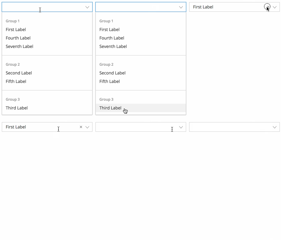
Typereact is a simple React typeahead component that supports grouped entries.

Demo
You can find a demo here: https://visusnet.github.io/typereact/
Install
With npm:
npm i typereactOr with yarn:
yarn add typereactUsage
import Typeahead from 'typereact';

const handleBlur = (fieldName, value) => {
    console.log(`Field ${fieldName} set to ${value}.`)
};

<Typeahead options={options} onBlur={handleBlur} />
Configuration
| Prop | Required | Default | Description |
|---|---|---|---|
| allowUnknownValue | false | false | If true, arbitrary values can be typed. |
| autoSelectSingleOption | false | false | If true, the component will automatically select an option if there are no other options available. |
| calculateGroupHeight | false | 59 or 28 | A callback that returns the height of group entries in pixels. Parameters: group, index. |
| calculateListHeight | false | 28 or min(300, number of options * 28) | A callback that returns the height of the menu in pixels. Parameters: rows, totalRowsHeight. |
| calculateOptionHeight | false | 28 | A callback that returns the height of option entries in pixels. Parameters: option, index. |
| estimateMenuWidth | false | undefined | Either a callback that returns the width the menu in pixels or a boolean value. Parameters: rows. If true, a default implementation is used that tries to estimate the menu width based on label length. |
| groups | false | undefined | If supplied, options will be grouped according to these groups. |
| id | false | undefined | Sets the HTML input ID. |
| isClearable | false | false | Renders a button that unsets the selected value if set to true. |
| isDisabled | false | false | If true, the component is disabled. |
| menuWidth | false | undefined | A number that manually sets the width of the menu. |
| notFoundLabel | false | nicht gefunden (German) | A string that is displayed after the typed label for which no options could be found. |
| onBlur | false | no op | A callback that is called when focus is lost. Parameters: fieldName, value. |
| onChange | false | no op | A callback that is called when the value has changed. Parameters: fieldName, value. |
| options | false | [] | An array of label-value-pairs. |
| placeholder | false | '' | Sets the HTML placeholder attribute. |
| renderEmptyGroups | false | false | If true, groups will be rendered even if they don't have any options. Works only in conjunction with groups. |
| tabIndex | false | undefined | If set, this prop is passed down to the input field. |
| value | false | undefined | If set, selects the option with the specified value. |
Options
options must be an array with objects containing a label (string) and a value (can have any type), e.g.
{
  label: 'This will be shown',
  value: 'this is the value'
}
Groups
If you want your options to be grouped, you can set the groups prop which has the same structure as the options prop. In order to assign options to a group, you have to add an additional group property (of any type that matches the type of the group's value) to the options.
Example:
const options = [
    {label: 'First option in Group 1', value: 'firstOfGroup1', group: 'group1'},
    {label: 'Second option in Group 1', value: 'secondOfGroup1', group: 'group1'},
    {label: 'First option in Group 2', value: 'firstOfGroup2', group: 'group2'},
    {label: 'Second option in Group 2', value: 'secondOfGroup2', group: 'group2'}
];

const groups = [
    {label: 'Group 1', value: 'group1'},
    {label: 'Group 2', value: 'group2'}
];
Styling
You can apply your own styling or use the example that is used by the demo page.
License
MIT
7 years ago
7 years ago
7 years ago
7 years ago
8 years ago
8 years ago
8 years ago
8 years ago
8 years ago
8 years ago
8 years ago
8 years ago
8 years ago
8 years ago
8 years ago
8 years ago
8 years ago
8 years ago
8 years ago
8 years ago
8 years ago
8 years ago
8 years ago
8 years ago
8 years ago
8 years ago
8 years ago
8 years ago
8 years ago