
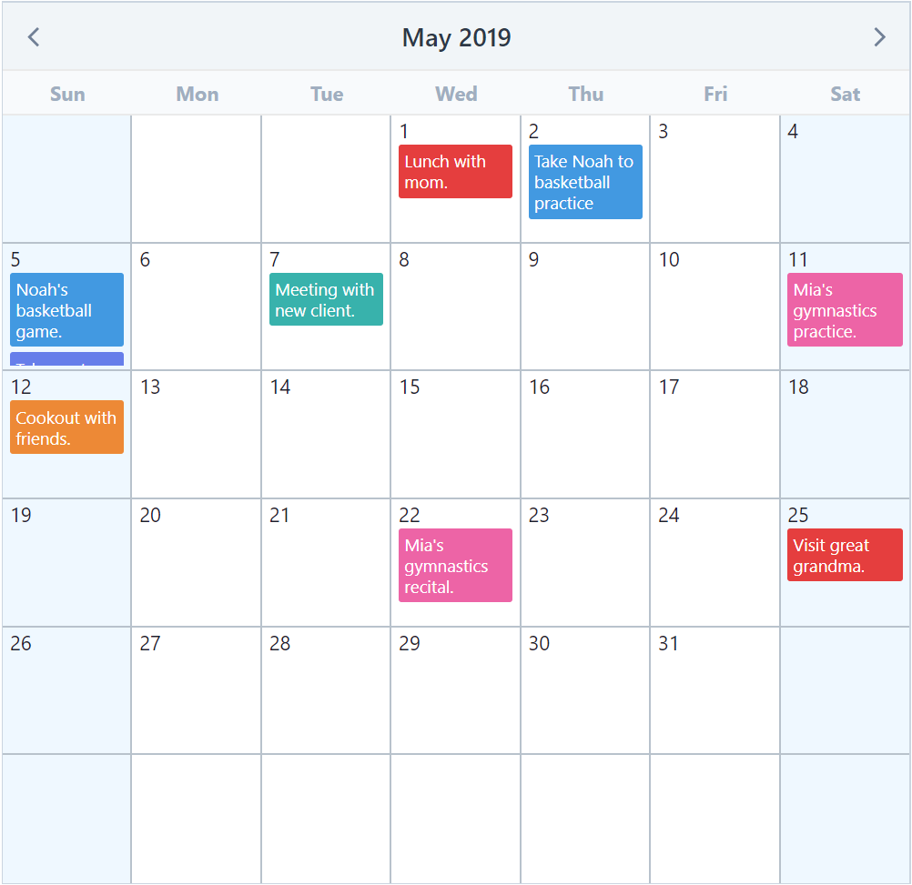
An elegant calendar and datepicker plugin for Vuejs.


npm i --save v-calendarDocumentation
For full documentation, visit vcalendar.io.
Attributes
| Highlights | Dots |
|---|---|
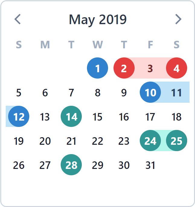 |
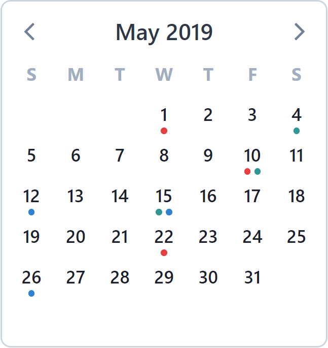 |
| Bars | Popovers |
|---|---|
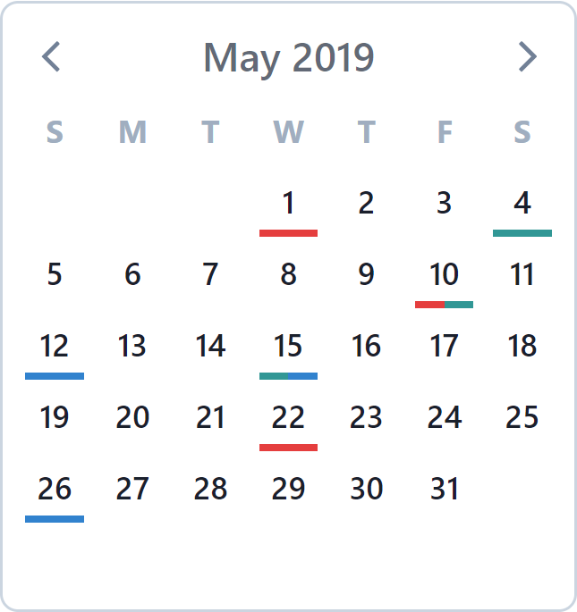 |
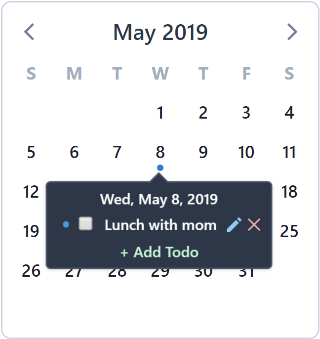 |
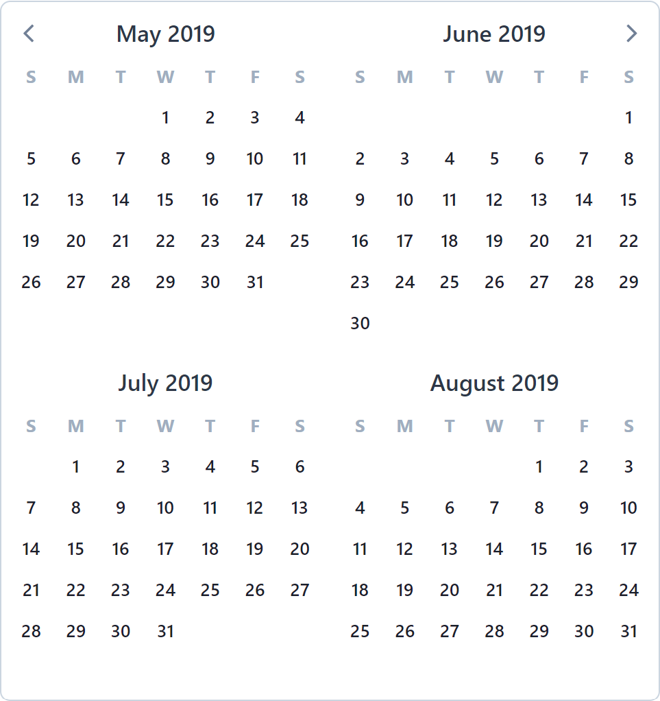
Multi-Paned Calendars
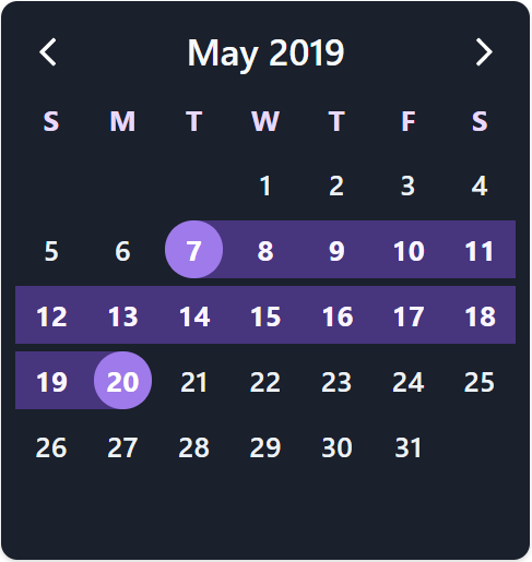
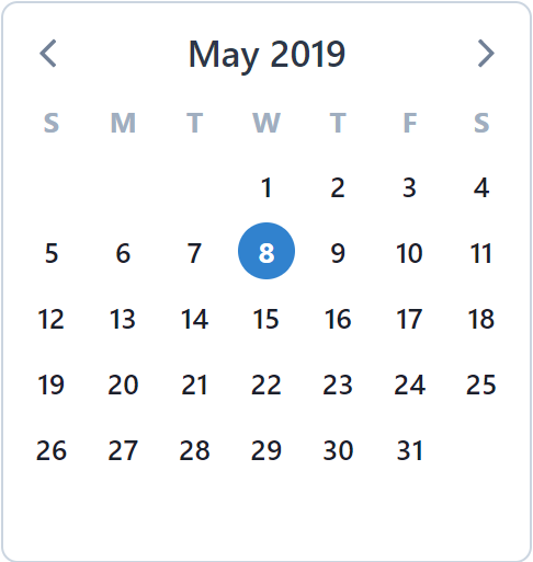
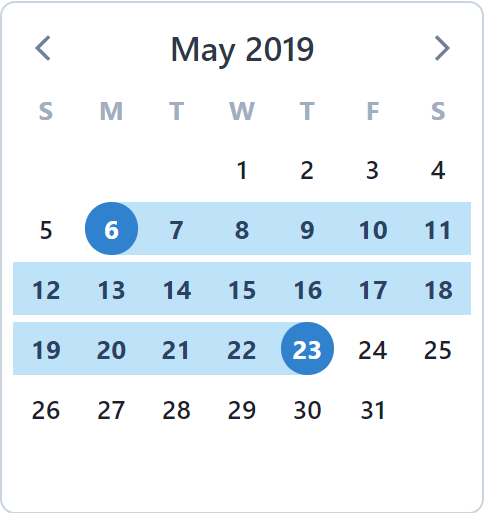
Theme Colors & Dark-Mode
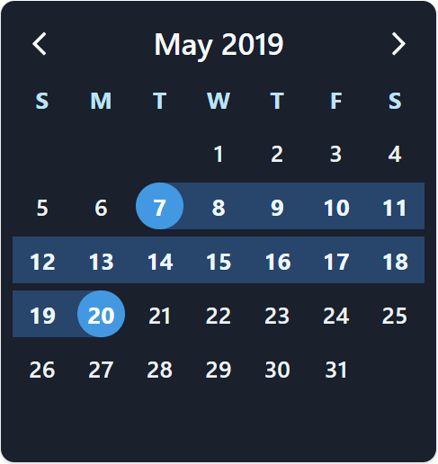 |
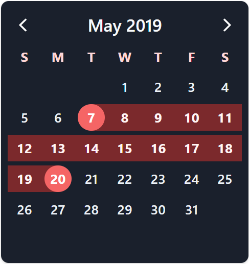 |
 |
 |
Date Pickers
| Single Date | Multiple Date | Date Range |
|---|---|---|
 |
 |
 |
Custom Calendars w/ Scoped Slots