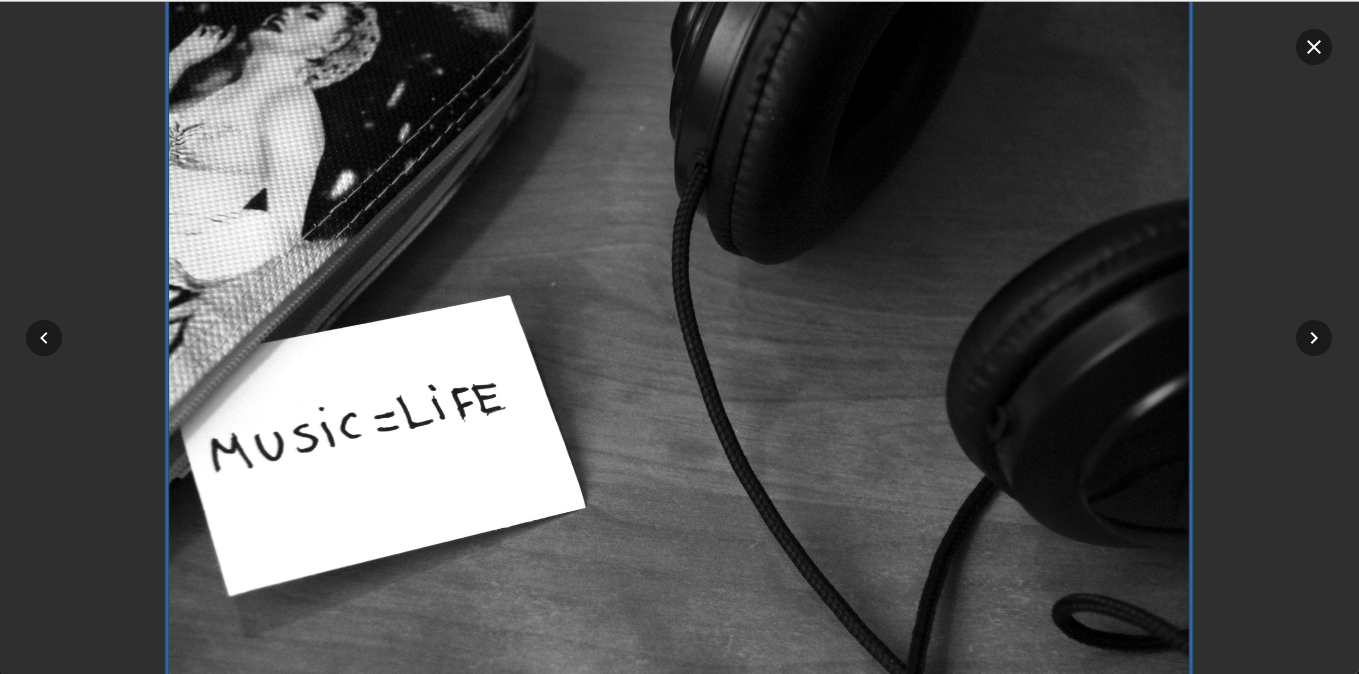
vanillabox v0.1.0
VanillaBox
Vanilla Js to create beautiful Lightbox without dependencies. It uses A11Y-dialog to address the Lightbox modal and accessibility.

Features
✔️ No dependencies
✔️ Closing dialog on overlay click and ESC
✔️ Toggling aria-* attributes
✔️ Trapping and restoring focus
✔️ Build with TypeScript with typings in mind
✔️ Powered by CSS animations, no need for JS animations
✔️ Build with the powerful SASS so you can customize as much as you want
✔️ Highly customizable (in progress)
✔️ Tested with Jest (in progress)
Getting Started
You can use it on many environments and in many ways, but I recommend going with npm/yarn installation.
Prerequisites
You will need to have Node.js with npm or Yarn installed on your machine.
Installing
Just type on your terminal
npm install vanillabox -S # with npm
yarn add vanillabox # with yarn
Implementing the VanillaBox
The Javascript
Then import the module into your main file
import VanillaBox from 'vanillabox'

const GalleryImages = document.querySelectorAll('.gallery .images')
const Lightbox = document.getElementById('lightbox-container')
const animationClass = '.is--animating'

VanillaBox({ GalleryImages, Lightbox, animationClass })
The (S)CSS
Using SCSS
You gonna need some basic styles. If you’re using SASS we got you cover. Just import into your sass file as follow
@import '~vanillabox/src/scss/main';SCSS Variables
Using SASS/SCSS instead of CSS has the advantage to customize some aspects of the Lightbox. Here are them:
$tmlb-block: 'lightbox'; // Name of the base selector for all classes

$tmlb-pre-animation-transform: scale(0.98); // Transformation(s) needed for .lightbox__image before in
$tmlb-animating-class: 'is--animating'; // Animating class (should match the used in the Javascript)
$tmlb-animation-name: fadeIn; // Animation name would be used once the .lightbox__image.is--animating
$tmlb-animation-duration: 500ms; // Animation duration
$tmlb-animation-timming: cubic-bezier(0.86, 0, 0.07, 1); // Animation timming-function
$tmlb-max-image-width: 960px; // max width for the .lightbox__image
$tmlb-max-image-height: 520px; // max height for the .lightbox__image
Using with CSS
Add a good link tag at any place in your html file pointing to our precompiled css file
<link href="./node_modules/vanillabox/dist/main.css" re="stylesheet">The HTML
I decided to be very liberal with the markup and let decide to you. Even thou, we need some special attributes in order to work properly.
Needed parts
[data-a11y-dialog-hide]these attributes are used in any component you want to use to close the Lightbox (is inherited from A11YDialog)[data-action="prev"]this attribute is placed in any component you want to use to load the previous image. If not found both next/prev actions will be ignored[data-action="next"]this is to load the next image. If not found both next/prev actions will be ignored.lightbox__imagethis class is not required (the element will be created if not found) but is good to have in order to optimize the initialization. The Lightbox image will be loaded on it, and should be animgelement as well
The desired markup
<div class="lightbox-container" aria-hidden="true">
    <div class="lightbox-overlay" tabindex="-1" data-a11y-dialog-hide></div>
    <div role="dialog" class="lightbox">
      <button type="button" class="lightbox__close" data-a11y-dialog-hide aria-label="Cerrar lightbox">
        ✖️
      </button>
      <div role="document" aria-labelledby="lightbox__image">
        <button class="lightbox-controls__prev" data-action="prev" aria-label="Imagen Anterior">
          ⬅️
        </button>
        <button class="lightbox-controls__next" data-action="next" aria-label="Imagen Siguiente">
          ➡️
        </button>
        <div class="lightbox-image">
          <img id="lightbox__image" tabindex="-1" src="" class="lightbox__image" alt="">
        </div>
        <!-- /.lightbox-image -->
      </div>
      <!-- /.lightbox-content -->
    </div>
    <!-- /.lightbox -->
  </div>
Built With
- A11YDialog - Easy, lightweight and accessible dialog
- Webpack 4 - THE module bundler
- Typescript - Powerful futuristic typings for Javscript
Versioning
We use SemVer for versioning. For the versions available, see the tags on this repository.
Each release is done with the help of StandardVersion
Changelog
See a full list of changes on our Changelog file
Authors
- Misael Taveras - Initial work - TaverasMisael
License
This project is licensed under the MIT License - see the LICENSE file for details
Acknowledgments
- Hat tip to anyone who's code was used
- Inspiration
- Need
What’s next?
- Add keyboard support
- Add Jest test
- Add more freedom to choose the markup and other configs
- Add events
- Support a full gallery
- Add more options
- Optimize code
- Disable Carrousel Mode